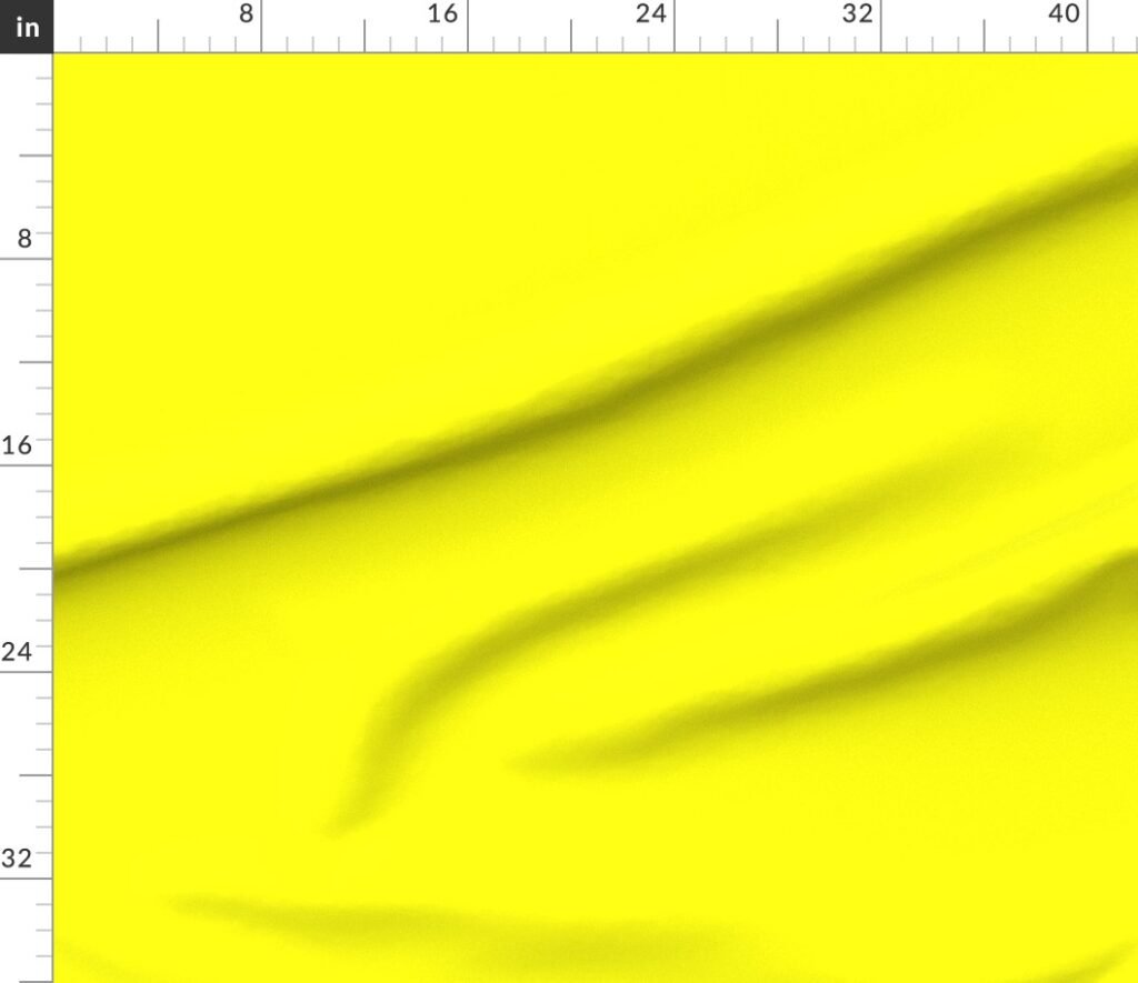
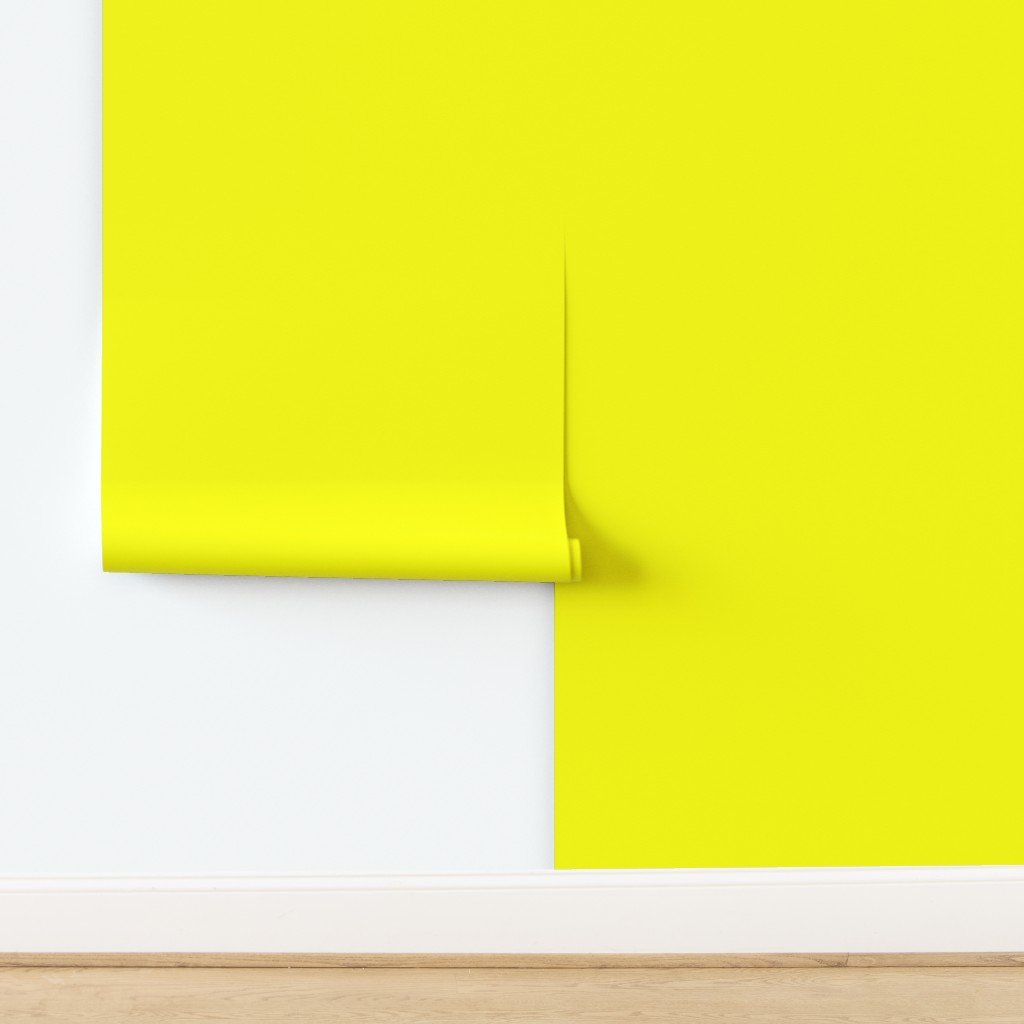
Watercolor Kitchens & Coastal Patterns – New Arrivals from Paper & Frill

Watercolor Kitchens & Coastal Patterns – New Arrivals from Paper & Frill

This latest collection from Paper & Frill explores calm, lived-in interiors and soft abstract textures through watercolor.
From European farmhouse kitchens to coastal sea glass patterns, each design is created to bring a relaxed, timeless atmosphere to everyday home décor.


🌿 Watercolor Kitchen Interiors

These watercolor kitchen scenes capture the quiet beauty of real spaces — light through windows, folded linens, ceramic details, and countryside views.
Perfect for kitchen towels, placemats, serving trays, and everyday tableware.

London Townhouse Kitchen Watercolor with Garden


London townhouse kitchen watercolor

A bright, airy London kitchen with muted blue cabinetry, warm wood countertops, striped linen towels, and a peaceful garden beyond the window.

View on Zazzle

Scandinavian Winter Kitchen Watercolor


Scandinavian winter kitchen watercolor

Pale wood cabinetry, open shelving, soft neutrals, and a snowy pine landscape create a calm, cozy Nordic winter atmosphere.

View on Zazzle

Tuscan Countryside Kitchen with Sunlit Farmhouse Sink


Tuscan countryside kitchen watercolor

Terracotta floors, olive oil bottles, herbs, and rolling Italian hills bathed in warm Mediterranean light.

View on Zazzle

Provence Country Kitchen Watercolor


Provence country kitchen watercolor

Cream cabinetry, tiled walls, rustic countertops, and rolling Provençal countryside beyond the window.

View on Zazzle

Japanese Countryside Kitchen with Rice Field View


Japanese countryside kitchen watercolor

Minimalist cabinetry, natural wood textures, ceramic tea sets, and serene rice fields stretching into the distance.

View on Zazzle

Alpine Chalet Kitchen with Snowy Mountain View


Alpine chalet kitchen watercolor

Warm timber interiors paired with crisp alpine scenery and snow-covered pine forests.

View on Zazzle


🌊 Watercolor Sea Glass & Coastal Patterns

Watercolor Sea Glass Pebble Pattern in Soft Aqua


Watercolor sea glass pebble pattern

Layered aqua, mint, teal, and seafoam pebble shapes on a crisp white background — calm, airy, and organic.

View on Zazzle

Watercolor Sea Glass Stones in Pale Blue & Green


Watercolor sea glass stones pattern

A lighter, minimalist coastal variation painted in pale blue, sage, soft green, and misty teal hues.

View on Zazzle


🛍️ Explore the Full Collection

Each design is available across a wide range of products including kitchen towels, placemats, serving trays,
beach towels, yoga mats, and gift items.

👉
Visit the Paper & Frill Zazzle Store

Geometric Wood Marquetry Inlay Diamond Pattern Leggings

Geometric Wood Marquetry Inlay Diamond Pattern Leggings
If you love patterns that feel handcrafted but wear like modern street style, this design hits that sweet spot.
Inspired by wood marquetry and classic parquet inlay, these leggings turn geometric craftsmanship into an
eye-catching all-over print you can dress up or keep casual.

Why This Pattern Works

  • Marquetry-inspired geometry: diamond and star motifs that feel artisanal and architectural.
  • Warm natural palette: light maple tones balanced with deep walnut and amber woodgrain.
  • Statement print: bold enough for outfits, subtle enough to pair with solid tops.
  • Giftable style: great for fashion lovers, interior-design fans, and anyone who loves pattern.


Tip: Use one front-view image as the featured image, and keep the other three in this grid for quick scrolling.

How to Style Them

  • Minimal top: white, black, or cream crop top or oversized tee.
  • Smart casual: blazer + sneakers for a gallery-day vibe.
  • Cozy: chunky knit sweater in camel, espresso, or oat.
  • Edgy: black leather jacket + boots.

Shop the Leggings

Ready to wear the marquetry look? CLICK HERE to view sizes, fabric options, and pricing.

Fabric Available on Spoonflower

This geometric marquetry wood inlay pattern is also available as fabric on Spoonflower. CLICK HERE to shop fabric for home décor, quilting, pillows, and creative sewing projects.

English Village Wedding Leggings for Bridal Parties and Bachelorette Weekends

Blush Pink English Village Wedding Watercolor Leggings


The Prettiest Wedding Weekend Leggings for Bridesmaids & Bachelorette Celebrations

From getting-ready photos to bachelorette weekends and post-wedding brunch, these romantic watercolor leggings
are designed for comfort, style, and unforgettable bridal-party moments.

When it comes to wedding celebrations, it’s the little details that make the biggest memories. From morning-of
getting ready photos to relaxed bachelorette weekends and post-wedding brunches, comfort and style matter just
as much as sparkle.Our English Village Wedding Watercolor Leggings were designed with exactly those moments in mind—
soft, elevated, and photo-friendly for brides and bridal parties.

A Romantic Pattern Made for Wedding Memories

Inspired by classic English countryside toile, these leggings feature hand-illustrated watercolor scenes of village
churches, cottages, florals, and subtle heart motifs. The design feels timeless and romantic—never loud, never novelty—
making them ideal for bridal celebrations where elegance still matters.

Available in soft blush pink, vintage blue, and gentle sage green,
each colorway pairs effortlessly with white tops, cozy knits, or bridal robes.

Why Brides Love These for Wedding Events

These leggings aren’t just cute—they’re practical for real wedding days:

  • Perfect for bridal party getting-ready photos
  • Comfortable for bachelorette weekends, travel days, and wine tours
  • Flattering high-waist fit that works across body types
  • Soft watercolor palette that photographs beautifully
  • Reusable after the wedding—no “one-day only” feel

They strike that rare balance between matching without being cheesy and festive without screaming “bachelorette.”

A Thoughtful Alternative to Traditional Bridal Party Gifts

If you’re looking for a bridal party gift that feels personal and wearable, these leggings make a beautiful choice.
They work wonderfully as:

  • Bridesmaid proposal gifts
  • Bachelorette weekend outfits
  • Wedding morning loungewear
  • Cozy honeymoon or post-wedding brunch wear

Unlike novelty shirts or sashes, these are pieces your bridal party will actually wear again.

Styled for Every Bridal Moment

Pair them with:

  • White cropped tanks or oversized button-downs
  • Bridal robes or soft cardigans
  • Sneakers for travel days or slippers for getting ready
  • Denim jackets for casual group outings

Whether you’re hosting a countryside wedding, a garden ceremony, or a cozy destination weekend, these leggings fit the mood effortlessly.

Designed by Paper & Frill

Every Paper & Frill design is created with an emphasis on soft color harmony, timeless patterning,
and real-life wearability. These leggings are no exception—made to feel special without feeling overdone.

If you’re planning a wedding, bachelorette weekend, or bridal shower and want something your group will genuinely love wearing,
these leggings are a beautiful place to start.

Shop the Leggings

Ready for your wedding weekend look? Choose your favorite colorway—blush, vintage blue, or sage—and create a bridal-party outfit
that’s comfortable, elegant, and photo-ready.

Shop Now


Soft Cream English Village Wedding Watercolor Leggings
Front
Back
Left
Right

Available as Fabric in Three Wedding-Perfect Colors

This English Village Wedding Toile is also available as Spoonflower fabric, ideal for bridal décor, table linens, keepsake projects, and wedding-day details. Choose from three timeless colorways below.


Blue English Village Wedding Toile Fabric
Blue — classic and traditional with an heirloom toile feel


Blush Pink — soft, romantic, and perfect for bridal celebrations

Cream English Village Wedding Toile Fabric
Cream — gentle and natural for garden and countryside weddings

All colorways are printed on demand through Spoonflower and are available as fabric, wallpaper, and home décor products.

Lux Faux Gold Scales Of Justice in Cross-Hatch Diamonds


Lux Faux Gold Scales of Justice in Cross Hatch Diamonds on Repeat — fabric ruler scale view
Scale ruler preview: use this view to judge motif size instantly (especially helpful before ordering yardage).

Lux Faux Gold Scales of Justice in Cross Hatch Diamonds on Repeat (Design ID 15729729)

Statement black-and-gold “Scales of Justice” artwork with a luxe faux-metal finish — ideal for wallpaper, home décor, and bold sewing projects.

Quick Tags

Design Options

This design takes the iconic scales of justice symbol and elevates it with a rich black ground, a convincing faux-gold finish,
and a structured cross-hatch diamond texture. The result feels bold, timeless, and tailored — perfect for law offices, libraries, statement interiors,
and anyone who loves classic symbolism with a modern luxe edge.

Wallpaper, Front and Center

Wallpaper is a major seller — and this design is made for it. The bold black ground creates instant drama, while the faux-gold scales read like
boutique wallcovering. Use it behind a desk, in a hallway, or as a feature wall in a library or powder room for a high-impact, tailored look.

For the most elevated styling, balance it with simple trim (wainscoting, panelling, or clean baseboards) and let the pattern do the heavy lifting.
Warm brass hardware and matte black accents complement the palette beautifully.

Shop the Wallpaper Version

Why This Pattern Works

This design is structured and symmetrical, which makes it especially strong on décor items that benefit from visual balance — pillows, runners,
bedding, and curtains. Up close, the cross-hatch texture adds depth; from across the room, it reads clean, classic, and confident.

Best Use Cases

  • Law offices & professional spaces: polished identity décor without looking novelty.
  • Libraries & studies: dramatic, old-world mood paired with dark woods and warm lighting.
  • Dining & entertaining: black-and-gold table linens for formal gatherings.
  • Giftable pieces: thoughtful gifts for graduates, new attorneys, or anyone who loves the symbolism.

Shop the Collection on Home Decor

Here are ready-to-order items pulled directly from this CSV. Each product card links to the exact Spoonflower page for this design.


Throw Pillow in Lux Faux Gold Scales Of Justice in Cross-Hatch Diamonds on Repeat

Pillow Sham in Lux Faux Gold Scales Of Justice in Cross-Hatch Diamonds on Repeat

Placemat in Lux Faux Gold Scales Of Justice in Cross-Hatch Diamonds on Repeat

Vintage Lace Rose Floral Pattern in Soft White


Vintage Lace Rose Floral Pattern in Soft White — fabric ruler scale view
Scale ruler preview: use this view to judge motif size instantly (especially helpful before ordering yardage).

Vintage Lace Rose Floral Pattern in Soft White (Design ID 21200642)

Vintage lace + rose florals in a soft white palette — classic, elegant, and made to style beautifully in home décor, bedding, and bridal-inspired sewing.

Design Options

If you love the look of heirloom lace, soft roses, and that quietly romantic feeling you get from vintage linens, this design was made for you. Vintage Lace Rose Floral Pattern in Soft White is the master fabric version of this Paper & Frill pattern on Spoonflower (Design ID 21200642). It layers delicate lace motifs with classic rose florals, all in a creamy, light-soft-white palette that reads like antique ivory without drifting into yellow. The result is elegant, timeless, and surprisingly versatile—easy to dress up for bridal and wedding makes, or to use every day in cottage, French country, and modern romantic homes.

1) What this pattern is

At its heart, this pattern is a conversation between two classics: rose florals and lace. The rose clusters bring softness and movement, while the lace framework adds structure and a “kept in a cedar chest” nostalgia. Because the lace is treated like an all-over texture rather than a single border, you can cut into the yardage without losing the vibe—every piece still feels intentional. That makes it especially friendly for sewing projects where pieces are rotated, pieced, or quilted.

The floral elements are arranged to feel balanced rather than busy. Think of it as a gentle, repeating tapestry: enough detail to be interesting up close, but cohesive at a distance so your finished project doesn’t look chaotic. In design terms, it’s “ornate but calm”—ideal when you want something decorative that won’t overpower a room.

If you’re shopping Spoonflower for a romantic floral fabric, you’ll see plenty of bold botanicals. This one leans refined: the roses feel like a vintage illustration, and the lace reads like a soft overlay. Together they create that classic, Victorian-inspired mood hinted at by the tags in this collection: bridal, classic, elegant, floral, ivory, lace, romantic, roses, victorian, vintage, wedding, and white.

2) The color story

The color story here is all about soft contrast. The background sits in the “soft white / ivory” zone, which is a sweet spot for interiors because it plays nicely with both warm and cool neutrals. On a warm side, it pairs beautifully with linen, oatmeal, antique brass, and honey woods. On the cool side, it still looks crisp next to marble, nickel hardware, and pale gray paint.

Because the palette is gentle, the pattern behaves almost like a textured neutral. You can use it as a feature—say, a statement headboard or full duvet—or as a supporting character, like pillow shams, curtains, or a table runner that adds romance without stealing the show.

Colorways in this CSV also show how the same lace-and-rose artwork shifts moods with different grounds: Blush Pink turns it sweet and feminine, Dusty Blue makes it airy and coastal-romantic, and Warm Linen leans naturally antique and farmhouse-friendly. If you love a coordinated home, these variations are an easy way to mix-and-match across rooms—keeping the pattern consistent while letting each space have its own tone.

More ideas in alternate colorways

Same design, different mood—here are a few ready-to-order products pulled from alternate colorways in this collection.


Placemat in Vintage Lace Rose Floral Pattern in Dusty Blue

Napkins in Vintage Lace Rose Floral Pattern in Dusty Blue

Tea Towel in Vintage Lace Rose Floral Pattern in Blush Pink

Throw Blanket in Vintage Lace Rose Floral Pattern in Dusty Blue

Tablecloth in Vintage Lace Rose Floral Pattern in Warm Linen

Sheet Set in Vintage Lace Rose Floral Pattern in Dusty Blue

3) Why it works in real homes

Patterns that feel “special occasion” can be tricky in real homes. The reason this one works day-to-day is scale and softness. The lace detail reads as texture, which is a design trick used in timeless interiors: texture adds depth without adding clutter. So even though the motif is ornate, it doesn’t feel loud.

In practice, this means you can pair it with simple solids and still get a layered, collected look. Try it with crisp white bedding, a natural woven rug, and a single accent color (sage, dusty rose, or soft blue) and the room will feel styled, not themed.

It also bridges styles. In a cottage setting, it feels right at home beside beadboard and vintage frames. In French country, it pairs beautifully with toile, ticking stripes, and weathered wood. In modern romantic spaces, it can soften clean lines—think a streamlined sofa with lace-rose pillows, or a minimal bedroom warmed up with a floral duvet and airy curtains.

And because the master version is a fabric design, you’re not limited to decor. The same pattern can become a memorable wardrobe detail—a skirt panel, a blouse yoke, or a special lining that feels like a secret.

4) Best use cases

Here are some practical, high-impact ways to use this design on Spoonflower:

  • Bedding: Duvet covers, sheet sets, and pillow shams create an instant romantic bedroom. The soft white base keeps it light and restful.
  • Living decor: Curtains and throw pillows add vintage charm without committing to a full room makeover.
  • Dining: Tablecloths, table runners, napkins, and placemats are perfect for brunch tables, bridal showers, garden parties, and everyday “pretty.”
  • Bridal & wedding makes: From getting-ready robes to ring pillows, guestbook covers, and keepsake quilts—this pattern is made for heirloom moments.
  • Small-sew projects: Zipper pouches, cosmetic bags, aprons, and tea towels let you enjoy the print in manageable cuts.

If you want a quick way to shop by category, use the buttons above to jump straight to Fabric, Wallpaper, Dining, Living, or Bedding results for this design.

Shop the collection on home decor

If you want to see this artwork applied across ready-to-order products,
here are a few on-theme picks pulled directly from this collection.
All items feature the design in Soft White
(the master colorway).


Curtain in Vintage Lace Rose Floral Pattern in Soft White

Throw Blanket in Vintage Lace Rose Floral Pattern in Soft White

Throw Pillow in Vintage Lace Rose Floral Pattern in Soft White

Napkins in Vintage Lace Rose Floral Pattern in Soft White

Duvet Cover in Vintage Lace Rose Floral Pattern in Soft White

Pillow Sham in Vintage Lace Rose Floral Pattern in Soft White

Table Runner in Vintage Lace Rose Floral Pattern in Soft White

Tea Towel in Vintage Lace Rose Floral Pattern in Soft White

5) Styling ideas

Styling this pattern is easiest when you think in layers: a soft base, a touch of shine, and one or two natural textures.

1) Pair it with gentle solids. The most effortless match is a solid that echoes the background—soft white, ivory, or warm linen. This keeps the look calm and lets the lace detail do the talking.

2) Add one accent color. Pull from the coordinated colorways in this collection: blush, dusty blue, or warm linen tones. A single accent in a vase, throw, or artwork makes the room feel intentional.

3) Mix in texture. Because the print already suggests lace, it plays beautifully with real textures: slub linen, matelassé, crochet, rattan, and lightly distressed wood. These materials amplify the vintage mood without looking costume-y.

4) Balance with a simple pattern. If you love pattern mixing, try pairing it with a subtle stripe or ticking. The stripe adds structure while the florals stay romantic.

5) Use metal like jewelry. Antique brass, champagne gold, or brushed nickel each work—choose based on your home’s undertone. Just a little shine (frames, lamp hardware, drawer pulls) makes the soft white palette feel elevated.

For giftable projects, this is a beautiful choice for tea towels, napkins, or pillow covers—especially when you stitch a simple label or monogram for a true keepsake finish.

6) Scale guidance

Scale is where this design becomes truly flexible. Start with the ruler preview at the top of this post—it’s the fastest way to judge how large the lace motif and rose clusters read in real life.

As a general guide:

  • Large-scale impact: Choose larger print scale when you’re covering big surfaces like curtains, duvets, or wallpaper. The pattern reads as elegant texture from across the room.
  • Everyday decor: A medium scale is ideal for throw pillows, table runners, and chair cushions—recognizable motif, but not overwhelming.
  • Small projects: For napkins, pouches, and details like pocket linings, a smaller scale keeps the roses from getting cut off awkwardly.

If you’re unsure, a simple trick is to imagine the finished object from six feet away. If you want the room to feel calm, go a bit larger so the pattern blends. If you want a more “print-forward” look, go medium so the rose clusters are clearly visible.

7) Sewing + project inspiration

If you’re here for sewing inspiration, this design shines in projects that benefit from a touch of romance. For apparel, consider pieces that let the print drape: a gathered skirt, a flutter-sleeve blouse, or a soft scarf. Because the lace motif reads as texture, even a simple silhouette feels dressed up. For accessories, this print makes beautiful linings—tote bags, zipper pouches, makeup bags, and notebook covers feel instantly “giftable.”

Quilters can use it as a sophisticated blender. The lace acts like a low-contrast background, while the roses provide focal points. Try it in a patchwork where you want your feature blocks to stand out without introducing a completely different print. It also works wonderfully as backing fabric on quilts made with blush, sage, dusty blue, or cream solids.

For baby and nursery projects, Soft White keeps the look gentle and calm. Think crib skirts, changing pad covers, curtain panels, or a soft quilt with a lace-rose border. If you prefer less traditional nursery styling, mix the print with modern shapes and matte black accents—the contrast looks fresh and editorial.

One more idea: heirloom-style items. The tags “bridal” and “wedding” are a clue—this pattern is perfect for keepsake pieces like a ring bearer pillow, a handfasting cloth, a bouquet wrap, or a memory quilt made from garments and special fabrics. Even if you’re not planning a wedding, those same projects translate into anniversary gifts and “something pretty for the home” makes.

8) Ordering + coordination tips

A few practical tips can make ordering smoother. First, use the ruler/scale preview at the top of this post to sanity-check motif size. If you’re ordering for a specific project—like pillow fronts or a table runner—measure the finished dimensions and imagine where the roses will land. When in doubt, a slightly smaller scale is safer for small items; a slightly larger scale often looks more luxe on curtains and bedding.

Second, consider continuity. For projects like curtains, duvets, or long tablecloths, you may want extra yardage so you can match repeats across seams. It’s a small step that can make a finished piece look custom.

Third, think about how you’ll style it. If this design will be a major feature in the room, keep surrounding elements simpler: solids, subtle textures, and a restrained palette. If you want a layered “romantic cottage” look, add one companion pattern such as a fine stripe or ticking and repeat the lace-rose print in small doses (napkins, pillow shams, or a single chair cushion) to tie everything together.

Finally, if you love the artwork but want to shift the mood, the additional colorways listed in this CSV—Blush Pink, Dusty Blue, and Warm Linen—make it easy to build a coordinated set. You can keep Soft White as your anchor and sprinkle the others as accents, or flip it: use Warm Linen for the main room and Soft White for the “light and airy” details.

9) Explore the vibe

This collection’s tags paint a clear mood board: vintage, victorian, classic, romantic, bridal, wedding, lace, roses, ivory, and white. That translates into a vibe that feels like antique stationery, heirloom handkerchiefs, and the prettiest corner of a vintage market.

To lean into that mood, style it with details that feel collected rather than new. Think: slightly imperfect ceramics, glass bud vases, embroidered trims, soft candlelight, and botanical artwork. If you prefer a fresher take, contrast it with modern shapes—clean-lined furniture, simple drum shades, and minimal styling—so the pattern becomes the “romance” in an otherwise streamlined space.

For seasonal styling, this design is a year-round neutral. In spring and summer, pair it with fresh greens and blush. In autumn, warm it up with caramel, terracotta, and deeper woods. In winter, add velvet textures and soft metallics for a cozy, elegant holiday feel.

And if you’re building a coordinated home, the additional colorways (Blush Pink, Dusty Blue, Warm Linen) give you an easy palette to repeat—the same artwork, tuned to different rooms and lighting conditions.

10) Wallpaper version

While the master design is the fabric version, the wallpaper format is a beautiful way to bring the lace-and-rose look to larger surfaces. Because the pattern is detailed yet gentle, it works especially well as a feature wall behind a bed, in a powder room, or in a dressing area where you want something romantic and elevated.

For a subtle, designer look, consider wallpapering the upper portion of a wall and pairing it with simple wainscoting or beadboard below. The soft white palette keeps the room light, while the lace motif adds that “wow” moment when you walk in.

If you’re wallpaper-shy, start small: line the back of a bookcase, cover a closet door, or use it in a laundry room where you’ll see it often and smile. The key is to balance it with calm, solid elements so the space feels serene rather than busy.

And remember: you can coordinate wallpaper and sewn decor. A lace-rose feature wall with matching curtains or throw pillows feels cohesive, like a boutique hotel suite—especially when you keep the rest of the palette simple and airy.

Fabric in Powder Pink Pinstripe in an English Country Garden


powder pink pinstripe in an english country garden — fabric ruler scale view
Scale ruler preview: use this view to judge stripe size instantly (especially helpful before ordering yardage).

Design Options

Sweet powder pink and white stripes offer a soft, romantic pinstripe design ideal for garden party themes and
baby shower
decor—tailored, airy, and easy to style across fabric, décor, and wallpaper.

1) What this pattern is

Powder Pink Pinstripe in an English Country Garden is a delicate, classic stripe with a gentle romantic feel—perfect when you want structure without anything harsh or bold. It’s a clean-lined
pinstripe
that reads polished from across the room.

2) The color story

The palette is soft and calm: powder pink paired with white for an airy, light-reflecting look. It layers beautifully with warm neutrals, pale woods, and gentle greens—an easy fit for
pastel
interiors that still feel grown-up.

3) Why it works in real homes

Stripes bring instant order—making spaces feel intentional—while the powder-pink tone keeps everything soft and welcoming. This is the kind of pattern that supports a room rather than dominating it, especially in
cottagecore
and classic country styling.

4) Best use cases (fabric)

This design is ideal for table linens, café curtains, pillow covers, and bedding accents. If you’re coordinating a set, it pairs naturally with other
stripes
and small-scale classics for a layered, collected look.

5) Styling ideas

Keep the look light: warm whites, soft woods, antique brass, and simple florals. For a slightly more playful mix, pair with tiny checks or delicate prints—then anchor it with the clean lines of
vertical lines
throughout the space.

6) Scale guidance

Use the ruler preview at the top to judge stripe thickness before ordering yardage. Smaller-scale stripes feel charming and detailed on accessories; larger applications read more tailored and designer—especially for bedding and curtain panels.

7) Explore the vibe

If you love this mood, explore more soft pinks, classic stripes, and English-inspired styling in the shop—this design is especially at home alongside
english garden
palettes and romantic, airy rooms.

8) Wallpaper version

As wallpaper, this powder-pink stripe adds quiet structure—perfect for nurseries, powder rooms, or a soft feature wall behind shelving. Keep the styling simple (warm whites + pale woods) and let the stripe do the tailoring.

Fabric in Vintage Ski Slope Blue


Vintage Ski Slope Blue — fabric ruler scale view
Scale ruler preview: use this view to judge check size instantly (especially helpful before ordering yardage).

Design Options

A charming vintage-style illustration of an alpine ski village in soft blue and wintery neutral tones—rolling snow-covered slopes, evergreens, and classic mountain buildings that feel like nostalgic vintage print travel art.

1) What this pattern is

Vintage Ski Slope Blue is a repeating scenic landscape—little lodges, winding trails, and snowy hills—built to read as a cozy story from a distance and reveal playful details up close for anyone who loves a ski scene.

2) The color story

The palette leans into calm, dusty blues with soft winter neutrals—easy to pair with warm woods, crisp whites, and simple solids when you want a collected, cabin-meets-minimal blue moment.

3) Why it works in real homes

Because the motifs are illustrated (not photographic), the pattern feels timeless and flexible—cute enough for family spaces, refined enough for grown-up rooms, and perfect as a seasonal accent that never screams “holiday.”

4) Best use cases

Think quilts, throw pillows, curtains, table linens, and cozy winter crafts—anywhere a medium-scale repeat can bring personality without overpowering the room; it’s also a fun choice for alpine-themed kids’ spaces with a subtle winter scene.

5) Styling ideas

Balance the illustration with texture: nubby knits, shearling, linen, and matte ceramics; then add one or two deep accents (charcoal, pine, espresso wood) to ground the lighter snow tones.

6) Scale guidance

Use the ruler preview at the top of this post to confirm motif size before ordering yardage—especially if you’re matching seams or planning a statement piece like curtains or a duvet cover.

7) Explore the vibe

The overall feel is classic ski lodge, but softened—more “vintage travel poster” than novelty print—making it an easy way to bring gentle ski slope charm into everyday decor.

8) Wallpaper version

In wallpaper, the design becomes an immersive backdrop: perfect for a feature wall behind a bed, in an entryway, or in a small powder room where a scenic repeat can create instant atmosphere without adding clutter.


Fabric in Pink Stacked Bound Vintage Books on Library Book Shelf


Pink Stacked Bound Vintage Books on Library Book Shelf — fabric ruler scale view
Scale ruler preview: use this view to judge check size instantly (especially helpful before ordering yardage).

Design Options

If your heart belongs in a quiet reading nook, this bookshelf print is for you—realistic vintage pink leather-bound books stacked shelf-to-shelf, made to feel like a cozy little library wall (and a dreamy match for vintage books lovers).

1) What this pattern is

This design is a richly illustrated wall of stacked, cloth-and-leather spines—an immersive “library shelf” look that reads like a full bookcase from a distance and rewards you with ornate details up close, especially if you’re collecting wall of books styles.

2) The color story

The palette leans warm and romantic: blush, rose, mauve, and dusty plum, balanced with subtle greens and antique neutrals—perfect for soft, moody interiors and a gentle nod to vintage charm.

3) Why it works in real homes

Because it behaves like a textured neutral: the repeating shelf rhythm creates structure, while the illustrated spines add warmth and personality—ideal as an accent in offices, libraries, and reading corners where library books vibes belong.

4) Best use cases

Use it for statement drapery, pillows, quilt backs, and playful upholstery accents—or go bold with wallpaper for a “built-in bookcase” illusion (especially fun for wallpaper books styling).

5) Styling ideas

Pair with warm woods, brass hardware, creamy whites, and deep plum or forest accents; the illustrated spines look gorgeous alongside leather details and vintage frames—hello leather books energy without the dusting.

6) Scale guidance

Check the ruler image at the top before ordering yardage—this print is designed to feel “real shelf sized,” making it especially satisfying for theatrical installs, photo backdrops, and that life-size books illusion.

7) Explore the vibe

If you love the idea of a cozy study wall, this one sits right between classic and whimsical—think romantic library, gentle academia, and a softly styled bookshelf moment you can sew into literally anything.

Fabric in White Polkadots on Cherry Red


White Polkadots on Cherry Red — fabric ruler scale view
Scale ruler preview: use this view to judge dot size instantly (especially helpful before ordering yardage).

Design Options

A crisp scatter of white dots on a saturated cherry red ground, this print is the kind of classic that never feels predictable. It reads as vintage sweetness at first glance, then lands with clean, modern confidence once it’s in a space. Simple in structure yet bold in presence, it’s a design that brings instant cheer while remaining polished and versatile.

1) What this pattern is

White Polkadots on Cherry Red is a timeless dot pattern reduced to its most iconic form. Evenly spaced white dots float across a rich cherry background, creating a look that feels playful yet considered. The repetition is deliberate and balanced, giving the design a steady rhythm that reads clearly at any scale. It’s a pattern rooted in classic design language, interpreted with clarity and restraint.

2) The color story

The palette relies on contrast to do the heavy lifting. Bright white brings freshness and lift, while the cherry red base adds warmth and saturation without becoming heavy. Together they create a lively, high-impact pairing that feels celebratory but not seasonal. The red has enough depth to feel grounded, allowing the white dots to pop cleanly and keep the overall look crisp.

3) Why it works in real homes

This design works beautifully in lived-in spaces because it behaves like a patterned neutral. From afar, it reads as texture; up close, it reveals cheerful detail. That flexibility makes it easy to layer with other patterns or solids. It bridges styles effortlessly, fitting into playful family homes, retro-inspired interiors, and more tailored spaces that benefit from a confident hit of color.

4) Best use cases

White Polkadots on Cherry Red shines across a wide range of applications. It’s ideal for statement cushions, table linens, and drapery, as well as apparel pieces that call for bold simplicity. In children’s rooms it feels joyful and bright; in dining spaces it evokes classic bistro charm. It also works beautifully as an accent—binding, trim, or lining—where a flash of pattern makes all the difference.

5) Styling ideas

Pair this print with warm whites, soft creams, and natural wood tones to keep the look balanced. For a more graphic direction, introduce black accents or simple stripes. Pastel companions lend a nostalgic, confectionary feel, while brass or chrome details elevate the palette. Fresh greenery and clear glass help ground the bold color and keep the overall styling light.

6) Scale guidance

The dot scale is intentionally versatile, reading cleanly both up close and from across a room. The ruler preview above is the best way to assess how the pattern will land in your project. Whether used sparingly or wall-to-wall, the consistent spacing keeps seams and transitions feeling cohesive and visually calm.

7) Explore the vibe

This pattern carries an unmistakably happy energy—classic, friendly, and a little nostalgic. It recalls vintage picnicware and wrapped gifts while still feeling modern and intentional. As fabric, it feels playful and adaptable; as wallpaper, it becomes bold and immersive. However it’s used, it brings a sense of optimism and timeless charm to the space.

Fabric in Easter Dino Eggs Watercolor Pattern on Soft Mint


Easter Dino Eggs Watercolor Pattern on Soft Mint — fabric ruler scale view
Scale ruler preview: use this view to judge motif size instantly (especially helpful before ordering yardage).

Design Options

Sweet baby dinos hatching from pastel speckled eggs in a gentle watercolor style on a soft mint ground—perfect for nursery sewing, baby shower makes, and cheerful spring projects.

1) What this pattern is

A playful all-over scatter of baby dinosaurs and speckled eggs—cute, calm, and easy to pair with solids for quilts, bedding, and kids’ accessories.

2) The color story

Soft mint keeps the background airy and soothing, while the eggs and dinos add gentle pops of pastel—think blush, lilac, and warm spring tones without feeling loud.

3) Why it works for nurseries + kids spaces

The hand-painted look makes it feel cozy and comforting (not “cartoony”), and the small scattered motifs keep it visually light—great for a nursery decor vibe that still grows with your little one.

4) Best use cases

Ideal for baby blankets, crib sheets, swaddles, quilt backs, pillowcases, pajamas, and sweet spring table accents. It also makes adorable gift projects for baby shower season.

5) Styling ideas

Pair with creamy whites, warm beige, and light gray for a calm palette, or lean into pastel coordinating prints (tiny dots, soft stripes, or simple ginghams) for a layered kids-room look.

6) Scale guidance

The ruler image at the top is your “truth source” for motif size. Use it to confirm whether the eggs and dinos will read as a delicate sprinkle (smaller) or more graphic and noticeable (larger) on your finished project.

7) Explore the vibe

If you love cheerful spring prints and kid-friendly themes, explore more kids pattern designs to build a matching set across fabric and wallpaper.