Design Options
A crisp scatter of white dots on a saturated cherry red ground, this print is the kind of classic that never feels predictable. It reads as vintage sweetness at first glance, then lands with clean, modern confidence once it’s in a space. Simple in structure yet bold in presence, it’s a design that brings instant cheer while remaining polished and versatile.
1) What this pattern is
White Polkadots on Cherry Red is a timeless dot pattern reduced to its most iconic form. Evenly spaced white dots float across a rich cherry background, creating a look that feels playful yet considered. The repetition is deliberate and balanced, giving the design a steady rhythm that reads clearly at any scale. It’s a pattern rooted in classic design language, interpreted with clarity and restraint.
2) The color story
The palette relies on contrast to do the heavy lifting. Bright white brings freshness and lift, while the cherry red base adds warmth and saturation without becoming heavy. Together they create a lively, high-impact pairing that feels celebratory but not seasonal. The red has enough depth to feel grounded, allowing the white dots to pop cleanly and keep the overall look crisp.
3) Why it works in real homes
This design works beautifully in lived-in spaces because it behaves like a patterned neutral. From afar, it reads as texture; up close, it reveals cheerful detail. That flexibility makes it easy to layer with other patterns or solids. It bridges styles effortlessly, fitting into playful family homes, retro-inspired interiors, and more tailored spaces that benefit from a confident hit of color.
4) Best use cases
White Polkadots on Cherry Red shines across a wide range of applications. It’s ideal for statement cushions, table linens, and drapery, as well as apparel pieces that call for bold simplicity. In children’s rooms it feels joyful and bright; in dining spaces it evokes classic bistro charm. It also works beautifully as an accent—binding, trim, or lining—where a flash of pattern makes all the difference.
5) Styling ideas
Pair this print with warm whites, soft creams, and natural wood tones to keep the look balanced. For a more graphic direction, introduce black accents or simple stripes. Pastel companions lend a nostalgic, confectionary feel, while brass or chrome details elevate the palette. Fresh greenery and clear glass help ground the bold color and keep the overall styling light.
6) Scale guidance
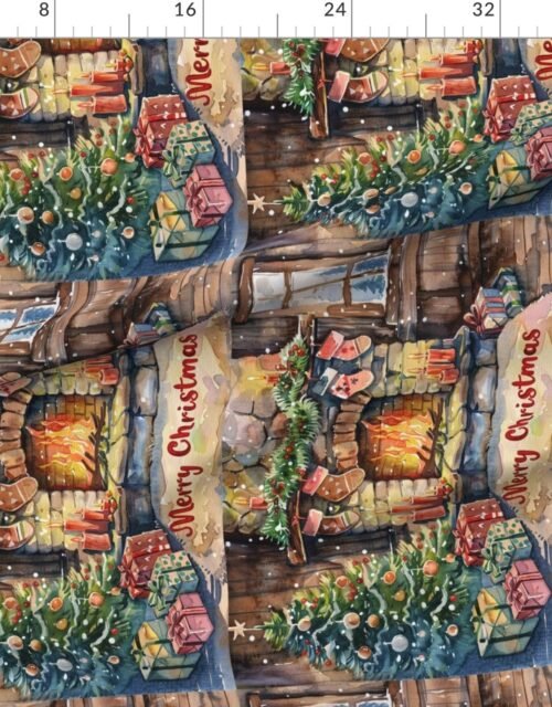
The dot scale is intentionally versatile, reading cleanly both up close and from across a room. The ruler preview above is the best way to assess how the pattern will land in your project. Whether used sparingly or wall-to-wall, the consistent spacing keeps seams and transitions feeling cohesive and visually calm.
7) Explore the vibe
This pattern carries an unmistakably happy energy—classic, friendly, and a little nostalgic. It recalls vintage picnicware and wrapped gifts while still feeling modern and intentional. As fabric, it feels playful and adaptable; as wallpaper, it becomes bold and immersive. However it’s used, it brings a sense of optimism and timeless charm to the space.
Pattern Preview & Style Examples


