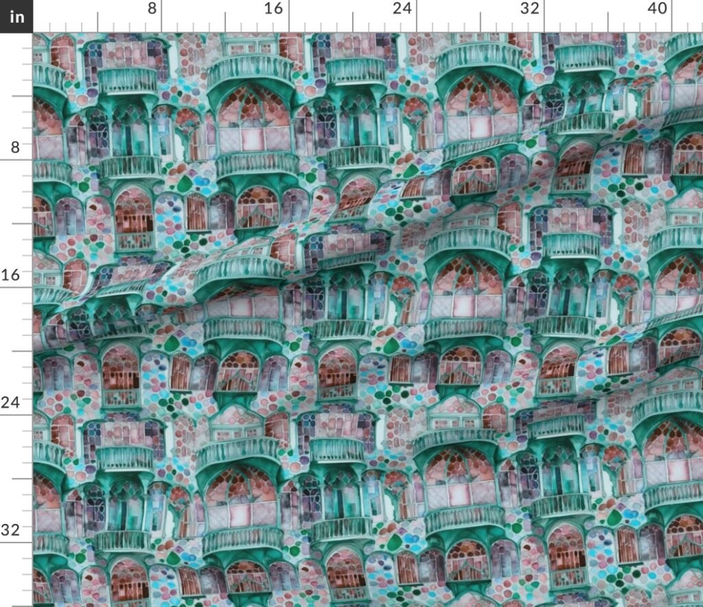
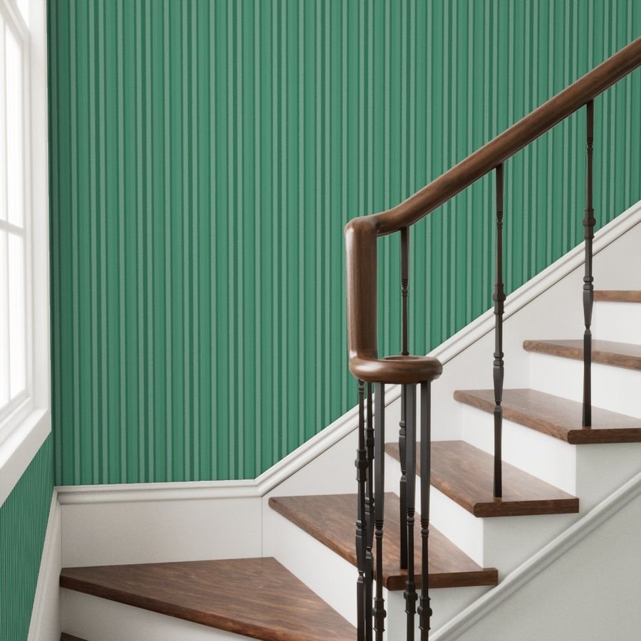
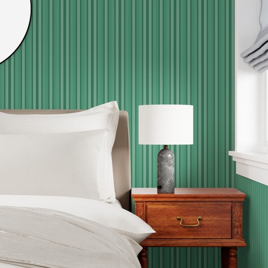
Immerse your space in the vibrant artistry of Barcelona with this captivating fabric, inspired by the intricate Art Deco architecture of its famed houses. Imagine elegant windows, graceful arches, and classic columns rendered in luminous watercolors, predominantly a soothing aqua, creating a unique, mosaic-like pattern with a stained-glass mood. This versatile design is perfect for elevating your Continue reading
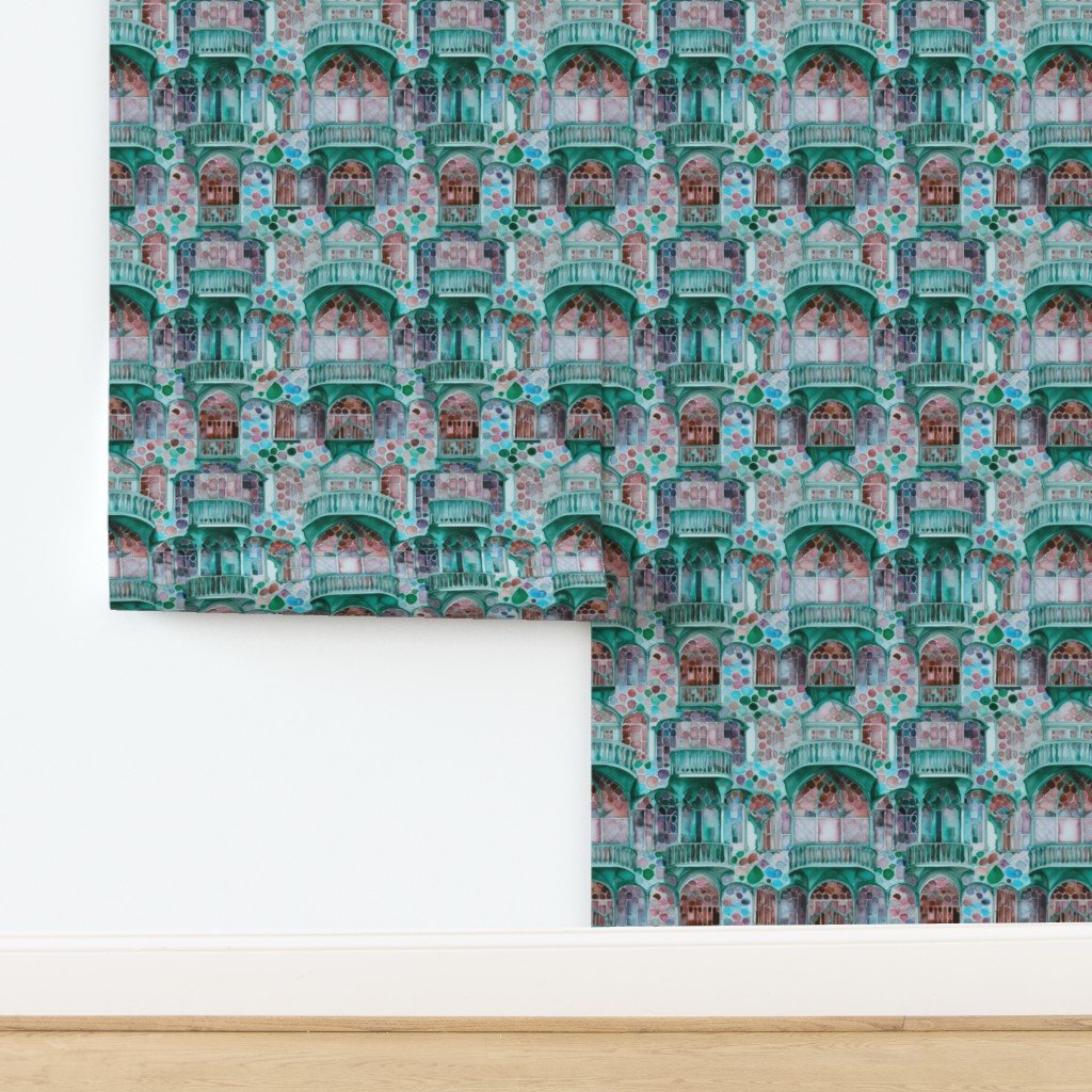
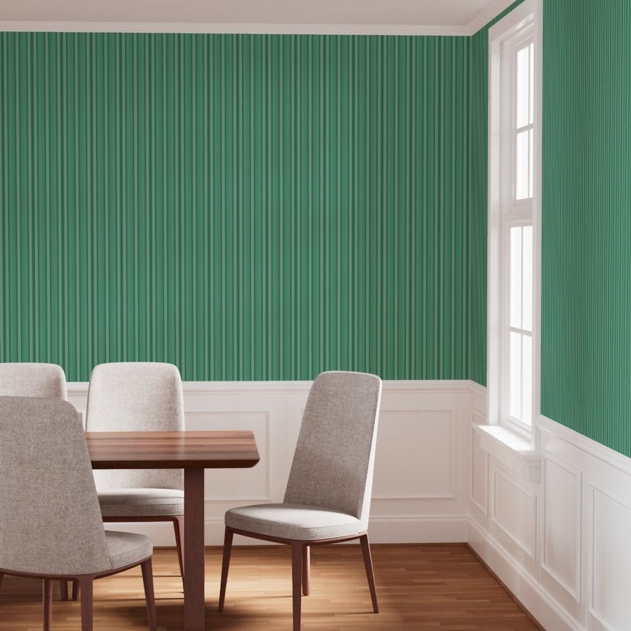
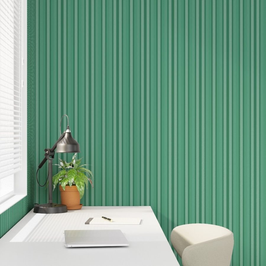
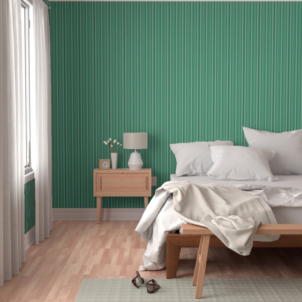
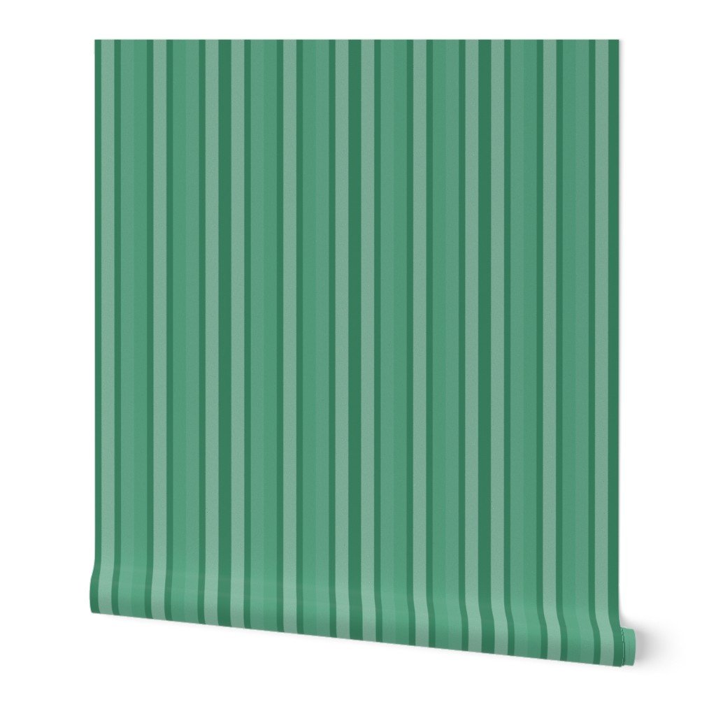
Imagine transforming your home with the exquisite charm of Barcelona. This unique wallpaper, inspired by the city’s famed Art Nouveau architecture, brings a touch of luxurious elegance to any space. Hand-painted watercolor details beautifully render intricate windows, columns, and graceful arches, infused with a vibrant aqua palette that evokes Continue reading
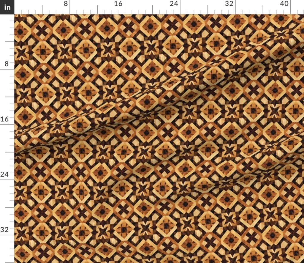
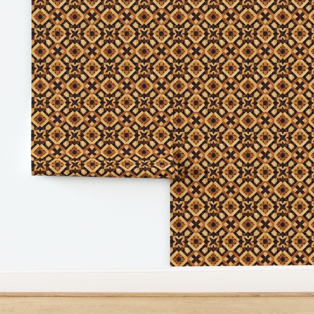
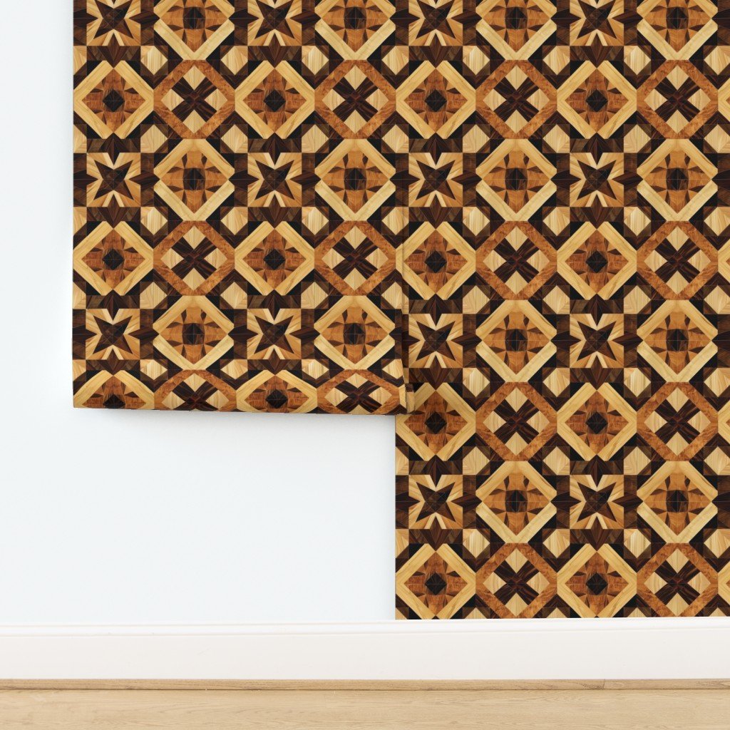
This geometric marquetry wood inlay pattern features a repeating parquet-style design inspired by traditional European cabinetmaking. Warm natural wood tones create depth and symmetry, making it well suited for fabric, home décor, and interior design
This geometric marquetry wood inlay pattern features a repeating parquet-style design inspired by traditional European cabinetmaking. Warm natural wood tones create depth and symmetry, making it well suited for fabric, home décor, and interior design
This geometric marquetry wood inlay pattern features a repeating parquet-style design inspired by traditional European cabinetmaking. Warm natural wood tones create depth and symmetry, making it well suited for fabric, home décor, and interior design
This geometric marquetry wood inlay pattern features a repeating parquet-style design inspired by traditional European cabinetmaking. Warm natural wood tones create depth and symmetry, making it well suited for fabric, home décor, and interior design
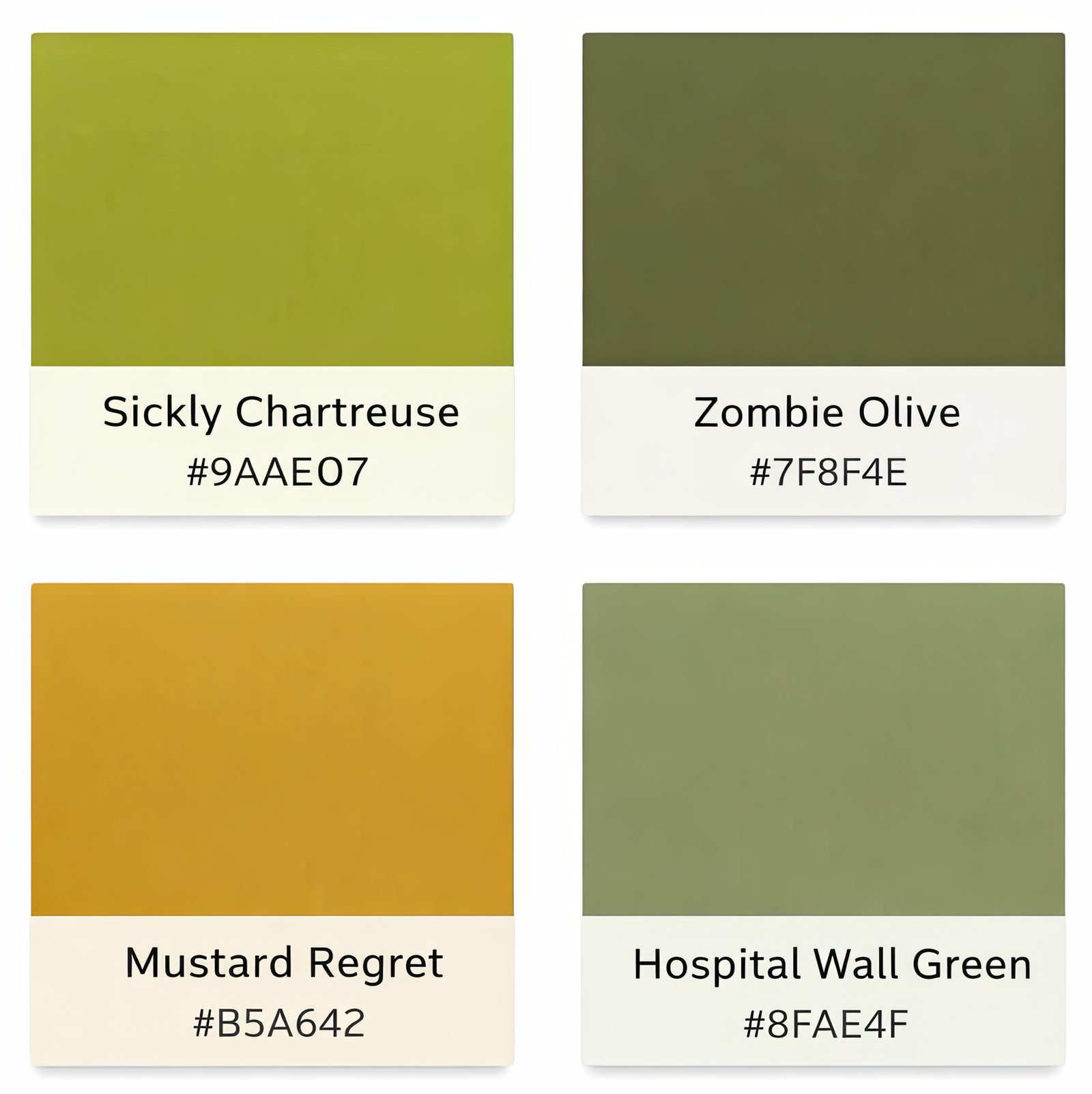
There are colors that feel universally safe—navy, crisp white, charcoal, beige. They communicate control, clarity, and neutrality. And then there are the others: the yellow-greens, the muddy olives, the stale mustards. These are the colors people instinctively reject. They’re described as “puke green,” “hospital wall,” or “1970s regret.” On their own, they often look like mistakes.Yellow-green tones in particular trigger strong reactions because they sit uncomfortably between freshness and decay. Too much yellow and they feel sickly; too much green and they feel institutional. Mustard shades can lean warm and nostalgic, but when slightly muted they take on a stale quality. Olive tones hover between earthy and fatigued. None of these colors signal sleek performance or minimalist polish. They resist the language of safe design.
The Usual Suspects
Colors frequently labeled “unattractive” — until used with intention.
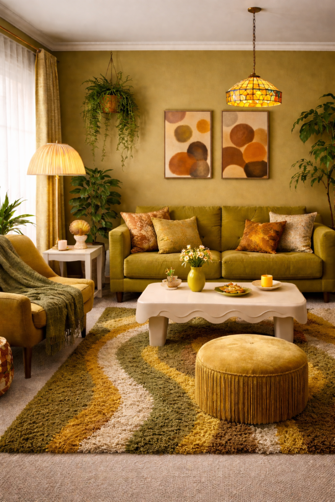
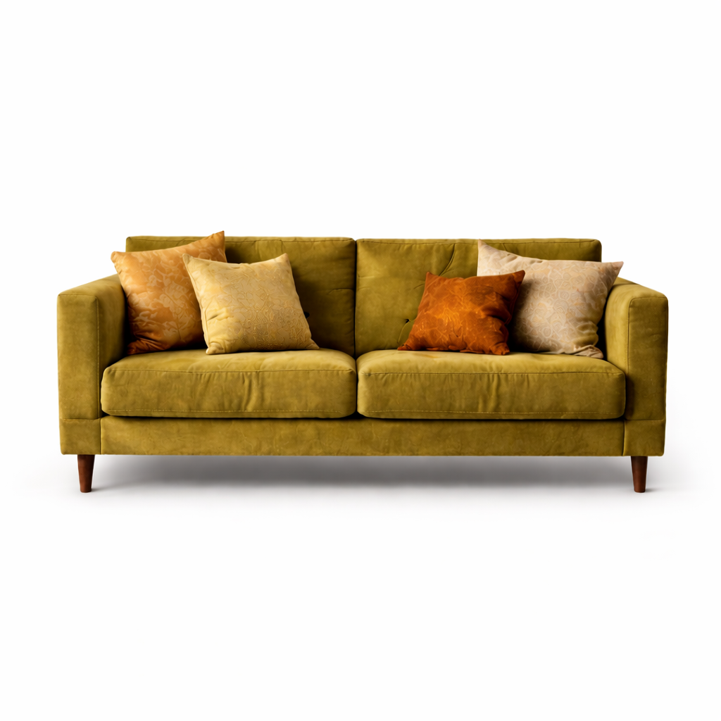
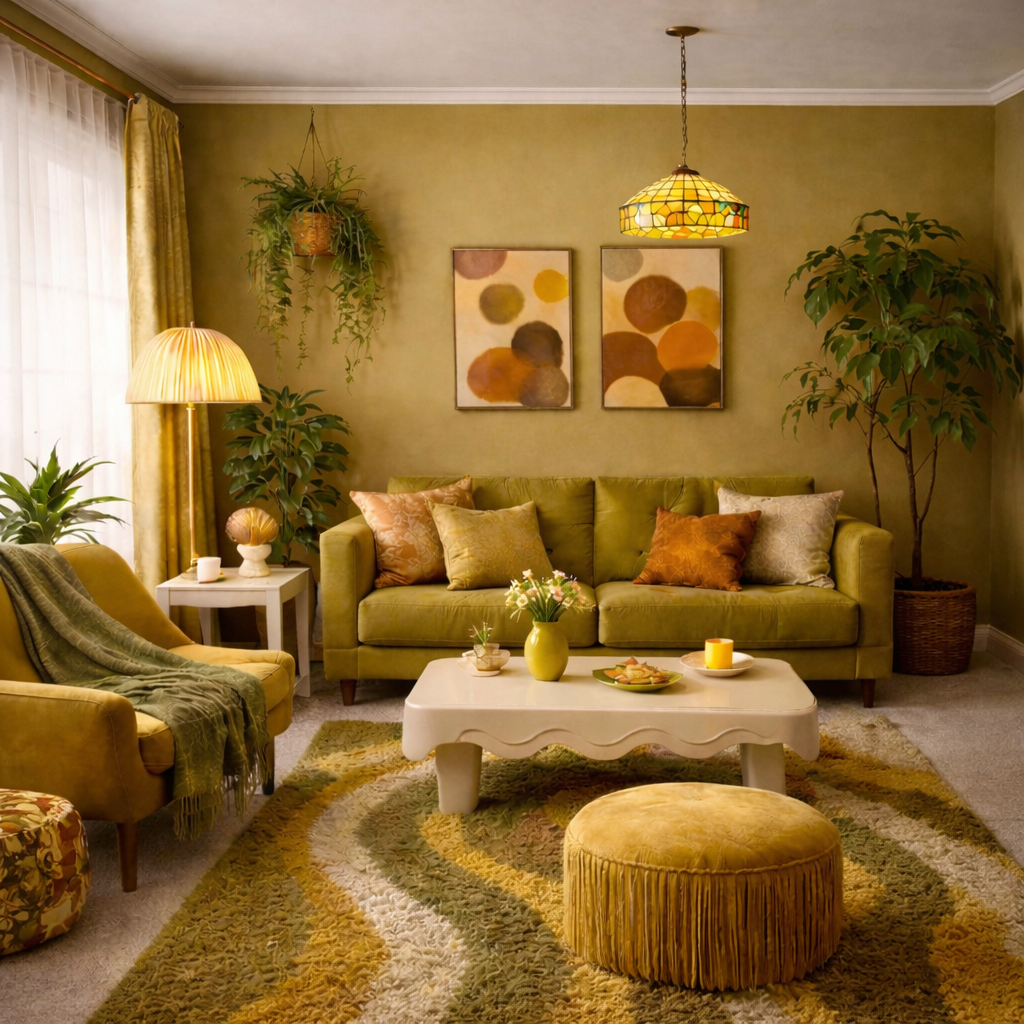
Viewed in isolation, these shades feel harsh and slightly wrong. But place them into a room, repeat them across textiles and surfaces, and something shifts. A single olive cushion feels accidental; an entire olive palette feels deliberate. One mustard accent may seem questionable, yet layered across art, upholstery, and flooring, it becomes cohesion.
The real lesson is not about whether a color is attractive in theory. It is about commitment. Safe palettes aim for universal approval, but selective palettes create identity. The moment a room stops trying to please everyone, it begins to communicate something personal.
The Cohesive Palette
The difference is not the color itself. It is the context around it. When these tones are supported, repeated, and softened by texture, they become intentional rather than accidental.
So-called man-repellent colors are not inherently ugly. They are emotionally specific. Used timidly, they look wrong. Used boldly, they look designed. In a culture saturated with safe beige interiors, that boldness can feel unexpectedly refreshing.
The Binding Neutrals
Every bold palette needs a stabilizer. In this collection, that role is played by warm cream / soft linen —
a tone that softens chartreuse, warms mustard, and prevents olive from feeling heavy.
It doesn’t compete. It connects.
Warm Oat Cream
#F2E9DA
Soft Linen
#E8DCC6
These tones aren’t dramatic, and that’s the point. They allow the so-called “ugly” colors
to feel intentional rather than overwhelming. Without a binding neutral, bold palettes
feel chaotic. With one, they feel curated.
Some of the links on this site are "affiliate links." This means if you click on the link and purchase the item, We could receive an affiliate commission. more info