
Surface pattern design available on Spoonflower.

Lifestyle View

Lifestyle View

Lifestyle View

Lifestyle View

Lifestyle View

Surface pattern design available on Spoonflower.
Lifestyle View
Lifestyle View
Lifestyle View
Lifestyle View
Lifestyle View

The colors of the rainbow flag in two inch vertical cabana stripes- red, orange, yellow, green, blue indigo and violet
…

Lifestyle View

Lifestyle View

Lifestyle View

Lifestyle View

A charming vintage-style illustration of an alpine ski village in soft blue and wintery neutral tones. Rolling snow-covered slopes, evergreen trees, and classic mountain buildings evoke nostalgic ski travel art. Perfect for subtle winter décor, fabric
…

Lifestyle View

Lifestyle View

Lifestyle View

Lifestyle View

Lifestyle View

A charming vintage-style illustration of an alpine ski village in soft blue and wintery neutral tones. Rolling snow-covered slopes, evergreen trees, and classic mountain buildings evoke nostalgic ski travel art. Perfect for subtle winter décor, fabric
…

Lifestyle View

Lifestyle View

Mockup View

Mockup View

Mockup View

Mockup View

Lifestyle View

Lifestyle View

Dark teal and black geometric diamond repeat pattern in the familiar argyle tartan
…

Mockup View

Mockup View

Mockup View

Mockup View

Lifestyle View

Lifestyle View

Lifestyle View

Lifestyle View

Dark teal and black geometric diamond repeat pattern in the familiar argyle tartan
…

Lifestyle View

Lifestyle View

Lifestyle View

Lifestyle View

Lifestyle View
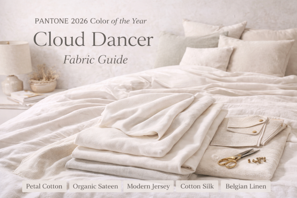
PANTONE 11-4201 Cloud Dancer has been named the Pantone Color of the Year 2026 — a soft, airy off-white described as a whisper of tranquility in a noisy world.
In a year defined by overstimulation and visual noise, Cloud Dancer represents a shift toward calm, tonal layering, and understated design. Unlike stark bright white, this warm off-white neutral carries softness and depth, making it easier to live with across interiors, apparel, and textiles.
As a solid fabric, Cloud Dancer becomes a foundation color. That means the fabric base you choose — quilting cotton, linen, jersey, velvet, or performance upholstery — will dramatically influence how the color performs. Texture, weave, drape, and weight all affect the final look.
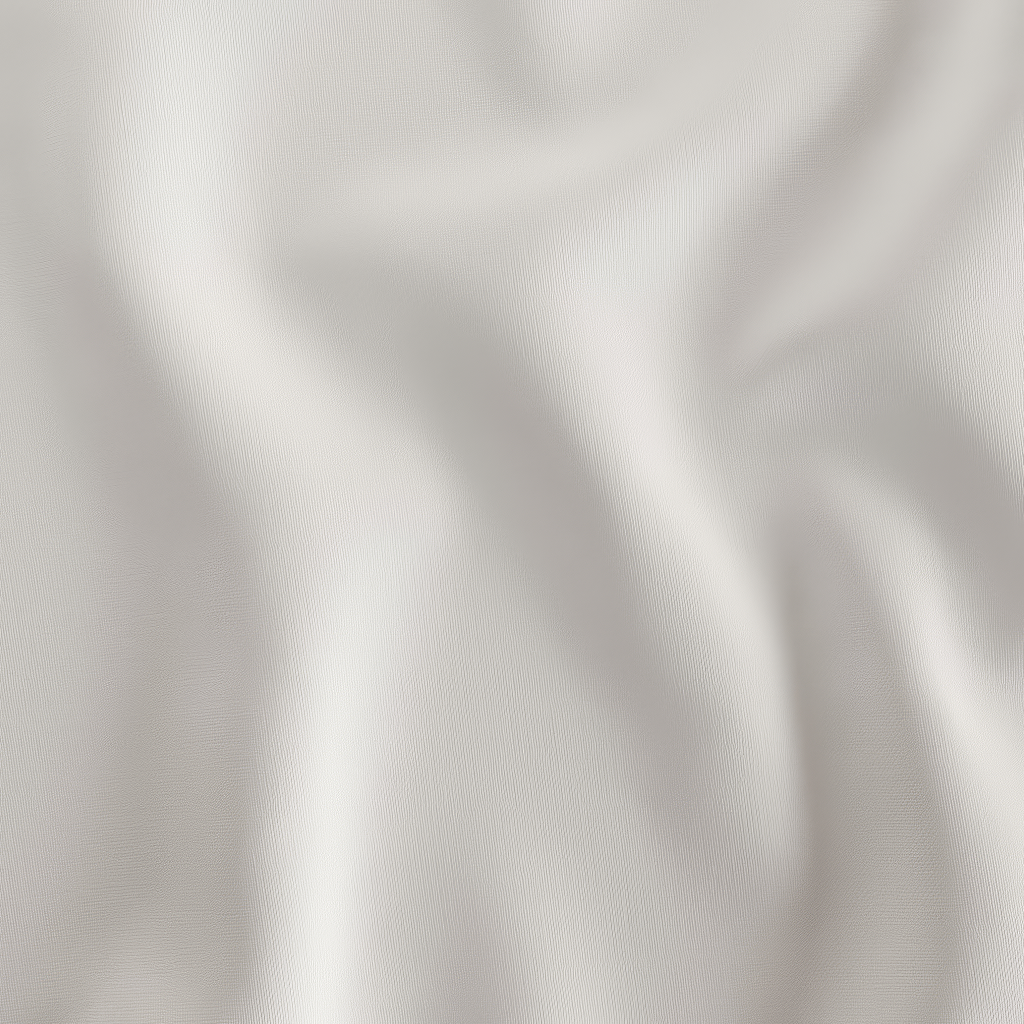
Cloud Dancer sits between white, cream, and pale beige without committing too strongly in any direction. It pairs beautifully with:
Because it absorbs light gently rather than reflecting it harshly, this off-white works across lightweight apparel fabrics and heavier upholstery bases without feeling clinical or flat.
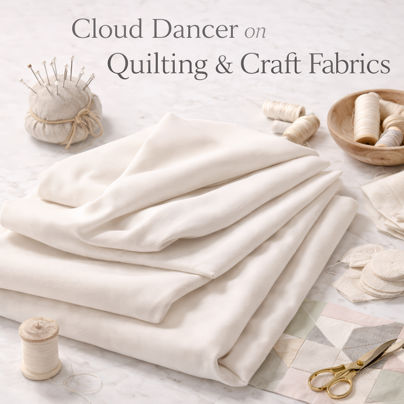
For quilting and craft projects, neutral solids are essential. Cloud Dancer works beautifully as a background fabric in patchwork quilts, modern minimalist layouts, baby blankets, and nursery decor. Its warmth prevents high contrast against softer color palettes.
A classic quilting-weight cotton with clean structure and crisp finish.
View on Petal Signature Cotton →
Slight sheen and smooth surface ideal for refined quilts and soft furnishings.
View on Organic Cotton Sateen →
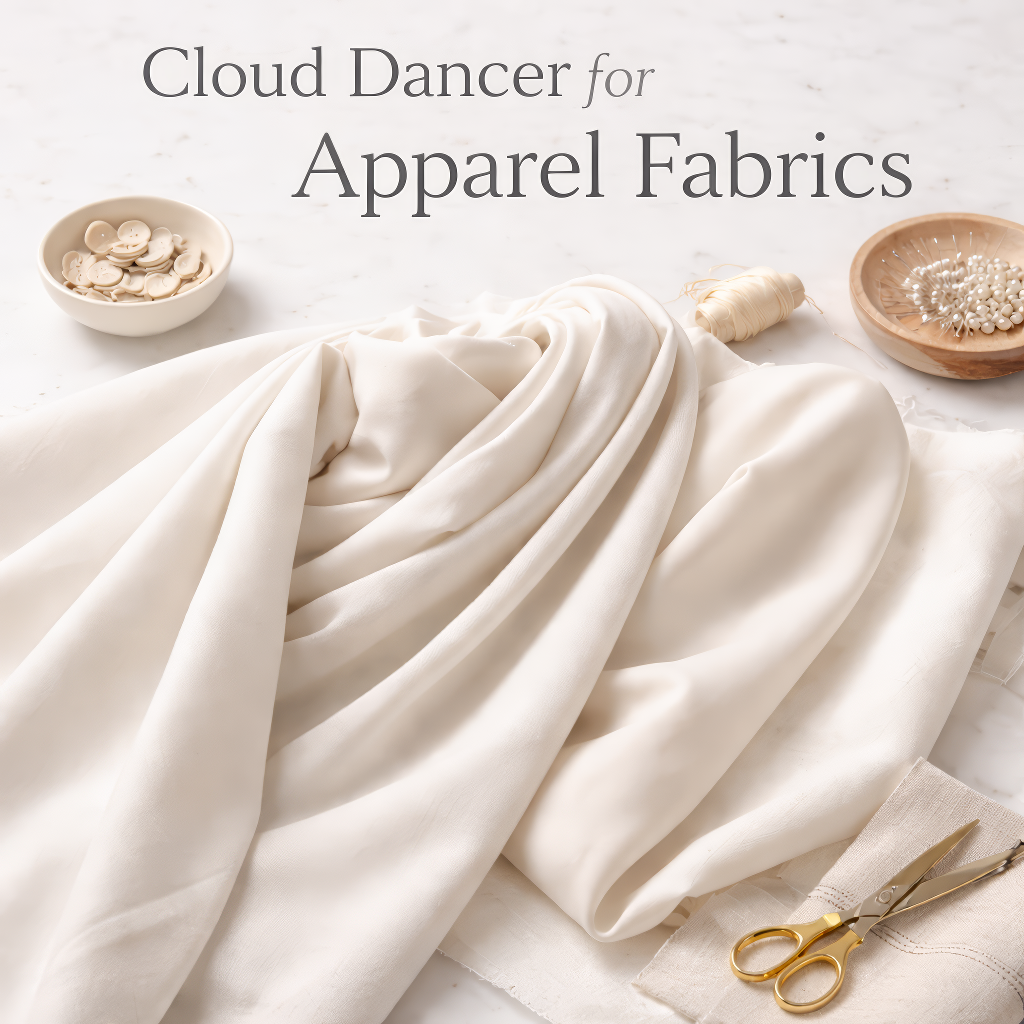
In apparel, Cloud Dancer becomes a refined neutral base for capsule wardrobes, bridal-inspired garments, minimalist silhouettes, and soft layering pieces. On lightweight woven bases it feels airy and breathable; on knits it becomes a versatile tonal foundation.
Modern Jersey → |
Organic Cotton Knit →
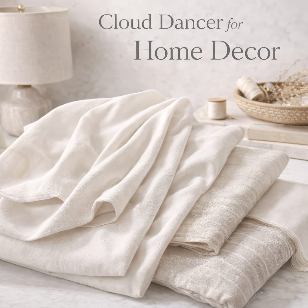
In interior spaces, Cloud Dancer works as a calm anchor. It softens natural light when used for curtains, creates tonal bedding layers, and adds quiet depth to table linens and neutral throw pillows. Unlike bright white, it feels livable and forgiving.
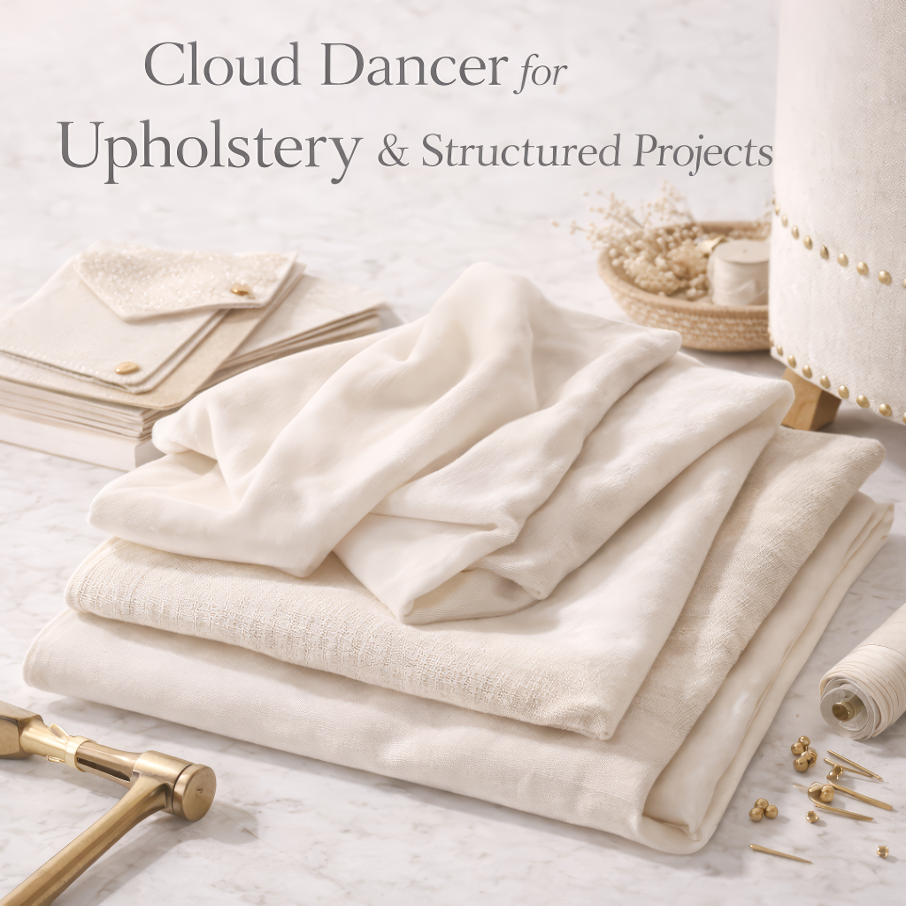
For upholstery, choosing a warm off-white helps prevent a room from feeling stark. On textured linen bases, Cloud Dancer gains movement and dimension. On velvet, it takes on a more elevated boutique tone while remaining understated and versatile.
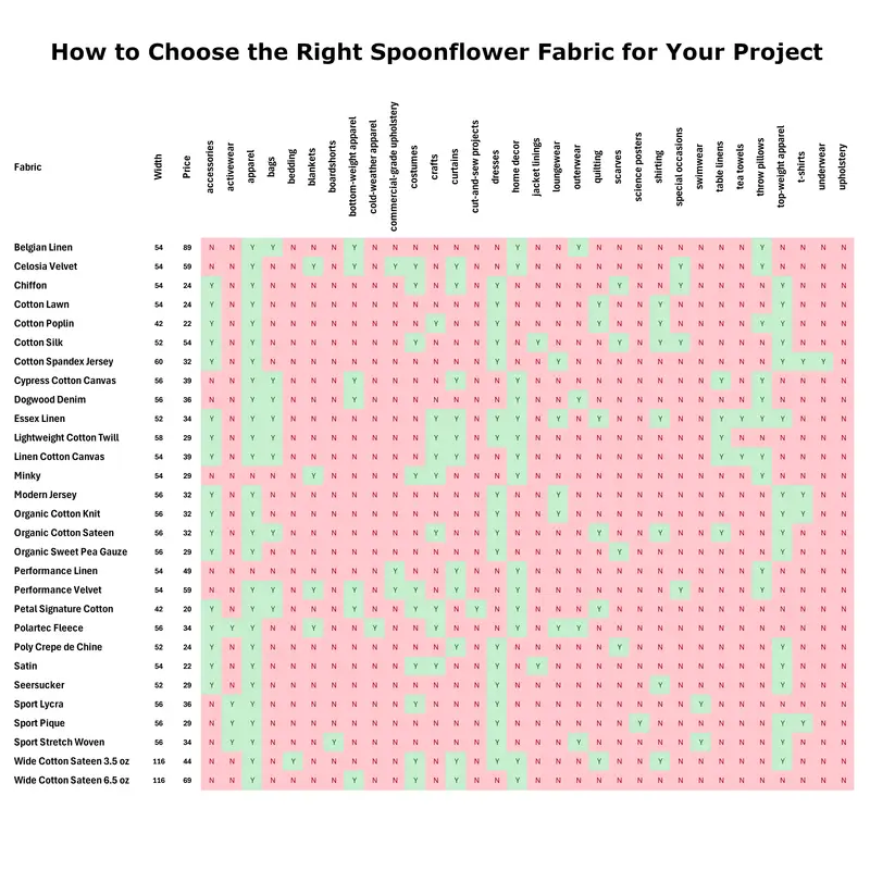
Spoonflower Fabric Usage Matrix — Green = Suitable | Red = Not Recommended
Cloud Dancer represents calm, tonal layering, and adaptable minimalism for 2026. As a solid off-white fabric, it provides a timeless base that works across sewing, upholstery, and interior design projects.
Browse the full Cloud Dancer fabric collection here:
View All Cloud Dancer Fabric Bases on Spoonflower →
Pin this guide, save it before ordering, and choose your base confidently.
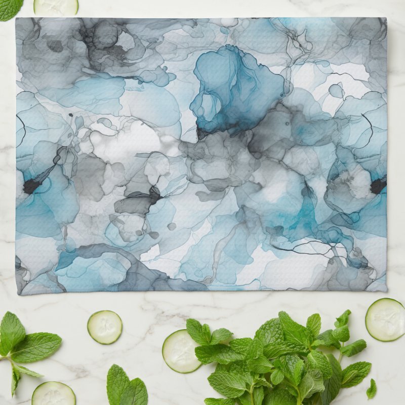
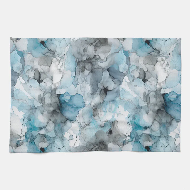
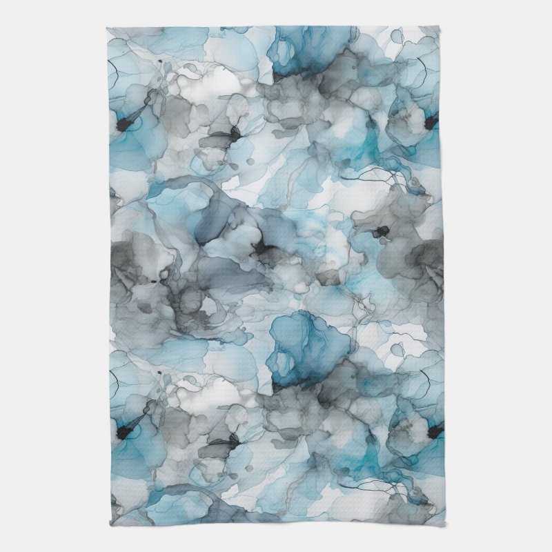
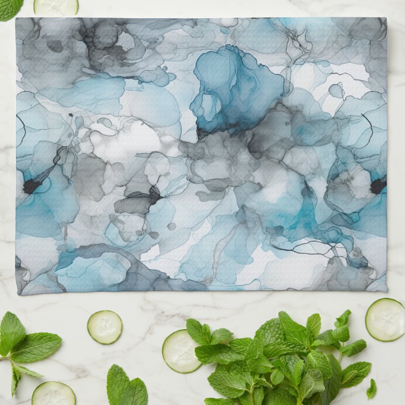
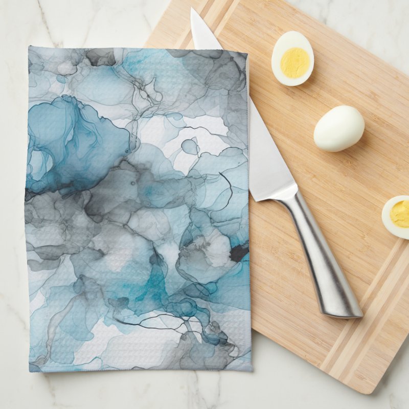
The artwork features swirling liquid ink forms layered in dusk blue and soft grey tones. The movement
feels natural and unforced, with gentle transitions between colors that create depth without sharp
contrast.
This restrained palette gives the design a contemporary feel, making it well suited to modern,
minimal, or neutral kitchen spaces where texture and tone matter more than bold pattern.
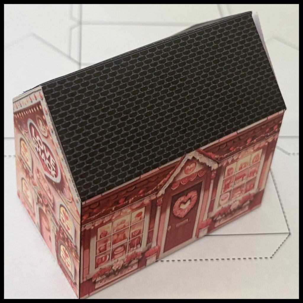
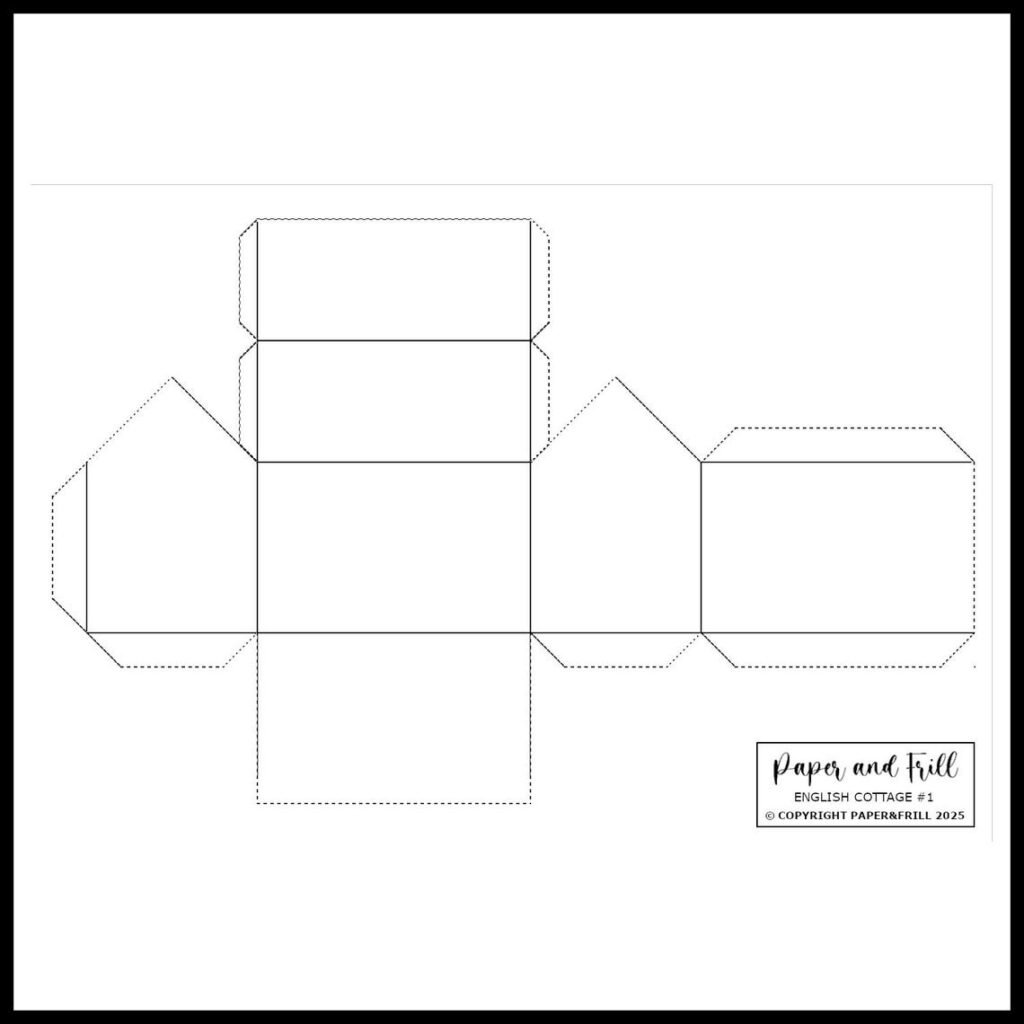
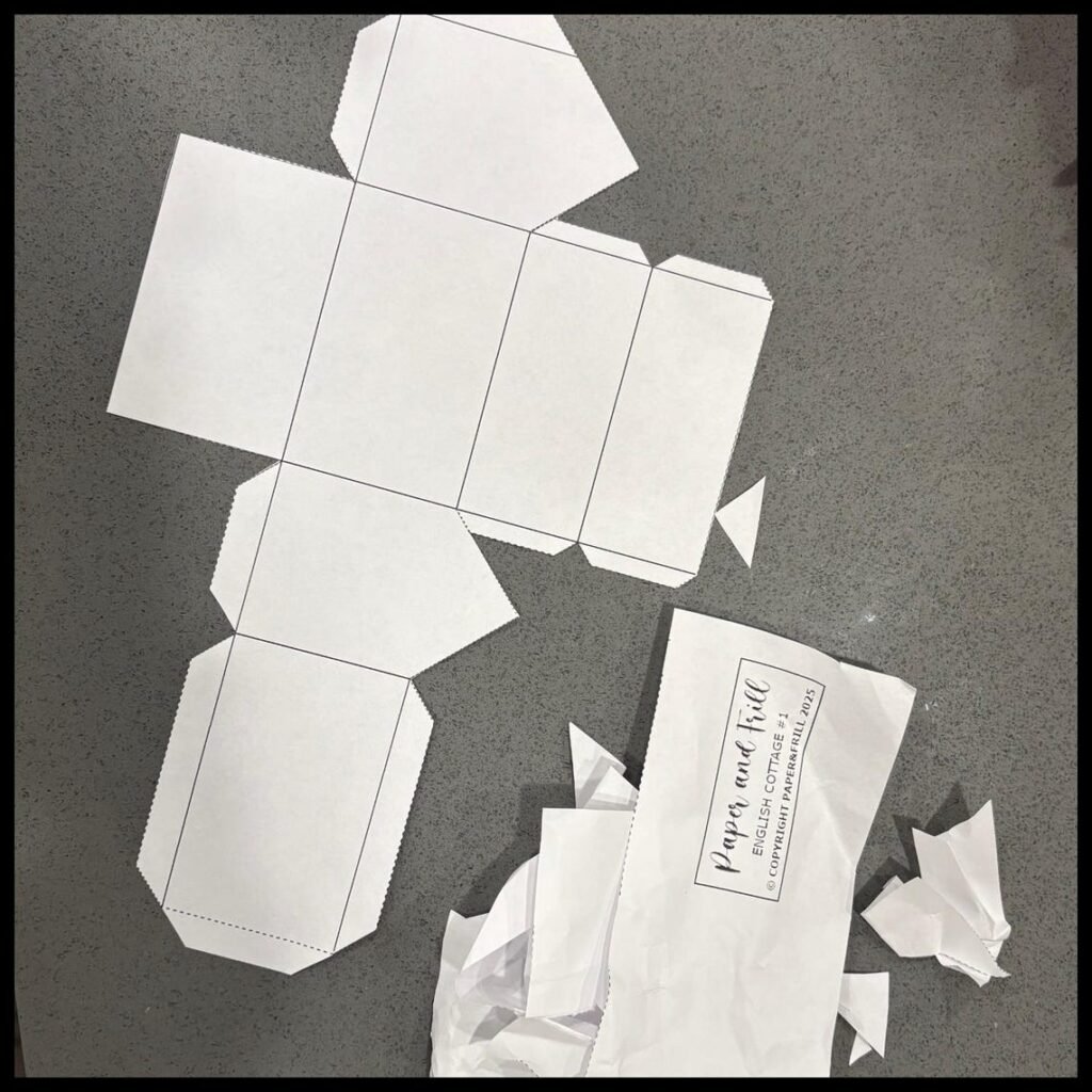
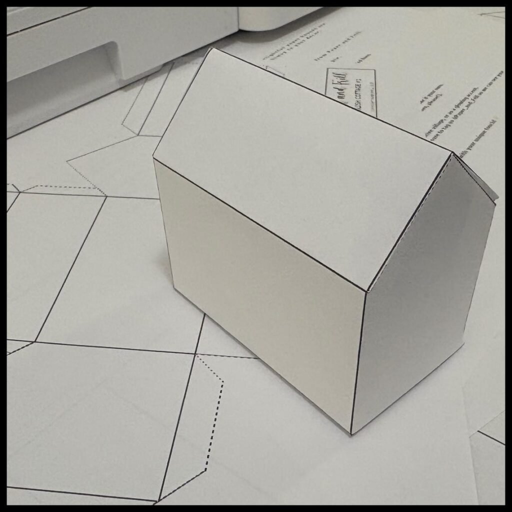
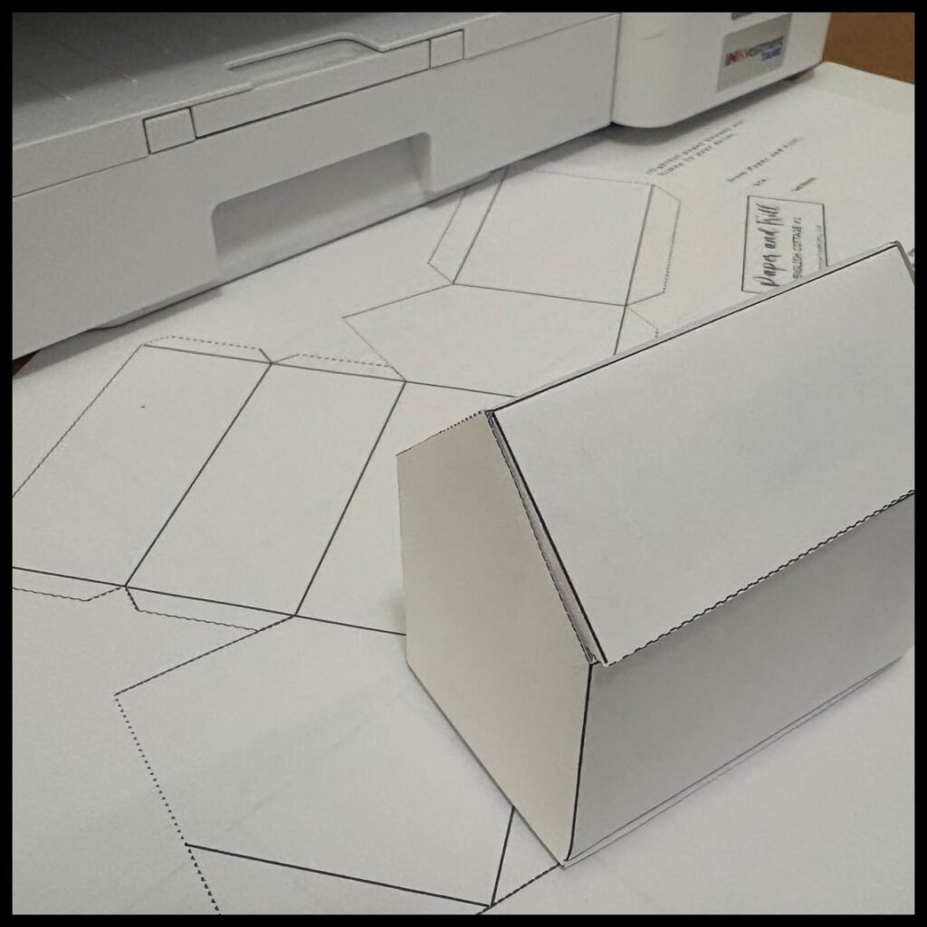
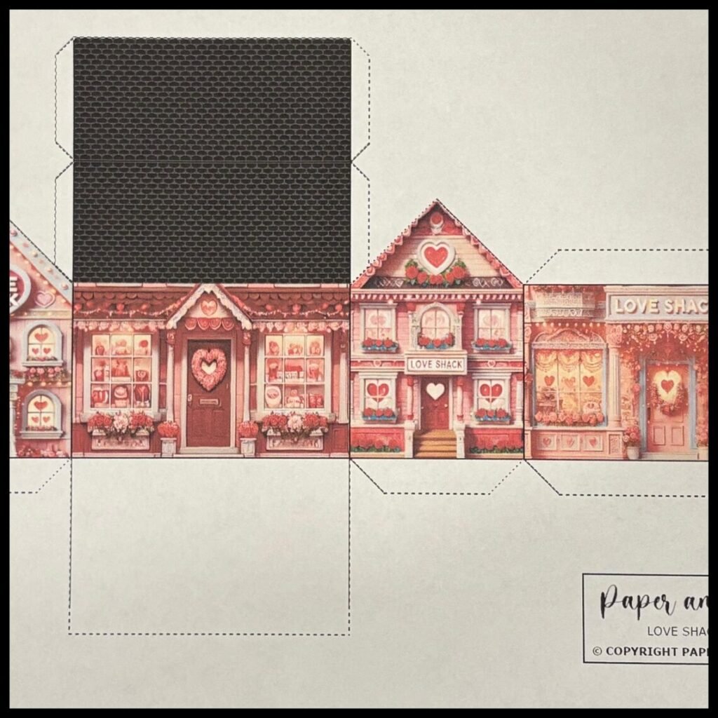
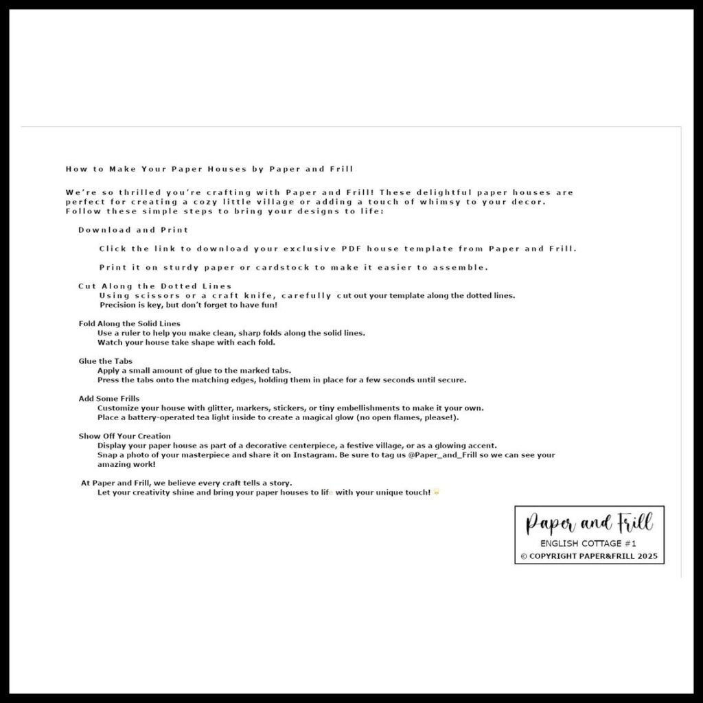
Create your own romantic little village with this printable Valentine paper house template. Designed in a charming English cottage style, this craft folds into a 3D decorative house perfect for Valentine décor, gifts, or table styling.
Print, cut, fold, and glue — no complicated tools required.
Ideal for:
• Valentine decorations
• Romantic table styling
• DIY paper crafts
• Classroom Valentine projects
• Cozy cottagecore décor
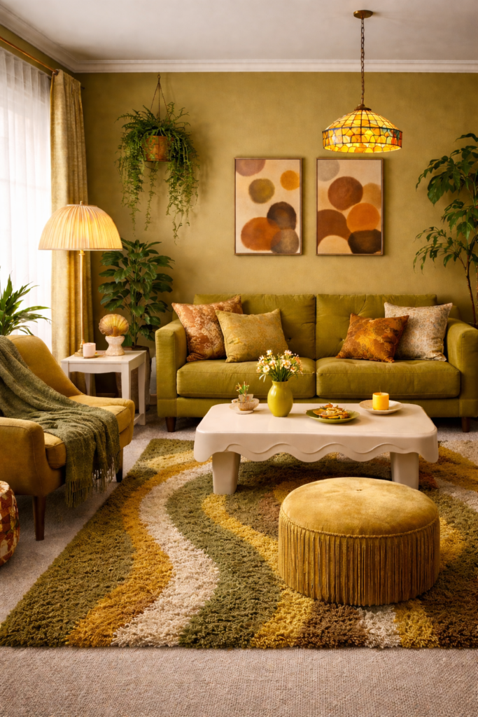
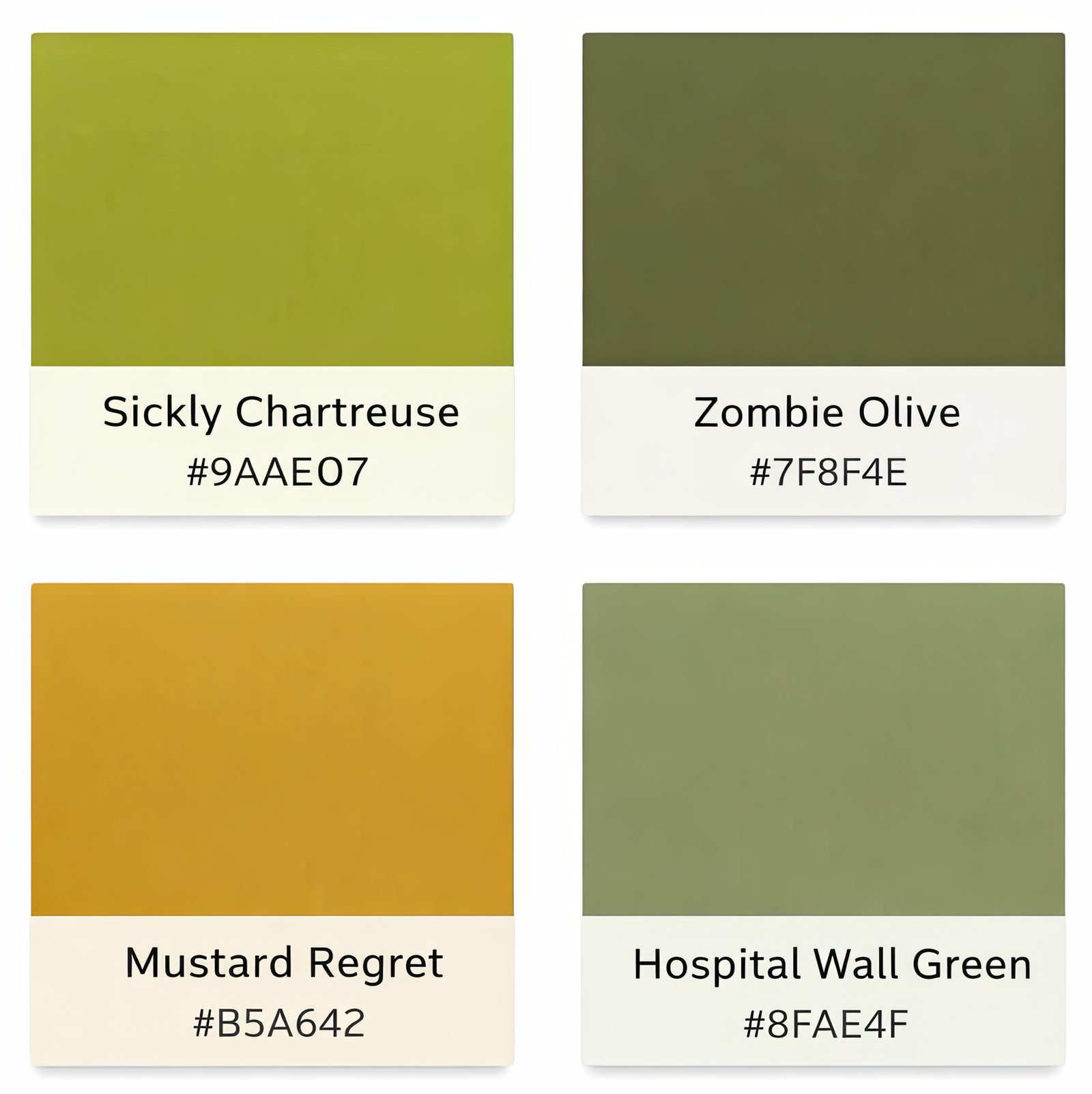
Viewed in isolation, these shades feel harsh and slightly wrong. But place them into a room, repeat them across textiles and surfaces, and something shifts. A single olive cushion feels accidental; an entire olive palette feels deliberate. One mustard accent may seem questionable, yet layered across art, upholstery, and flooring, it becomes cohesion.
👉 EXPLORE THE INTENTIONALLY UNLOVED COLLECTION 👈
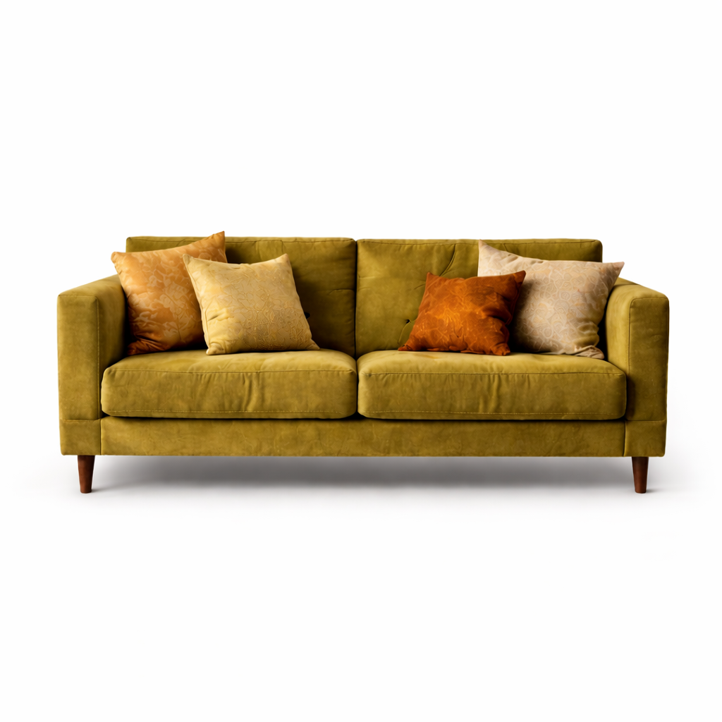
Isolation
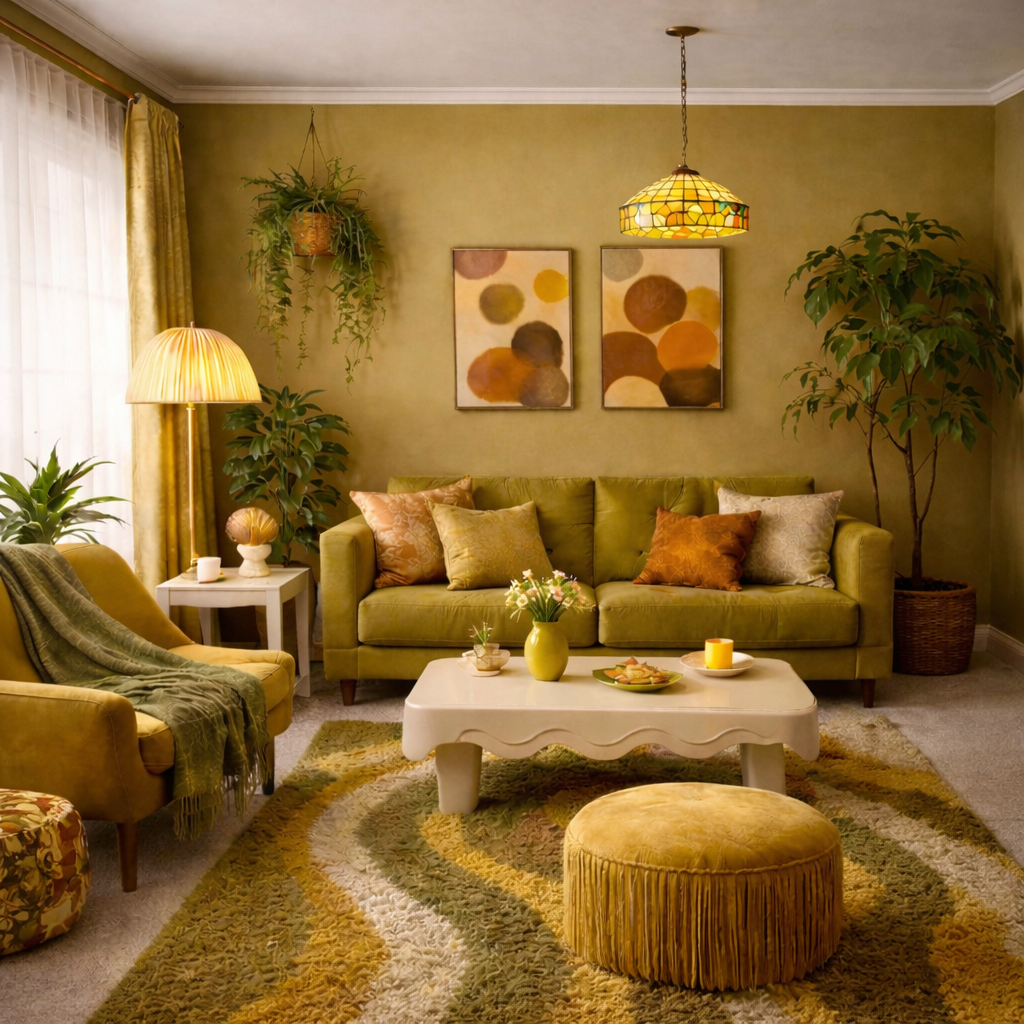
Integration
The real lesson is not about whether a color is attractive in theory. It is about commitment. Safe palettes aim for universal approval, but selective palettes create identity. The moment a room stops trying to please everyone, it begins to communicate something personal.
The difference is not the color itself. It is the context around it. When these tones are supported, repeated, and softened by texture, they become intentional rather than accidental.
So-called man-repellent colors are not inherently ugly. They are emotionally specific. Used timidly, they look wrong. Used boldly, they look designed. In a culture saturated with safe beige interiors, that boldness can feel unexpectedly refreshing.
Every bold palette needs a stabilizer. In this collection, that role is played by warm cream / soft linen —
a tone that softens chartreuse, warms mustard, and prevents olive from feeling heavy.
It doesn’t compete. It connects.
Warm Oat Cream
#F2E9DA
Soft Linen
#E8DCC6
These tones aren’t dramatic, and that’s the point. They allow the so-called “ugly” colors
to feel intentional rather than overwhelming. Without a binding neutral, bold palettes
feel chaotic. With one, they feel curated.

Recent Comments