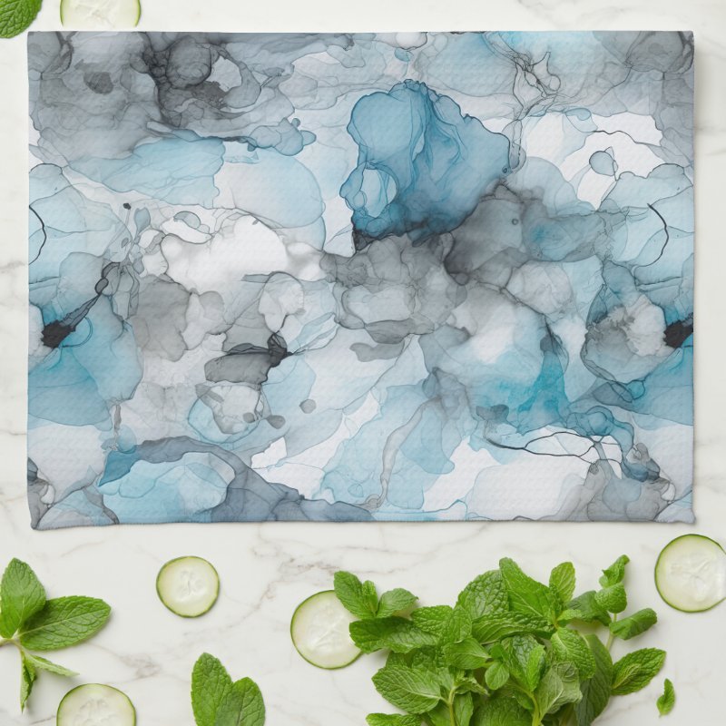
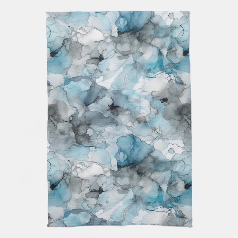
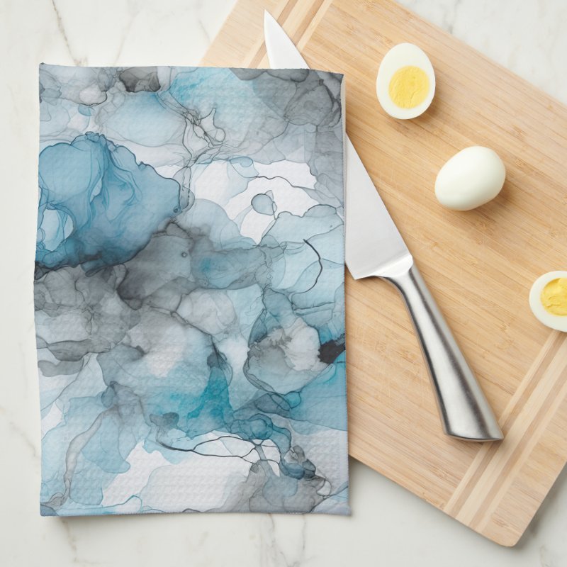
There’s something quietly atmospheric about alcohol ink artwork. Fluid, organic, and unpredictable,
it creates natural movement through color rather than line. This Dusk Blue Grey liquid ink design
captures that quality beautifully, with soft swirls that feel calm, modern, and expressive.
Fluid Motion in a Calm, Modern Palette
The artwork features swirling liquid ink forms layered in dusk blue and soft grey tones. The movement
feels natural and unforced, with gentle transitions between colors that create depth without sharp
contrast.
This restrained palette gives the design a contemporary feel, making it well suited to modern,
minimal, or neutral kitchen spaces where texture and tone matter more than bold pattern.
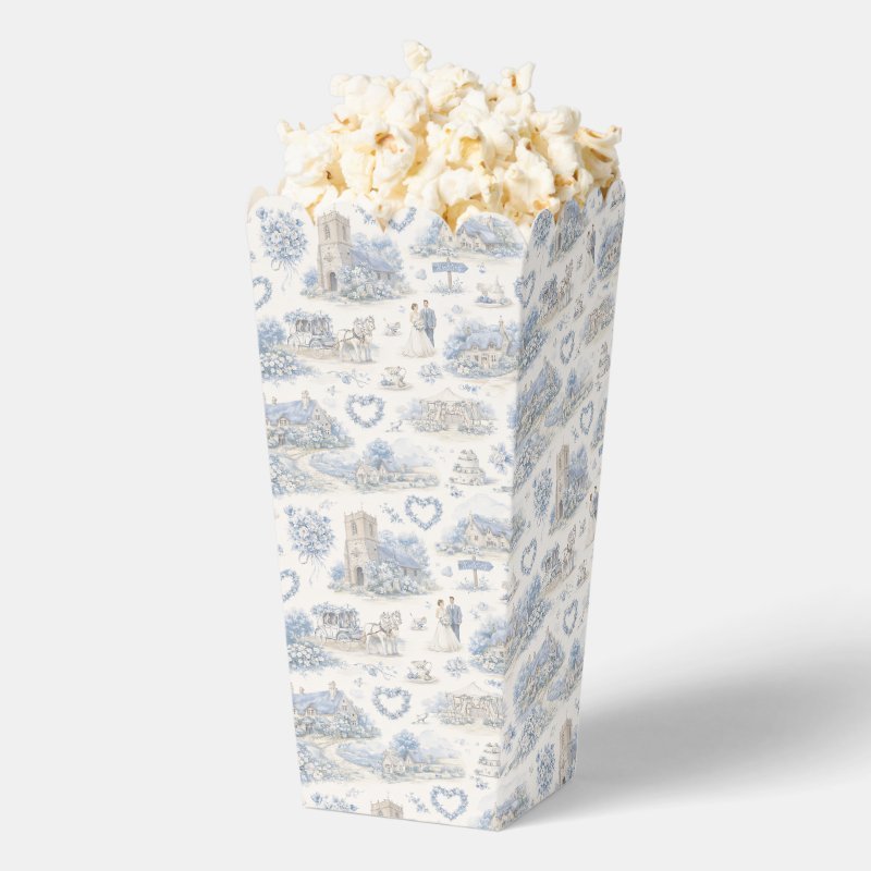
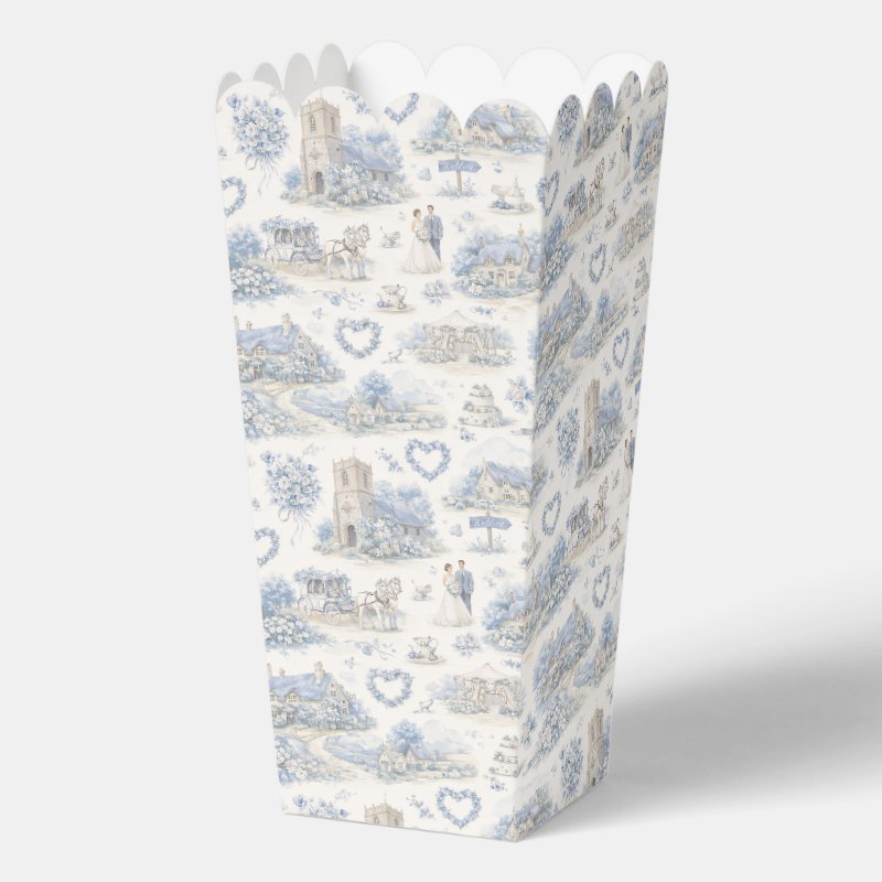
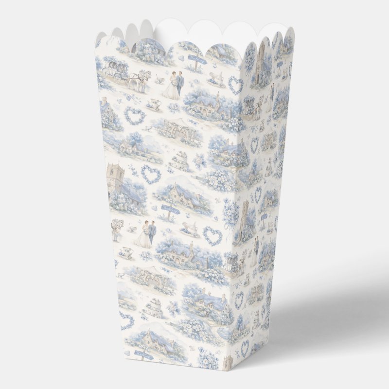
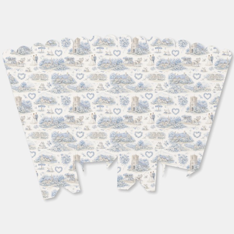
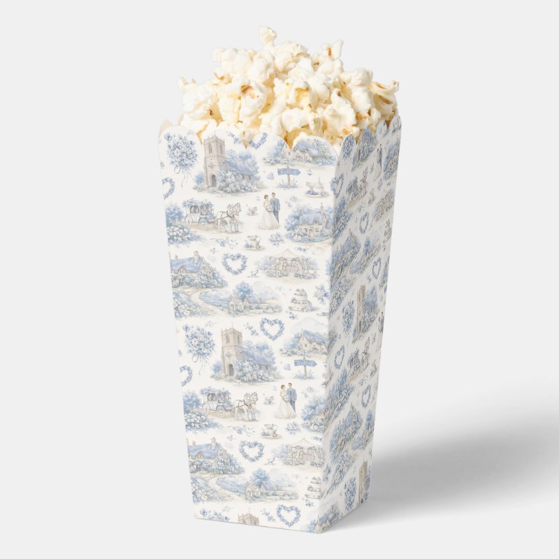
This romantic English village wedding design is painted in soft dusty blue tones, inspired by
classic countryside celebrations and nostalgic storybook scenes.Hand-painted stone cottages, a traditional village church, floral garlands, teacups, wedding
cakes, and a horse-drawn carriage repeat across the artwork in a charming watercolor layout.
The scene evokes a calm, celebratory atmosphere rooted in village life and timeless wedding
traditions.
A Soft Countryside Wedding Palette
The calming dusty blue base is paired with cream, sage green, and warm neutral accents, creating
an elegant and cohesive palette. The watercolor textures soften the scene, giving it a gentle,
hand-painted feel that suits relaxed celebrations and intimate gatherings.
The repeating village elements bring narrative charm to the design, making it ideal for
coordinated wedding details that feel thoughtful and personal rather than overly formal.
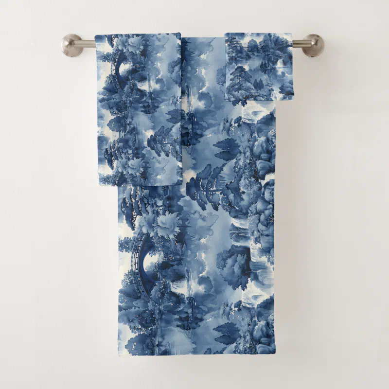
There’s something timeless about blue and white porcelain. Calm, balanced, and quietly detailed,
it carries centuries of decorative tradition while still feeling fresh in modern spaces.
This Japanese water garden artwork captures that feeling beautifully, translating a serene
landscape into a porcelain-inspired composition that feels both decorative and meditative.
A Tranquil Scene Inspired by Traditional Porcelain
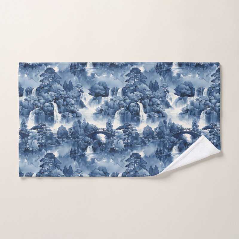
The artwork depicts a serene Japanese garden rendered in layered blue hues, echoing the look
of traditional porcelain ceramics. Cascading waterfalls flow gently over smooth stones,
surrounded by lush trees and soft vegetation.
A graceful arched bridge spans a calm pond at the center of the scene, reflecting the surrounding
landscape and anchoring the composition. The careful balance of water, rock, and foliage creates
a sense of depth and stillness.
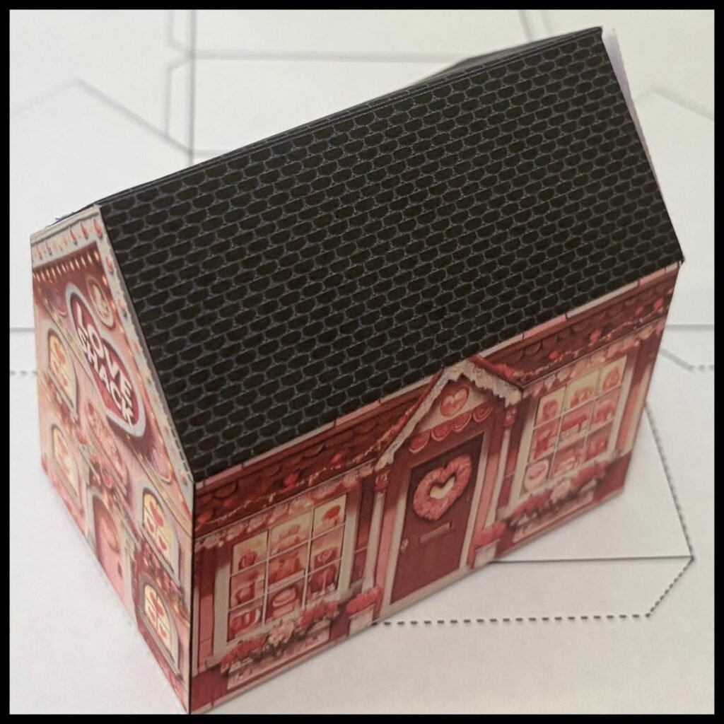
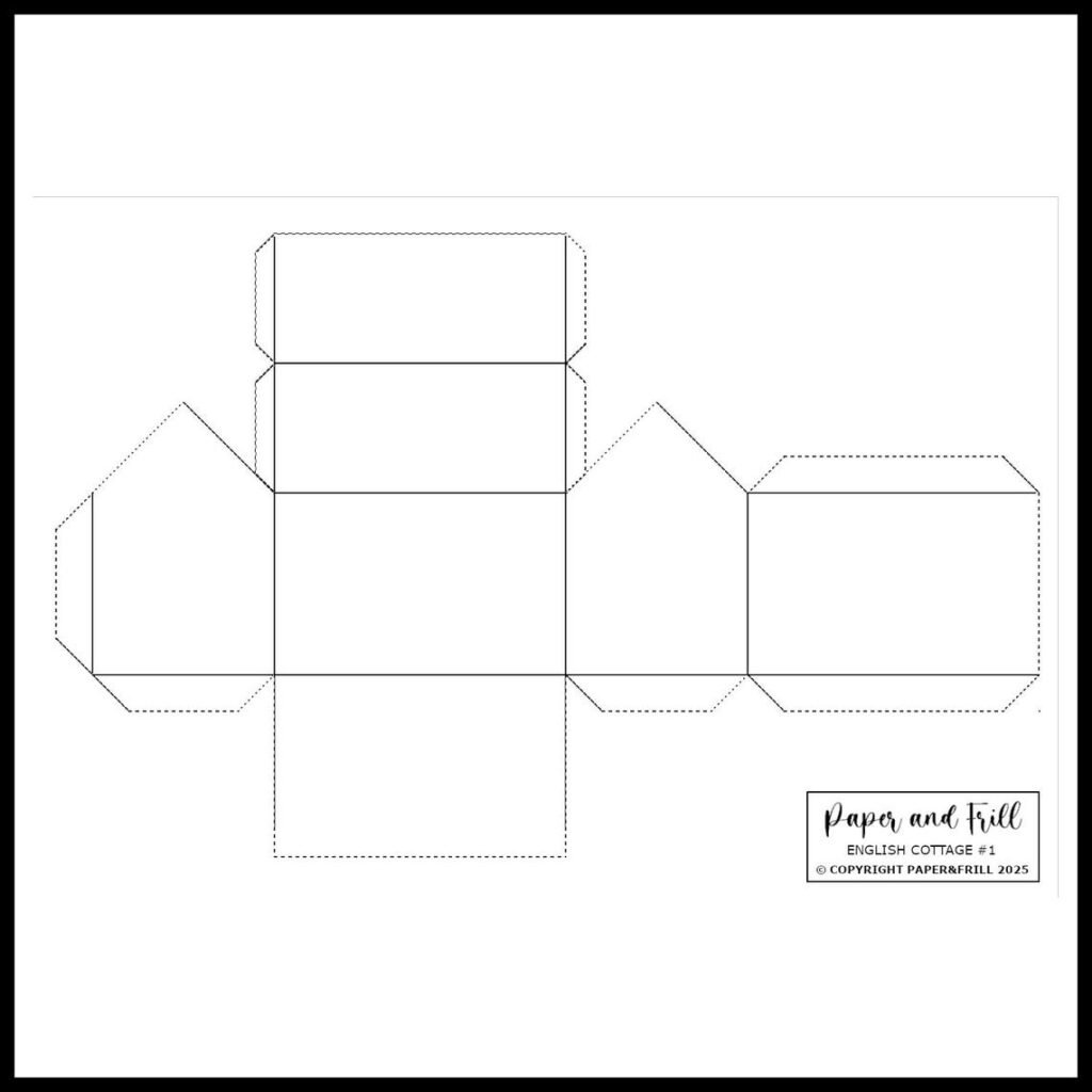
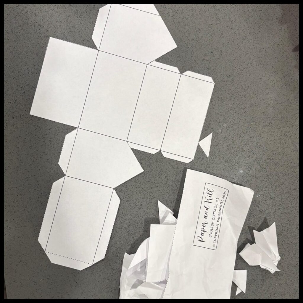
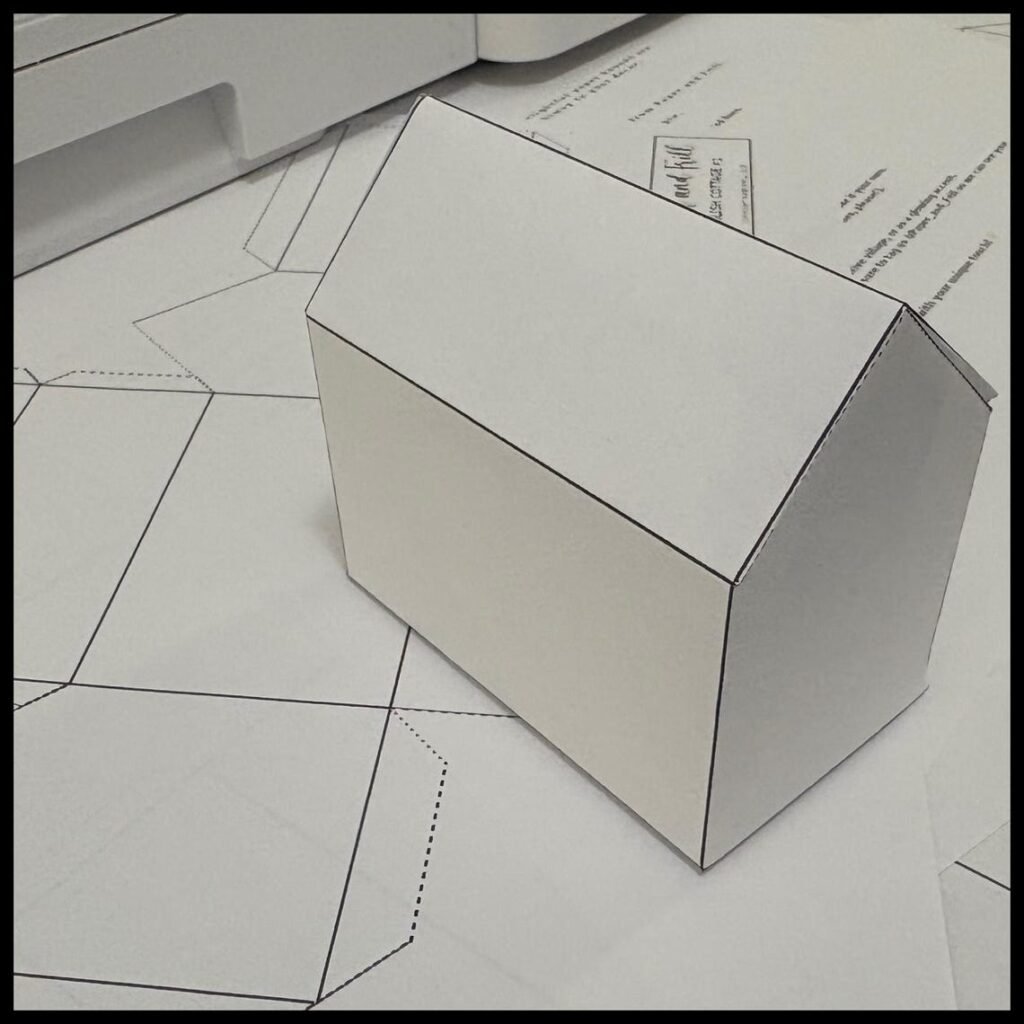
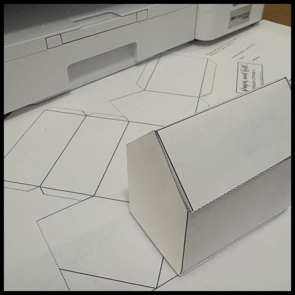
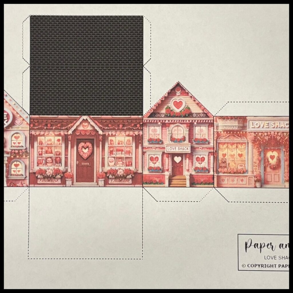
Create your own romantic little village with this printable Valentine paper house template. Designed in a charming English cottage style, this craft folds into a 3D decorative house perfect for Valentine décor, gifts, or table styling.
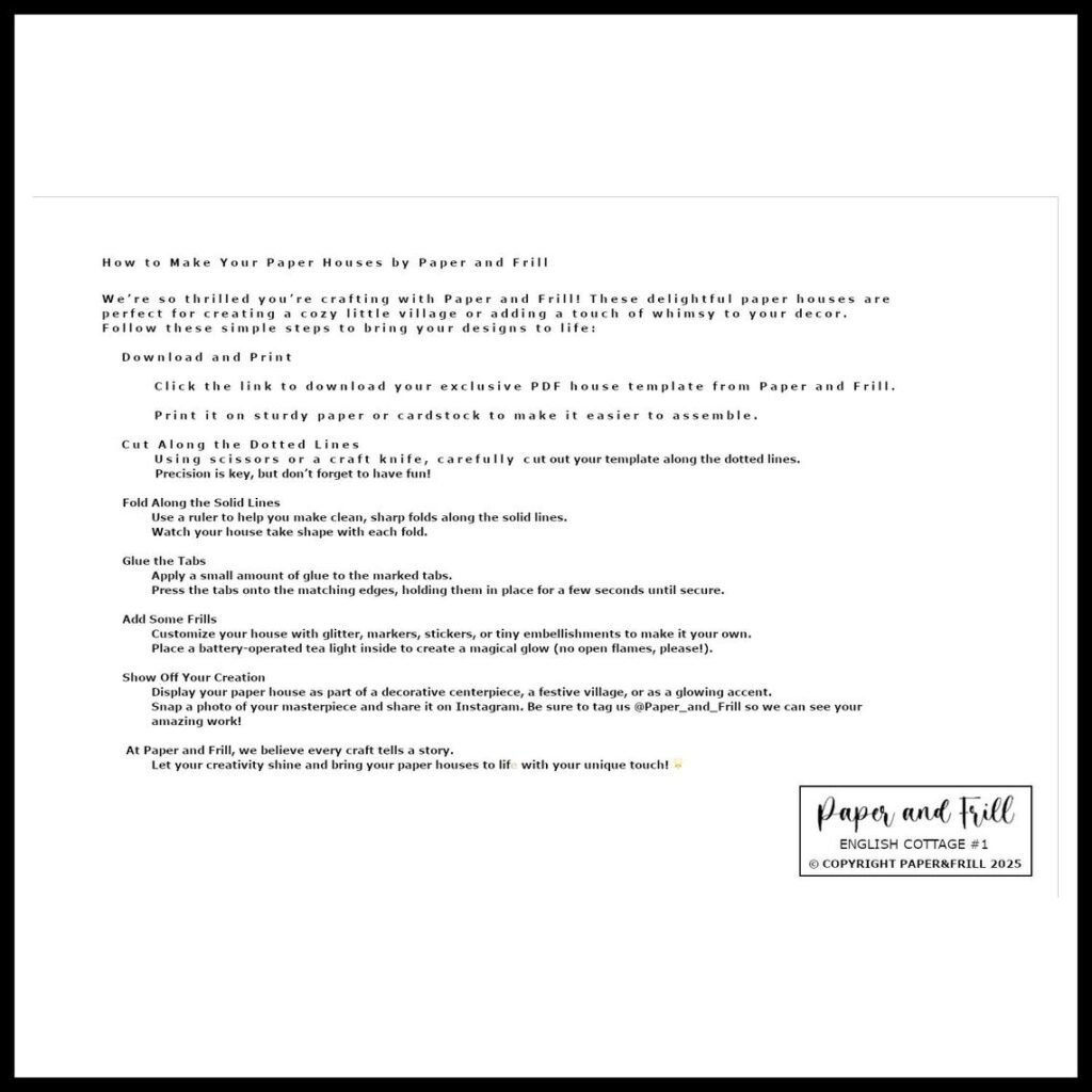
Print, cut, fold, and glue — no complicated tools required.
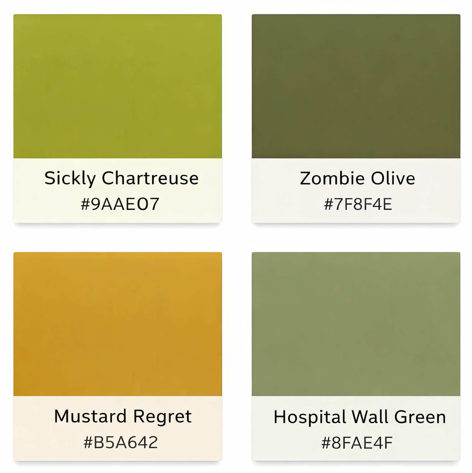
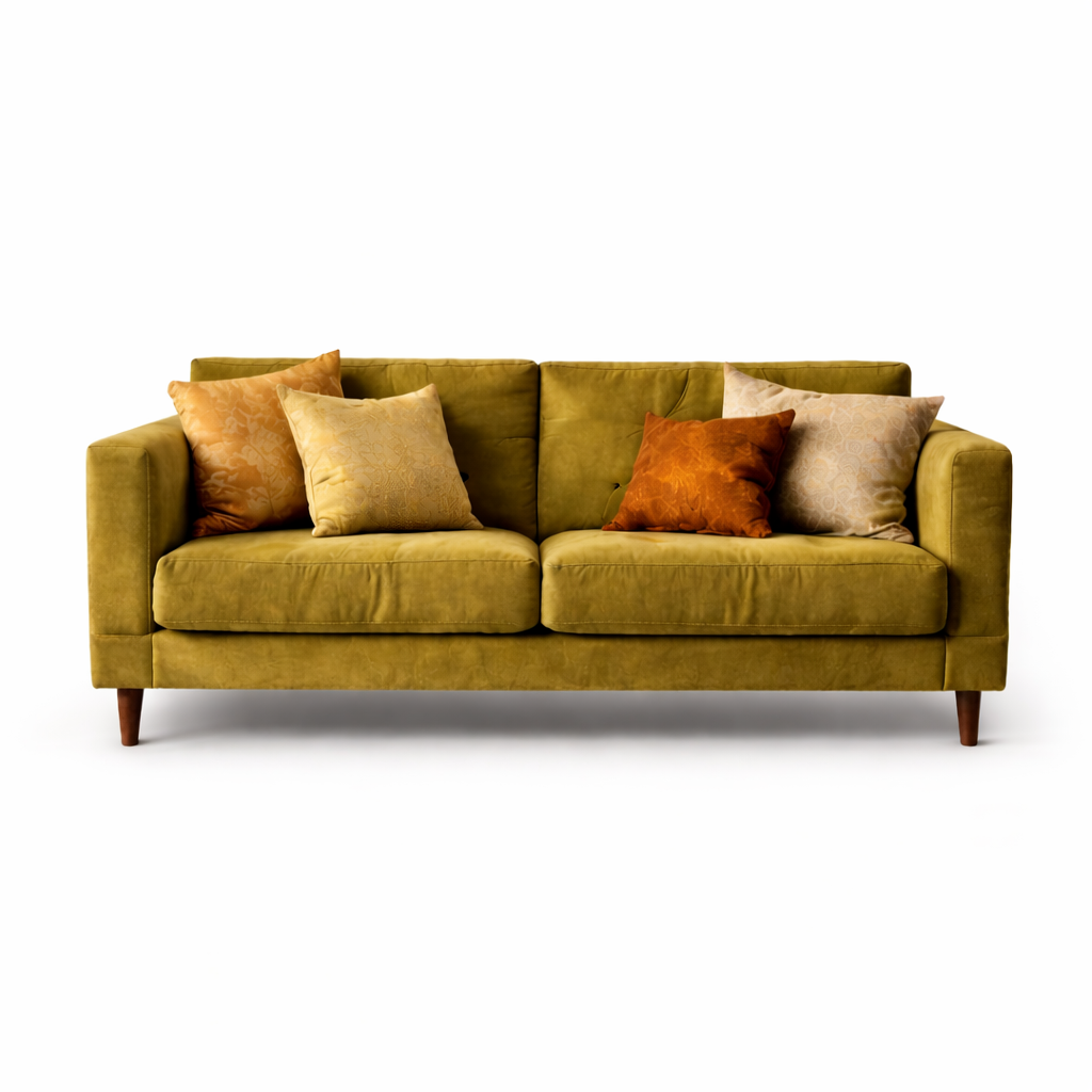
There are colors that feel universally safe—navy, crisp white, charcoal, beige. They communicate control, clarity, and neutrality. And then there are the others: the yellow-greens, the muddy olives, the stale mustards. These are the colors people instinctively reject. They’re described as “puke green,” “hospital wall,” or “1970s regret.” On their own, they often look like mistakes.Yellow-green tones in particular trigger strong reactions because they sit uncomfortably between freshness and decay. Too much yellow and they feel sickly; too much green and they feel institutional. Mustard shades can lean warm and nostalgic, but when slightly muted they take on a stale quality. Olive tones hover between earthy and fatigued. None of these colors signal sleek performance or minimalist polish. They resist the language of safe design.
The Usual Suspects
Colors frequently labeled “unattractive” — until used with intention.
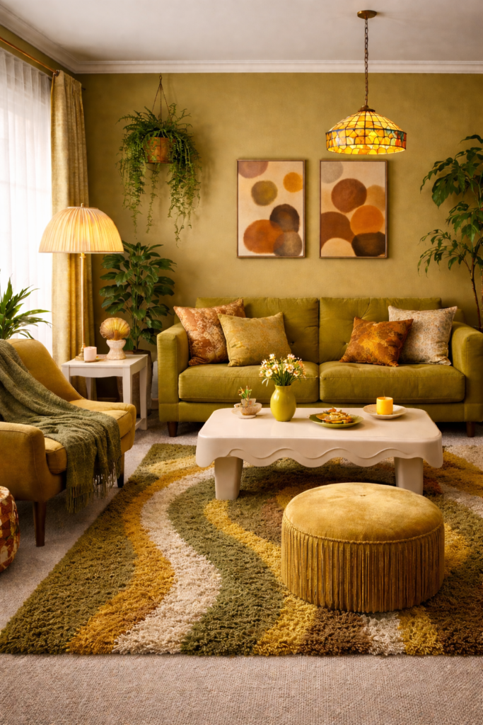
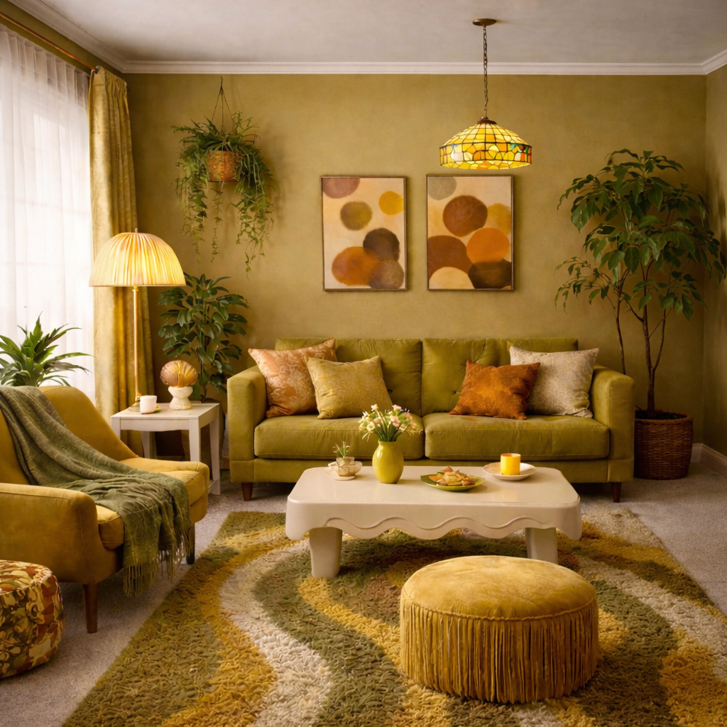
Viewed in isolation, these shades feel harsh and slightly wrong. But place them into a room, repeat them across textiles and surfaces, and something shifts. A single olive cushion feels accidental; an entire olive palette feels deliberate. One mustard accent may seem questionable, yet layered across art, upholstery, and flooring, it becomes cohesion.
The real lesson is not about whether a color is attractive in theory. It is about commitment. Safe palettes aim for universal approval, but selective palettes create identity. The moment a room stops trying to please everyone, it begins to communicate something personal.
The Cohesive Palette
The difference is not the color itself. It is the context around it. When these tones are supported, repeated, and softened by texture, they become intentional rather than accidental.
So-called man-repellent colors are not inherently ugly. They are emotionally specific. Used timidly, they look wrong. Used boldly, they look designed. In a culture saturated with safe beige interiors, that boldness can feel unexpectedly refreshing.
The Binding Neutrals
Every bold palette needs a stabilizer. In this collection, that role is played by warm cream / soft linen —
a tone that softens chartreuse, warms mustard, and prevents olive from feeling heavy.
It doesn’t compete. It connects.
Warm Oat Cream
#F2E9DA
Soft Linen
#E8DCC6
These tones aren’t dramatic, and that’s the point. They allow the so-called “ugly” colors
to feel intentional rather than overwhelming. Without a binding neutral, bold palettes
feel chaotic. With one, they feel curated.
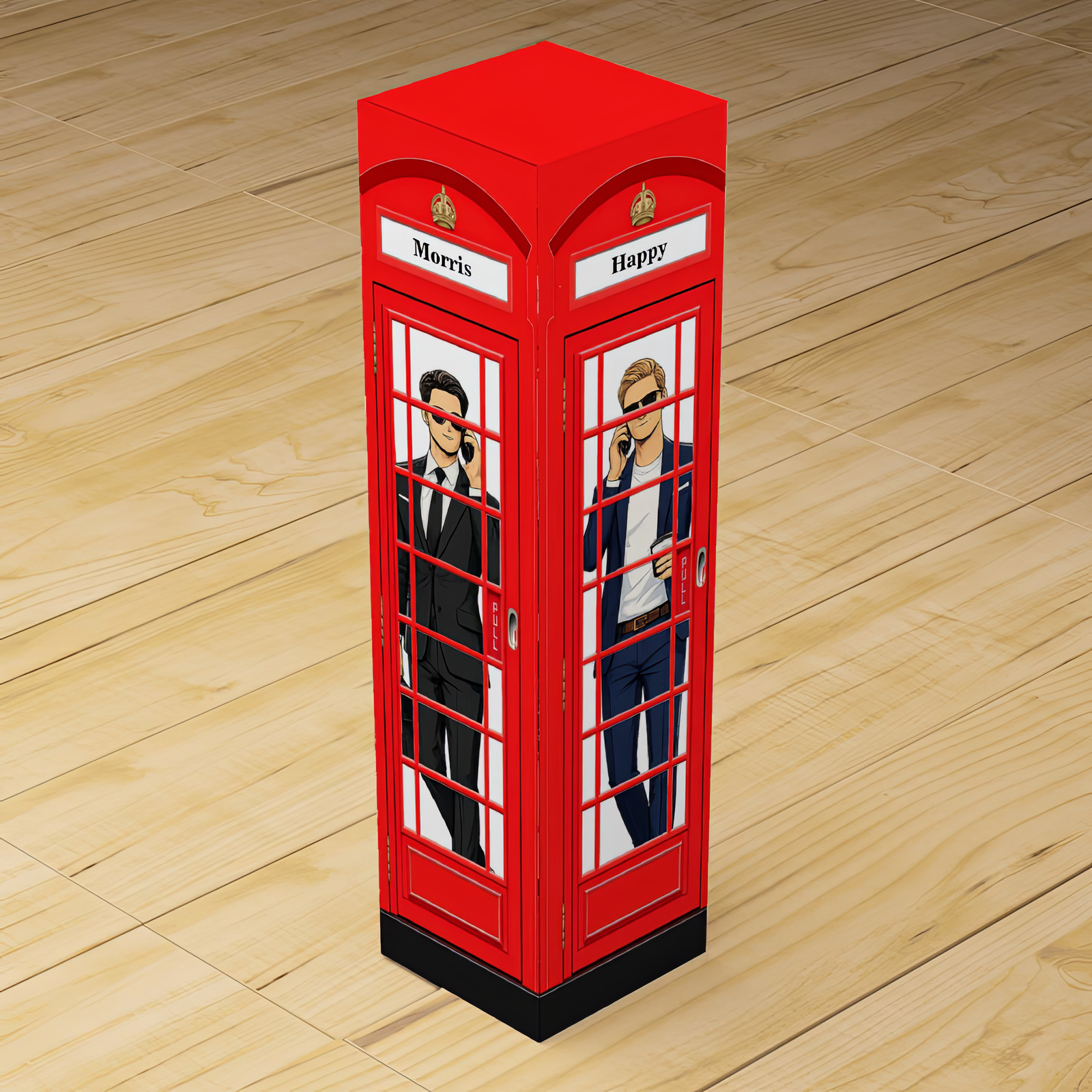
There’s something instantly iconic about a classic red London telephone box.
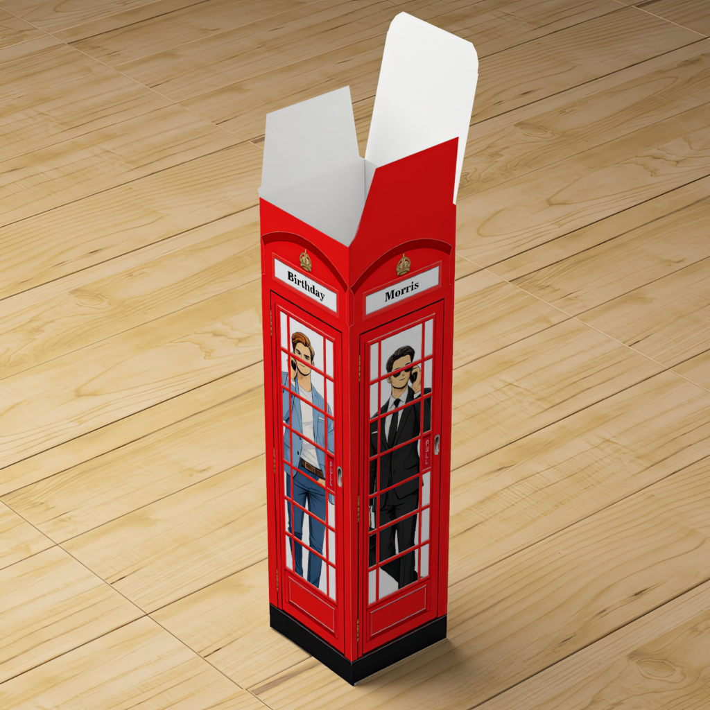
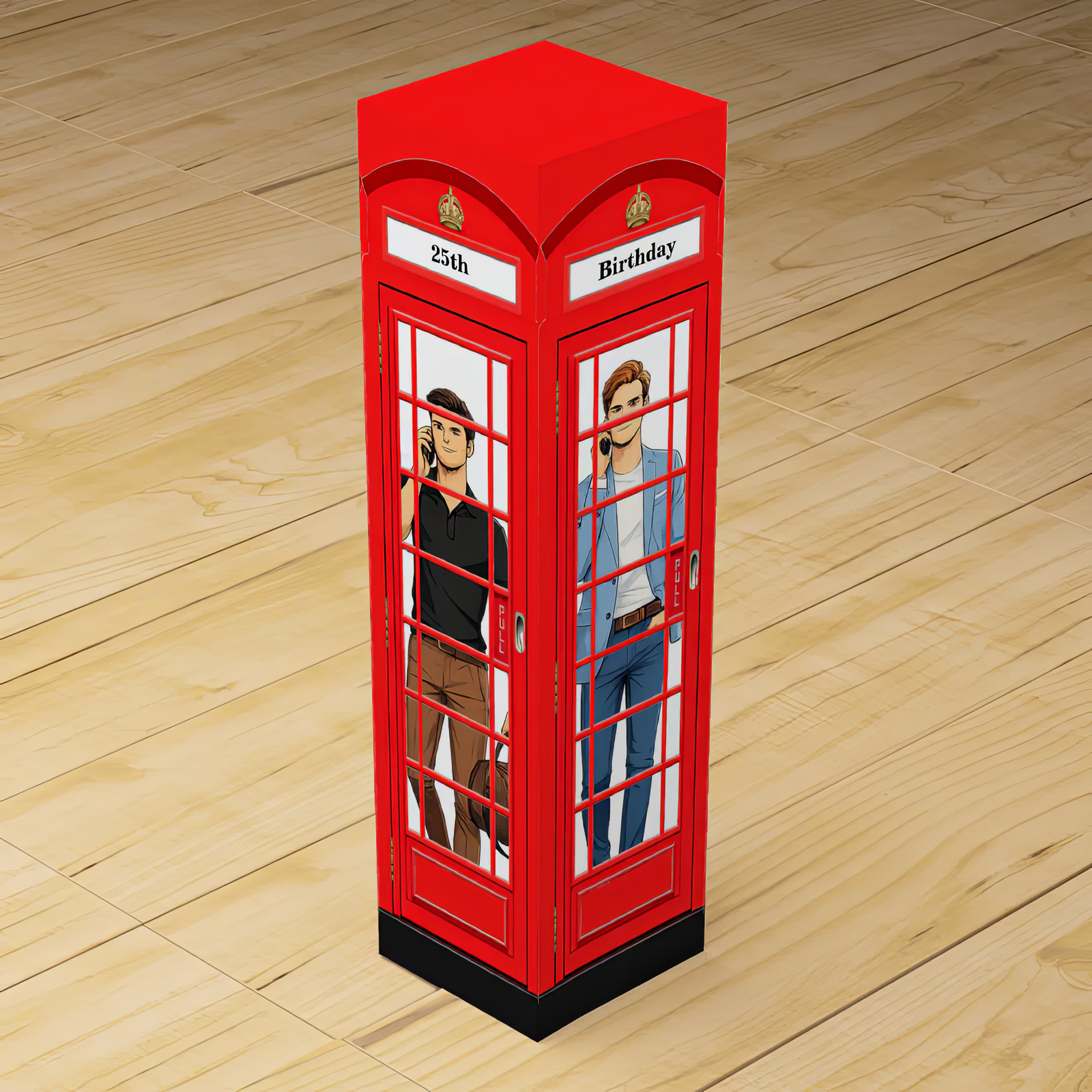
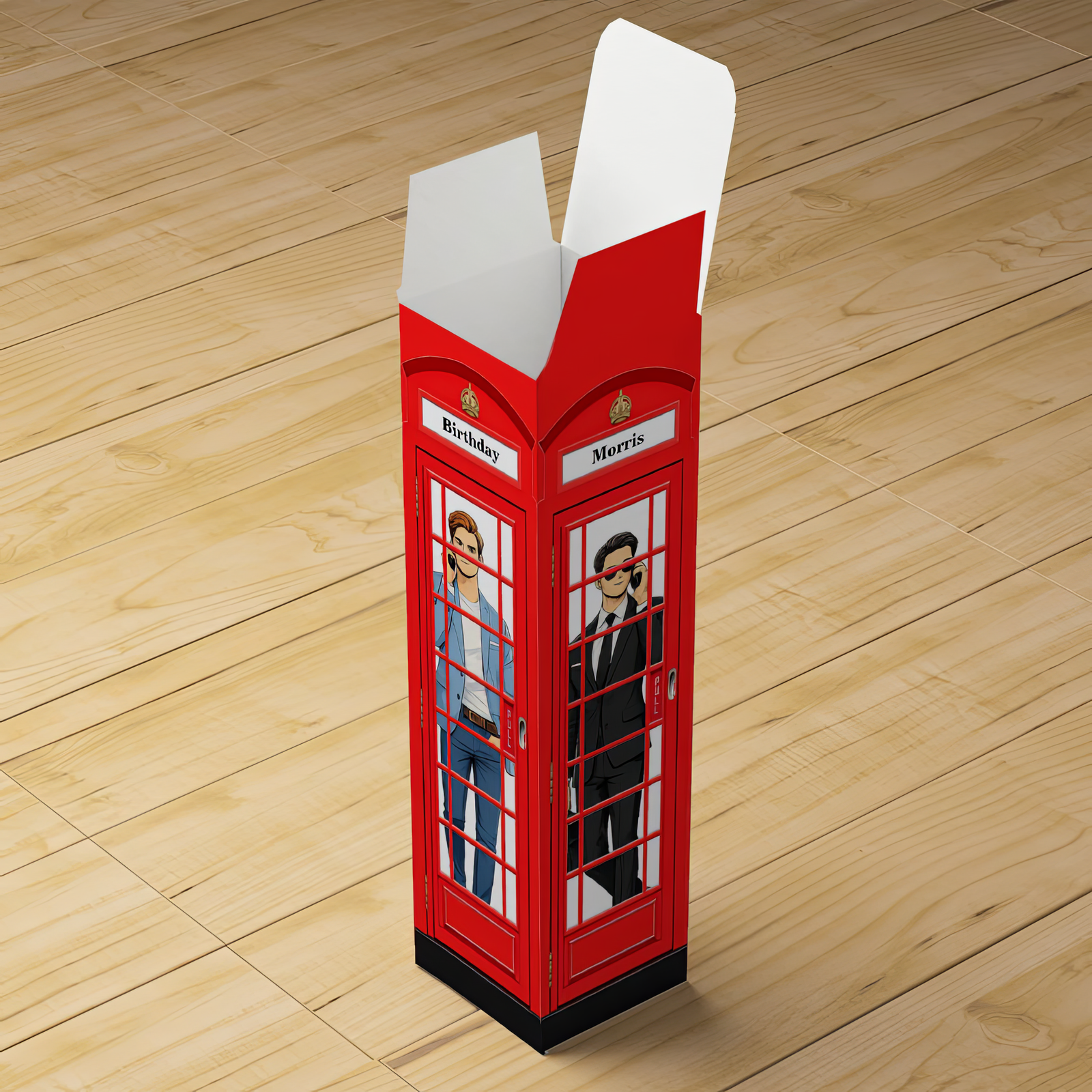
Bold. Recognizable. Timeless.Now imagine that icon wrapped around a wine box — turning a single bottle into a sharp, personalized statement designed for him.This design is created specifically for a four-sided wine box, with one editable word on each face. As the box is picked up and turned, the message reveals itself — side by side, word by word.Four sides. Four words. One unforgettable bottle.
Each panel of the box carries one word, creating a structured, intentional message that feels considered and premium — not decorative filler.
Example layouts include:
HAPPY
40TH
BIRTHDAY
MARK
Or:
CHEERS
TO
50
YEARS
Or:
LONDON
WEEKEND
EST
2026
Because each side is edited independently, the design works across ages and milestones — from birthdays to celebrations that deserve more than a generic presentation.
Why the Four-Side Layout Works So Well
A wine box is handled, turned, and explored. This design is built around that experience.
Each face delivers a single word, building anticipation as the box rotates. The message unfolds naturally, making the presentation feel deliberate, confident, and well thought through.
It feels designed.
It feels premium.
It feels like more than packaging.
The bold London red keeps it unmistakably British, while the modern illustration style gives it a clean, contemporary edge suited to men’s celebrations.
Perfect For Men’s Birthday Wine Boxes
Milestone birthdays
18th, 21st, 30th, 40th, 50th celebrations
Brothers, friends, partners, and colleagues
London-themed or British-inspired events
Statement wine bottles that stand out
Because the wording is fully customizable, the box adapts to the person — not the age.
Personalized London Telephone Box Wine Box for Men
Personalized London Telephone Box Wine Box for Men
Personalized London Telephone Box Wine Box for Men
Group of Four Men Standing Side by Side
Wine Box Design Details
Designed specifically for a four-sided wine box
One editable word per panel
Bold, clean typography for strong impact
Iconic London red color palette
Modern illustrated style
Works across ages and occasions
This isn’t just a label — it’s part of the gift.
How To Personalize Your Wine Box
Choose one word for each side of the box.
Keep wording short and bold for clarity.
Consider how the words flow as the box turns.
Preview all four sides together before finalizing.
Simple. Intentional. Designed to be remembered.
A British Icon Reimagined for Men’s Gifting
The London telephone box is one of the most recognizable structures in the world. Wrapped around a wine box, it transforms a single bottle into a keepsake object — personal, confident, and visually striking.
This design is made for modern men’s gifting.
Bold without being loud.
Classic without feeling dated.
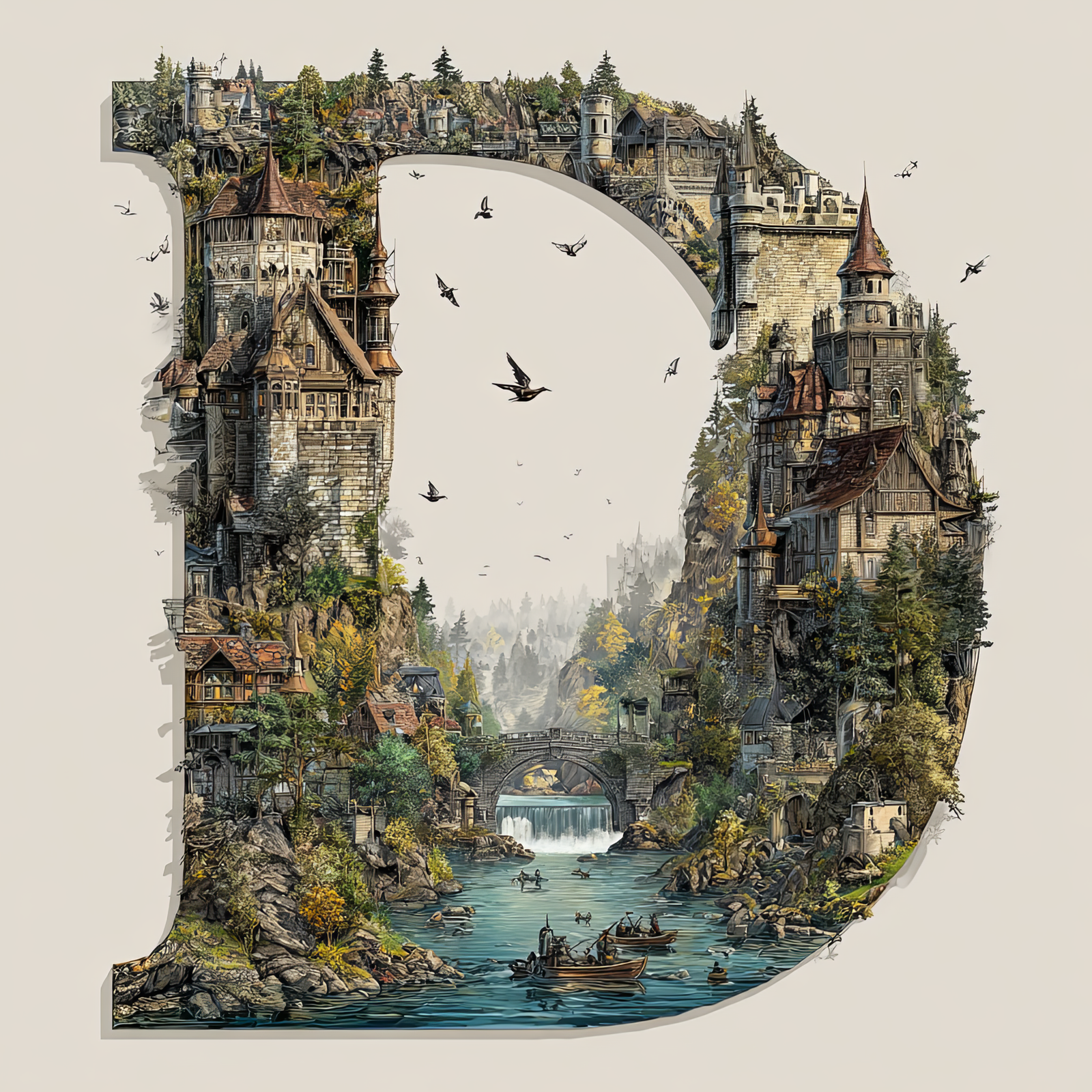
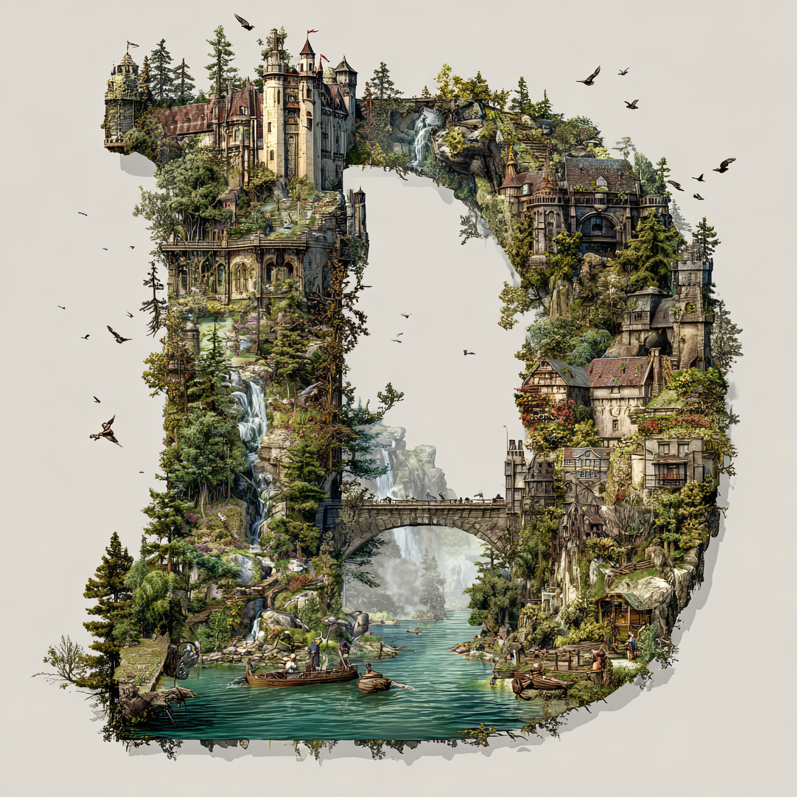
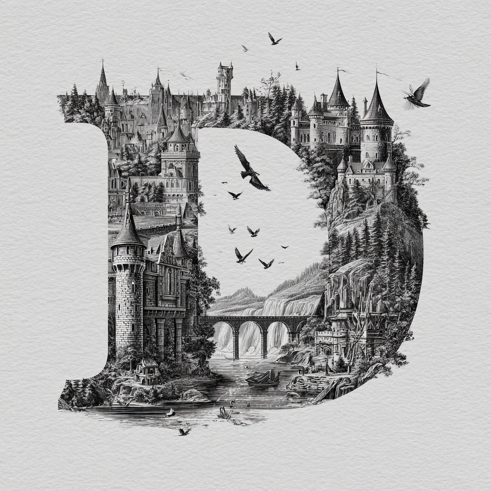
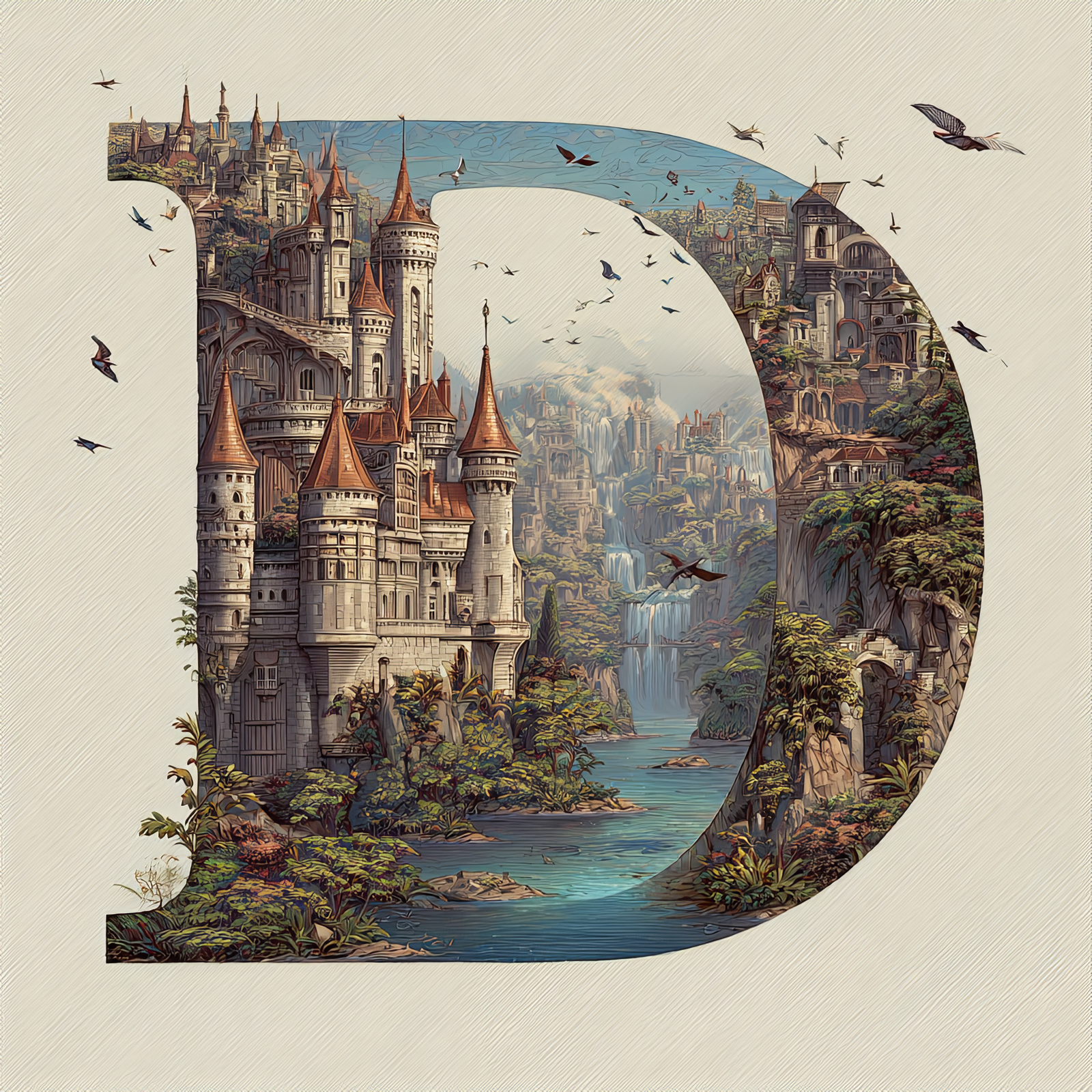
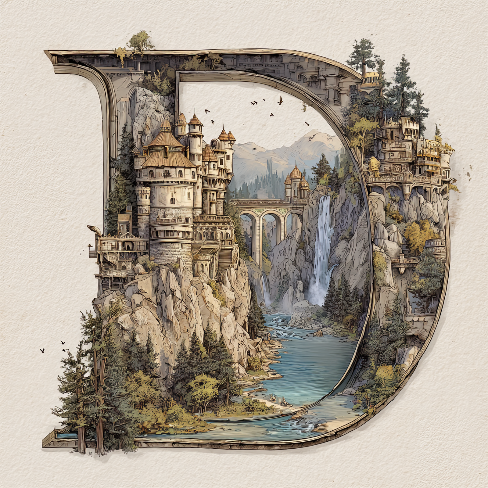
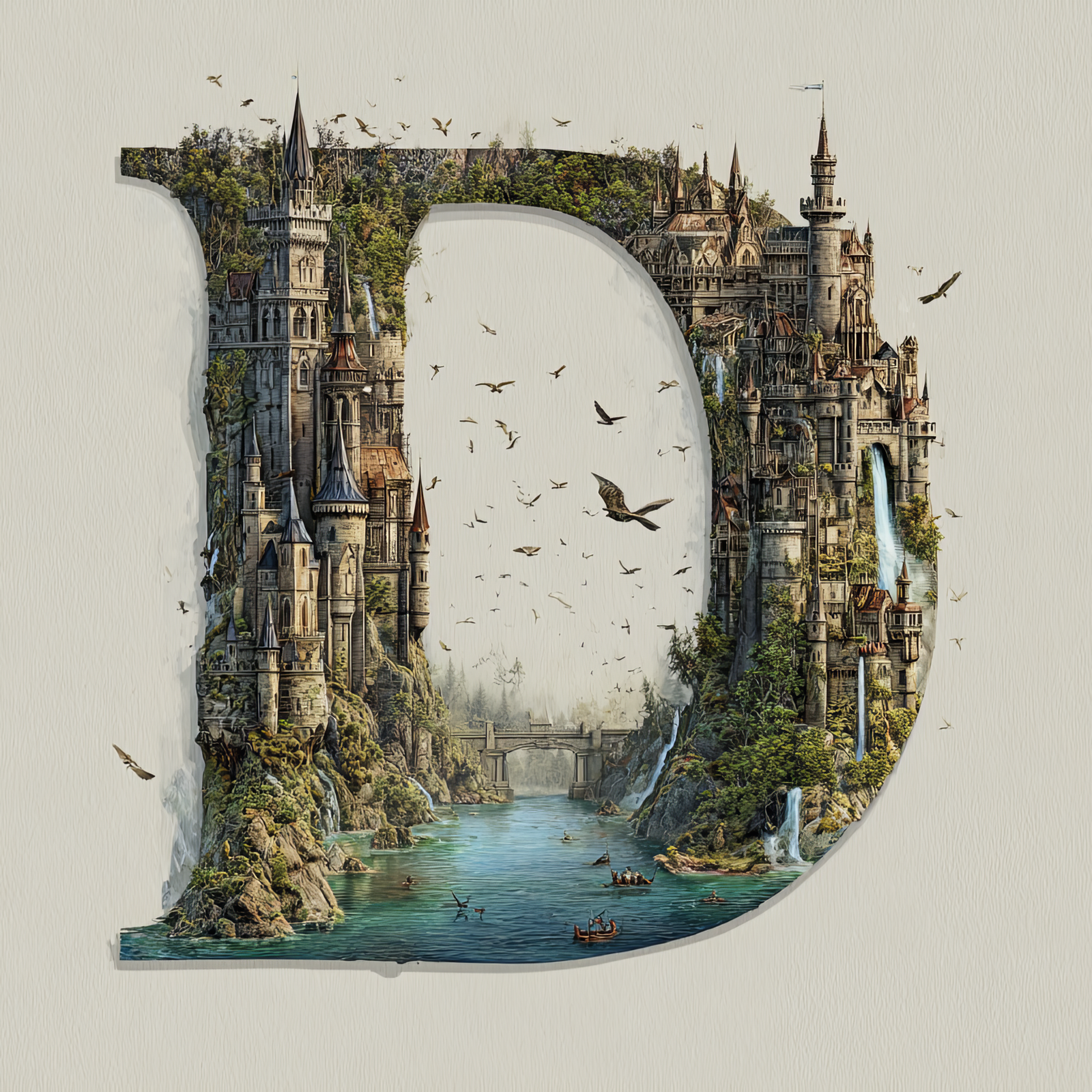
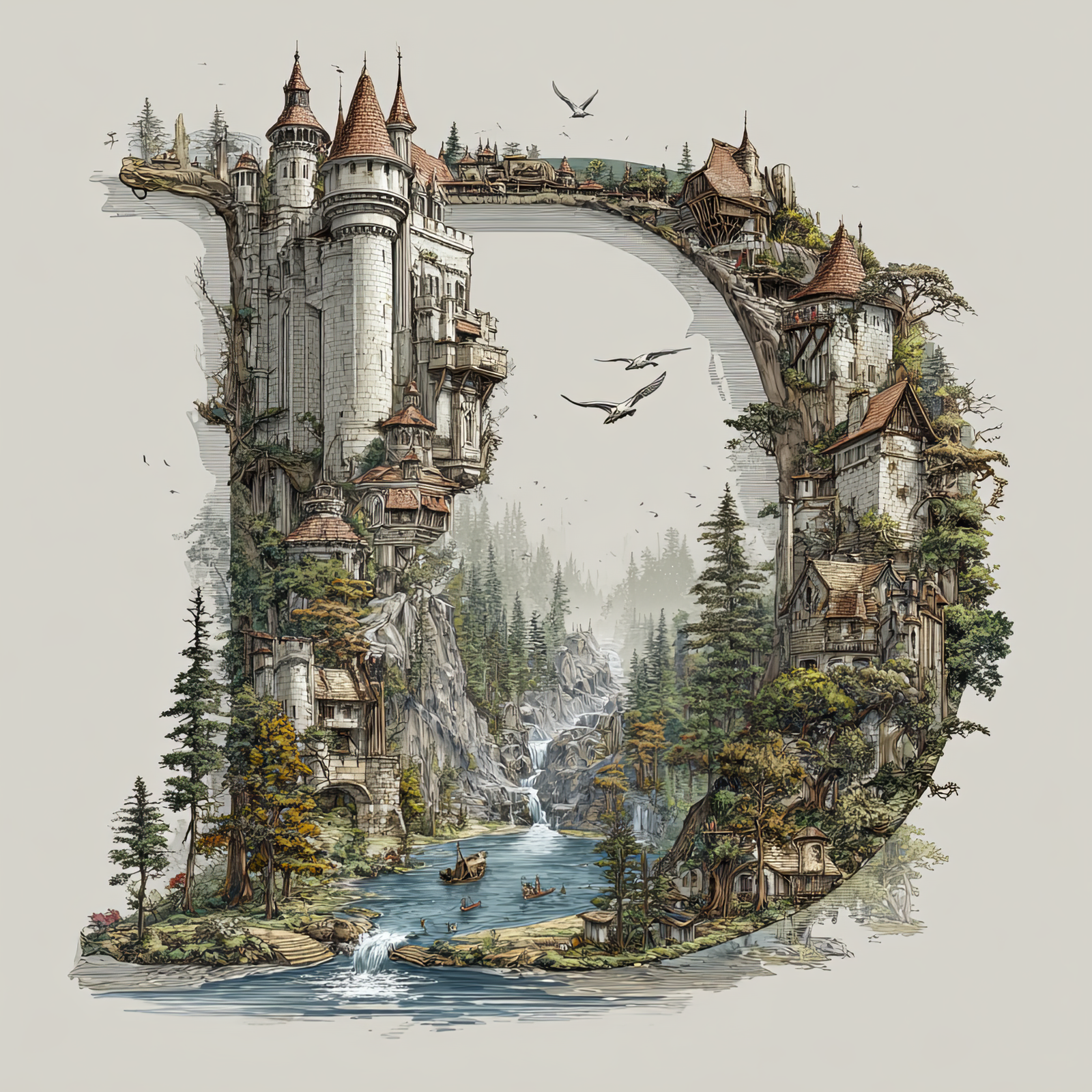
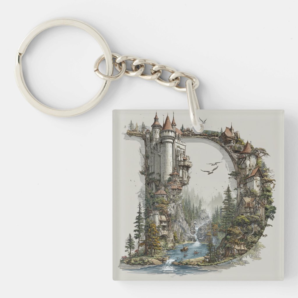
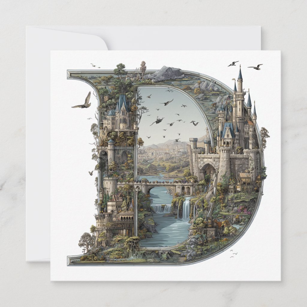
The Letter D: Castles in the Sky Fantasy Alphabet Art
The Letter D: Castles in the Sky Fantasy Alphabet Art
The Letter D: Castles in the Sky Fantasy Alphabet Art
The Letter D: Castles in the Sky Fantasy Alphabet Art
The Letter D: Castles in the Sky Fantasy Alphabet Art
The Letter D: Castles in the Sky Fantasy Alphabet Art
The Letter D: Castles in the Sky Fantasy Alphabet Art
The Letter D: Castles in the Sky Fantasy Alphabet Art
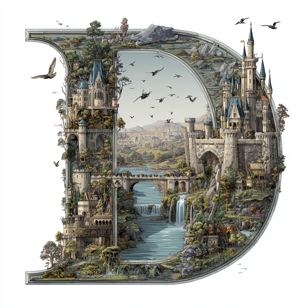
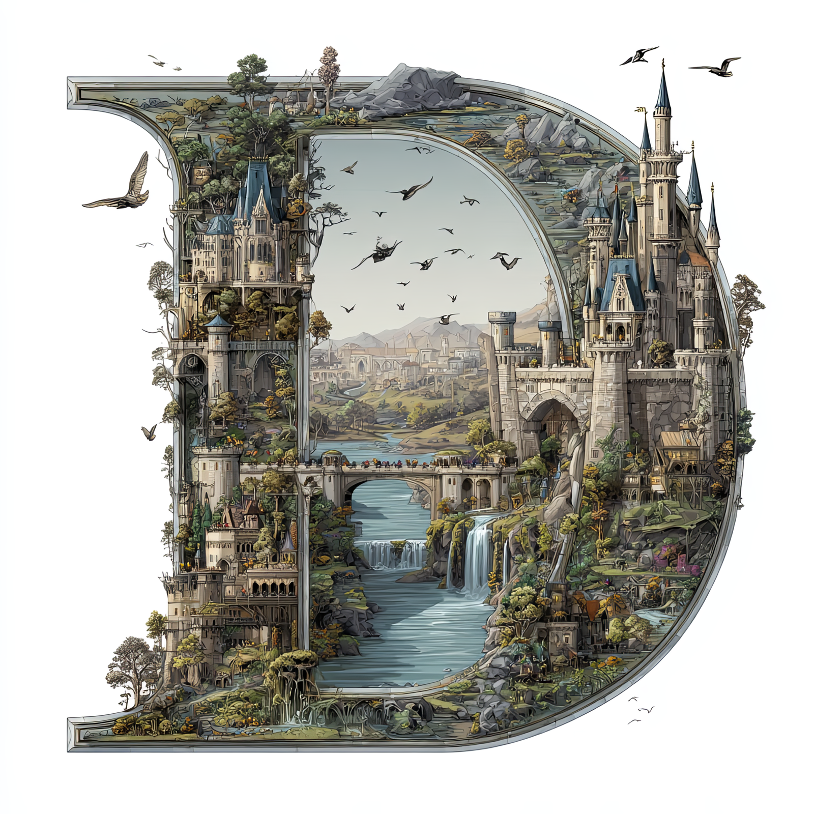
The letter D is transformed into a self-contained fantasy world, filled with towering castles,
winding rivers, stone bridges, waterfalls, and forested cliffs. Every architectural detail is shaped to follow
the rounded form of the letter, turning the initial into a storybook landscape suspended in the sky.
This illustration is part of the Castles in the Sky Fantasy Alphabet collection, where each letter
becomes its own immersive environment inspired by classic fairytales, illustrated novels, and architectural fantasy worlds.
The letter D adds a strong, curved silhouette to the series while maintaining intricate detail and a clear, readable letterform.
Free Download – Letter D Fantasy Art
You can download this Letter D – Castles in the Sky artwork completely free for personal use.
Scroll to the gallery below and click the Letter D image to open it full size.
Save the image: right-click (desktop) or long-press (mobile) and choose Save Image.
Enjoy it personally—use it as a wallpaper, inspiration, or for at-home projects.
Perfect for personal mood boards, digital wallpapers, craft planning, or previewing before ordering a print.
Great Ways to Use This Letter
This fantasy letter artwork works beautifully as nursery décor, reading-nook art, book-themed interiors, and personalized
initial displays. It can stand alone as a statement piece or be paired with other letters from the collection to spell names
or create a full alphabet wall.
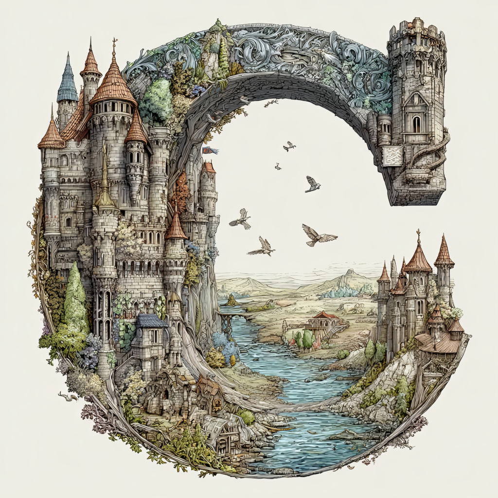
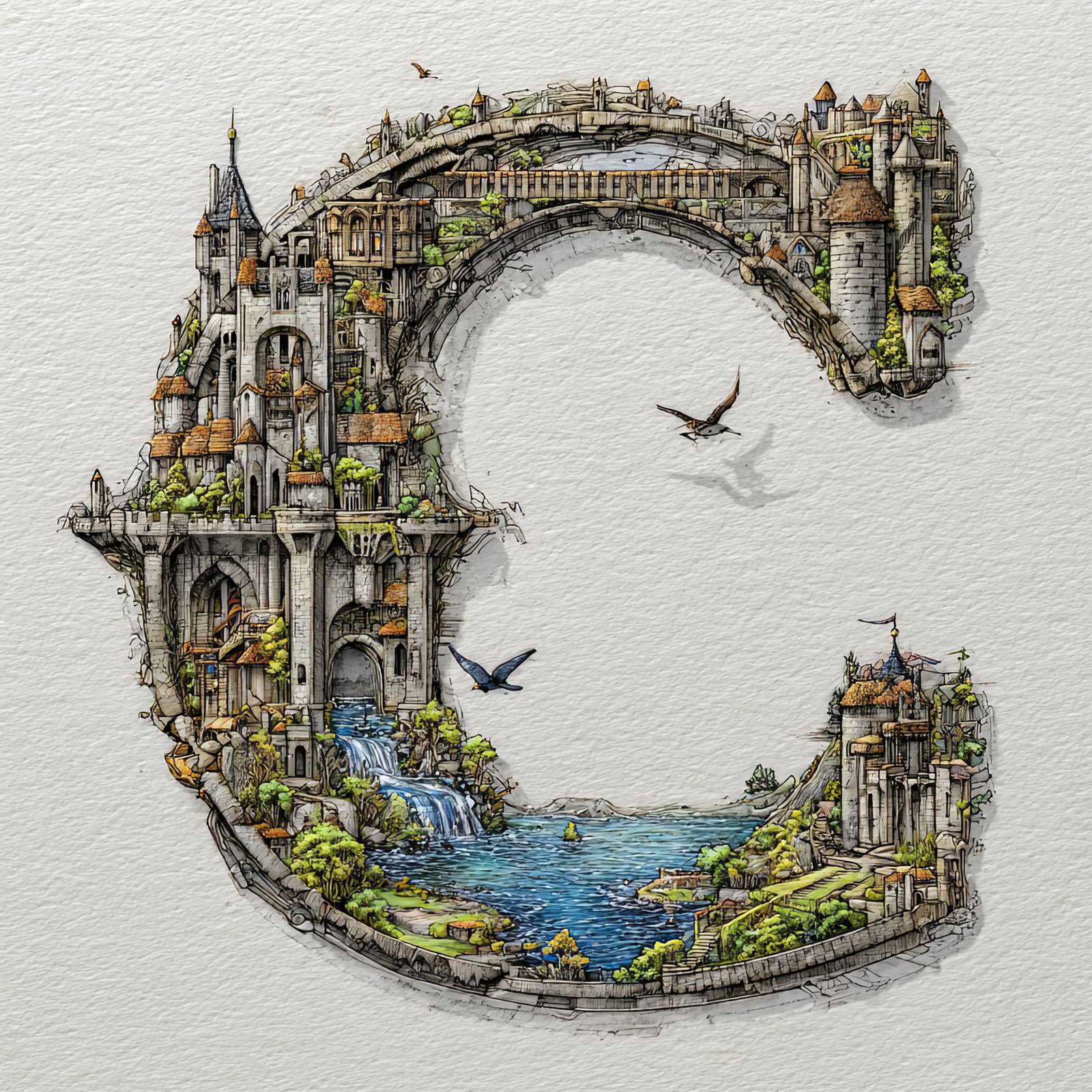
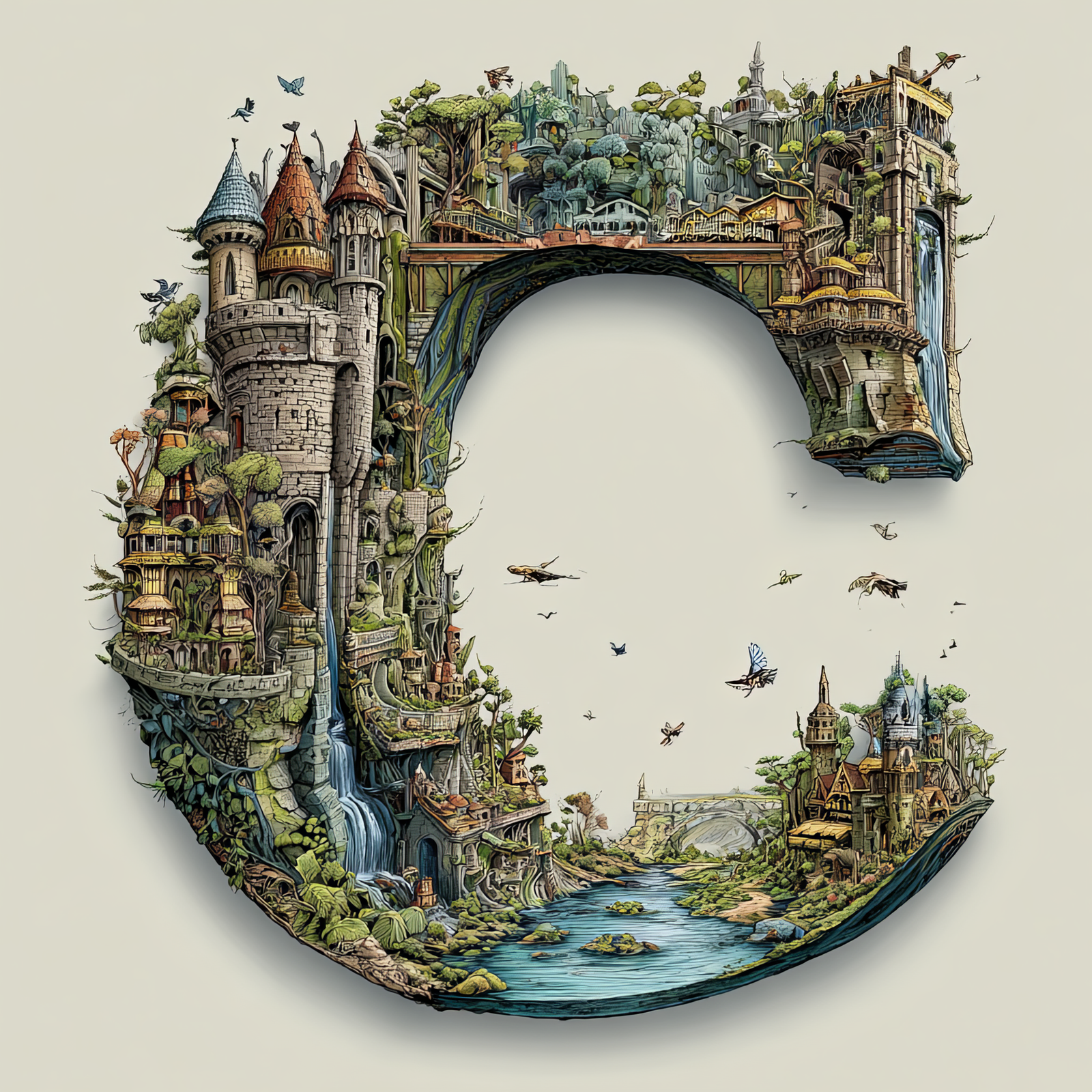
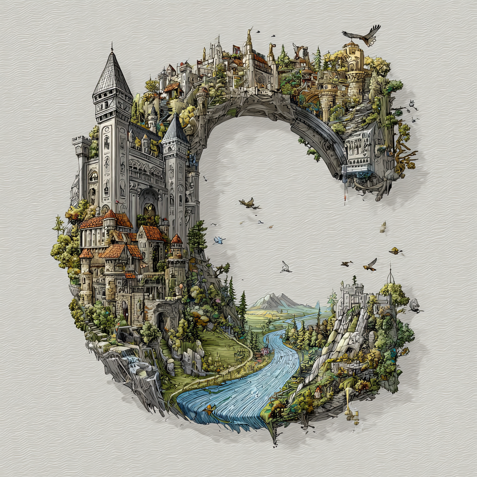
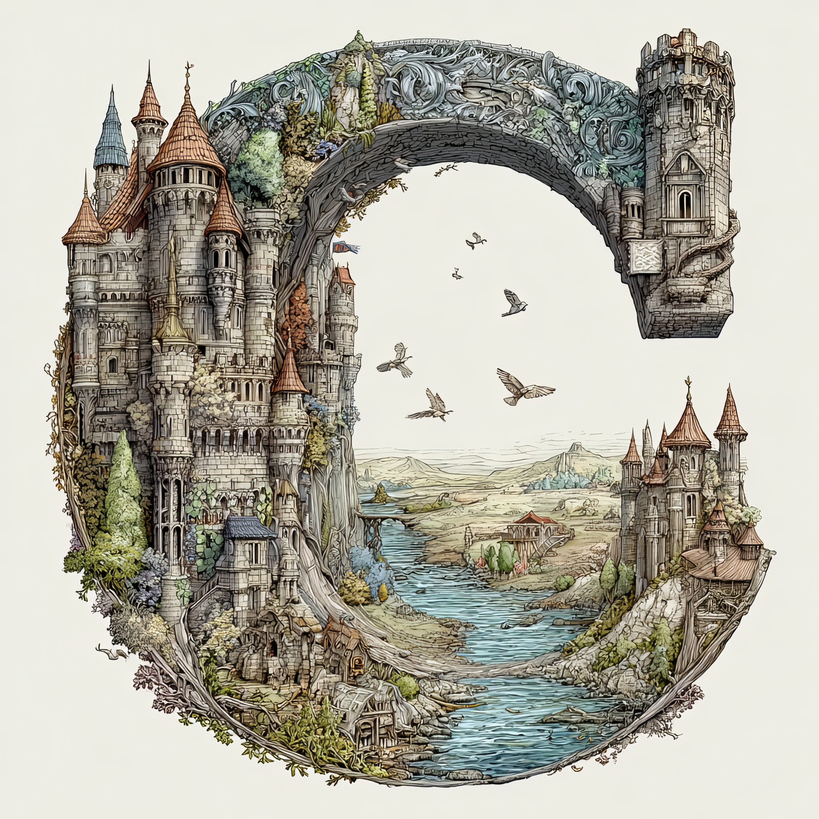
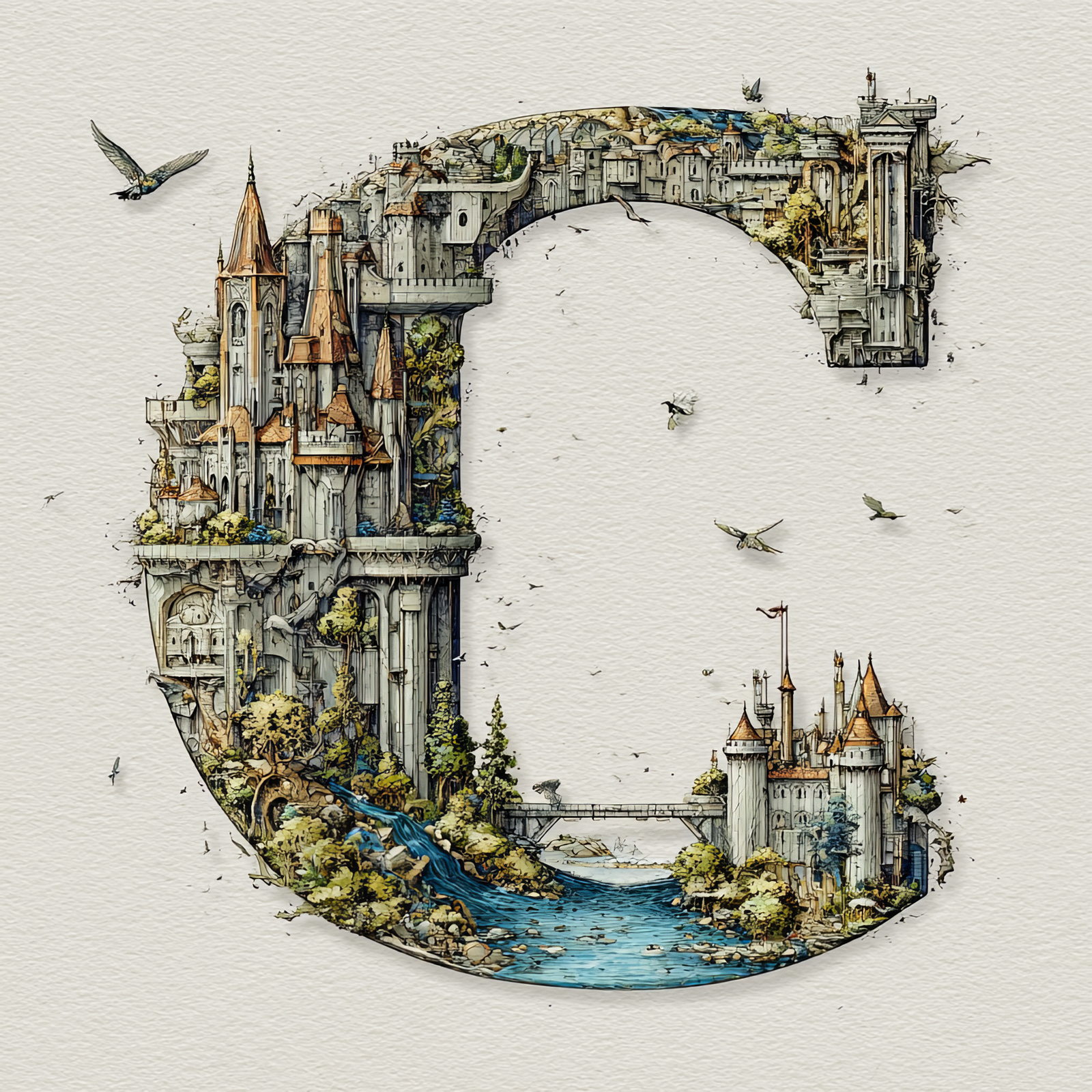
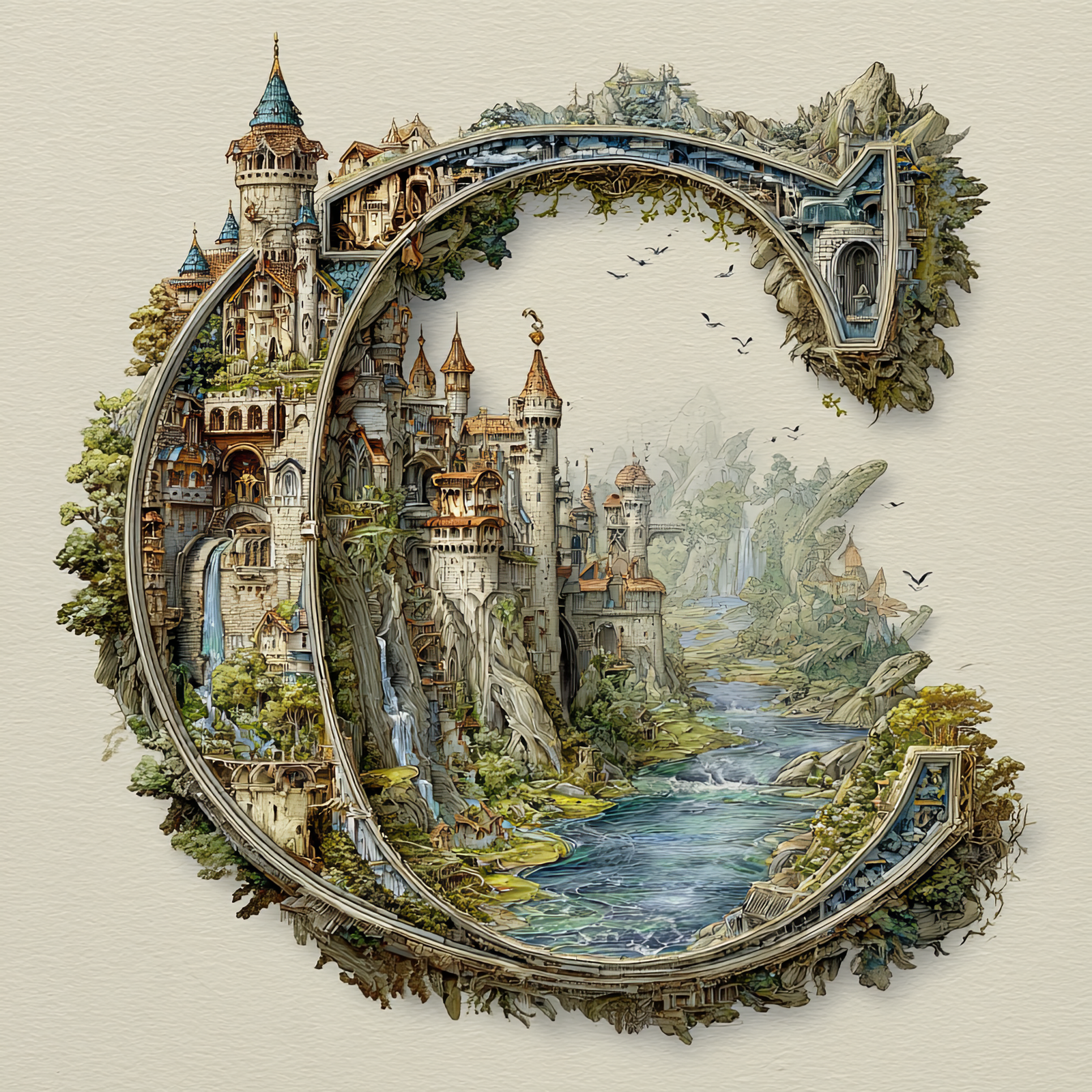
The Letter C: Castles in the Sky Fantasy Alphabet Art
The Letter C: Castles in the Sky Fantasy Alphabet Art
The Letter C: Castles in the Sky Fantasy Alphabet Art
The Letter C: Castles in the Sky Fantasy Alphabet Art
The Letter C: Castles in the Sky Fantasy Alphabet Art
The Letter C: Castles in the Sky Fantasy Alphabet Art
The Letter C: Castles in the Sky Fantasy Alphabet Art
The Letter C: Castles in the Sky Fantasy Alphabet Art
The Letter C: Castles in the Sky Fantasy Alphabet Art
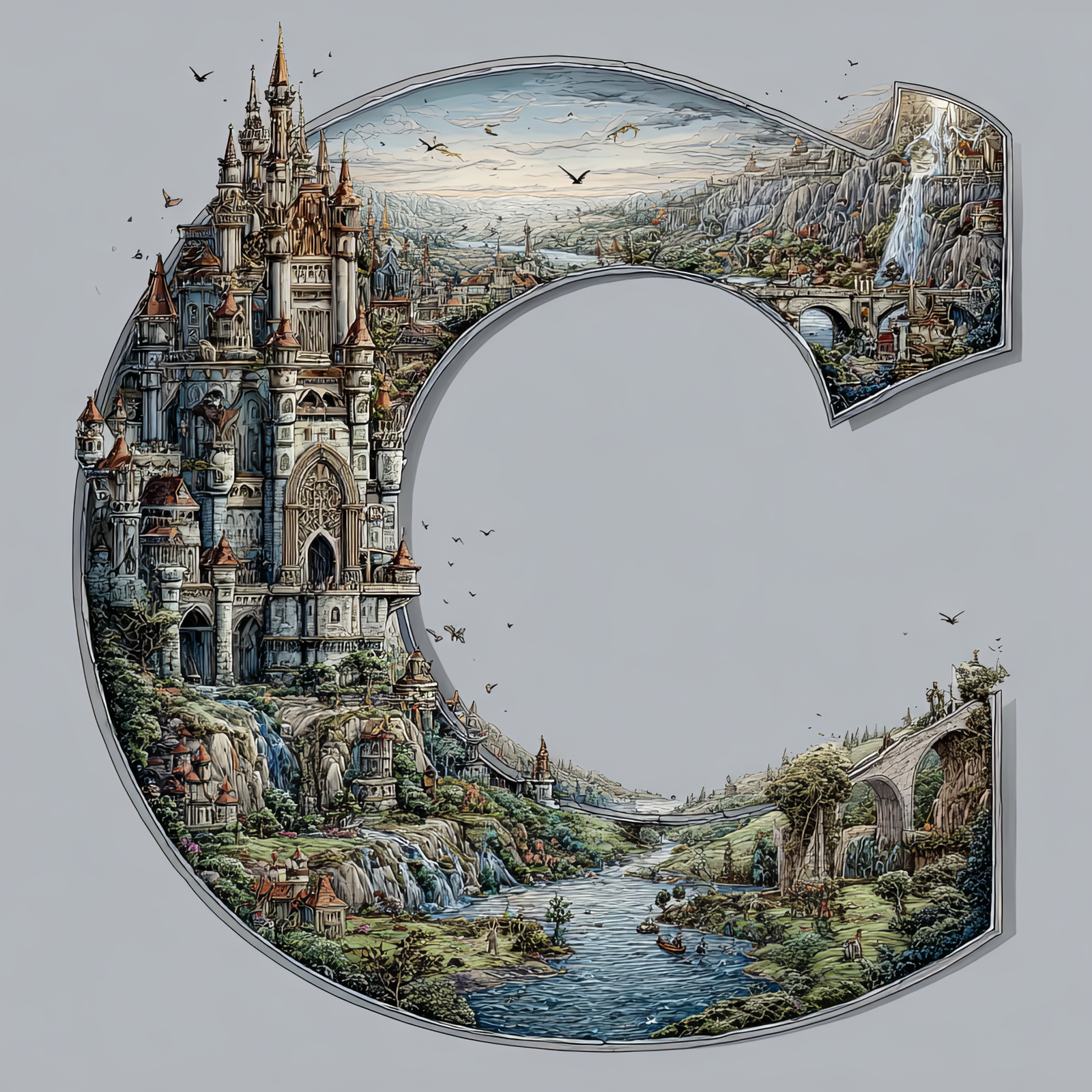
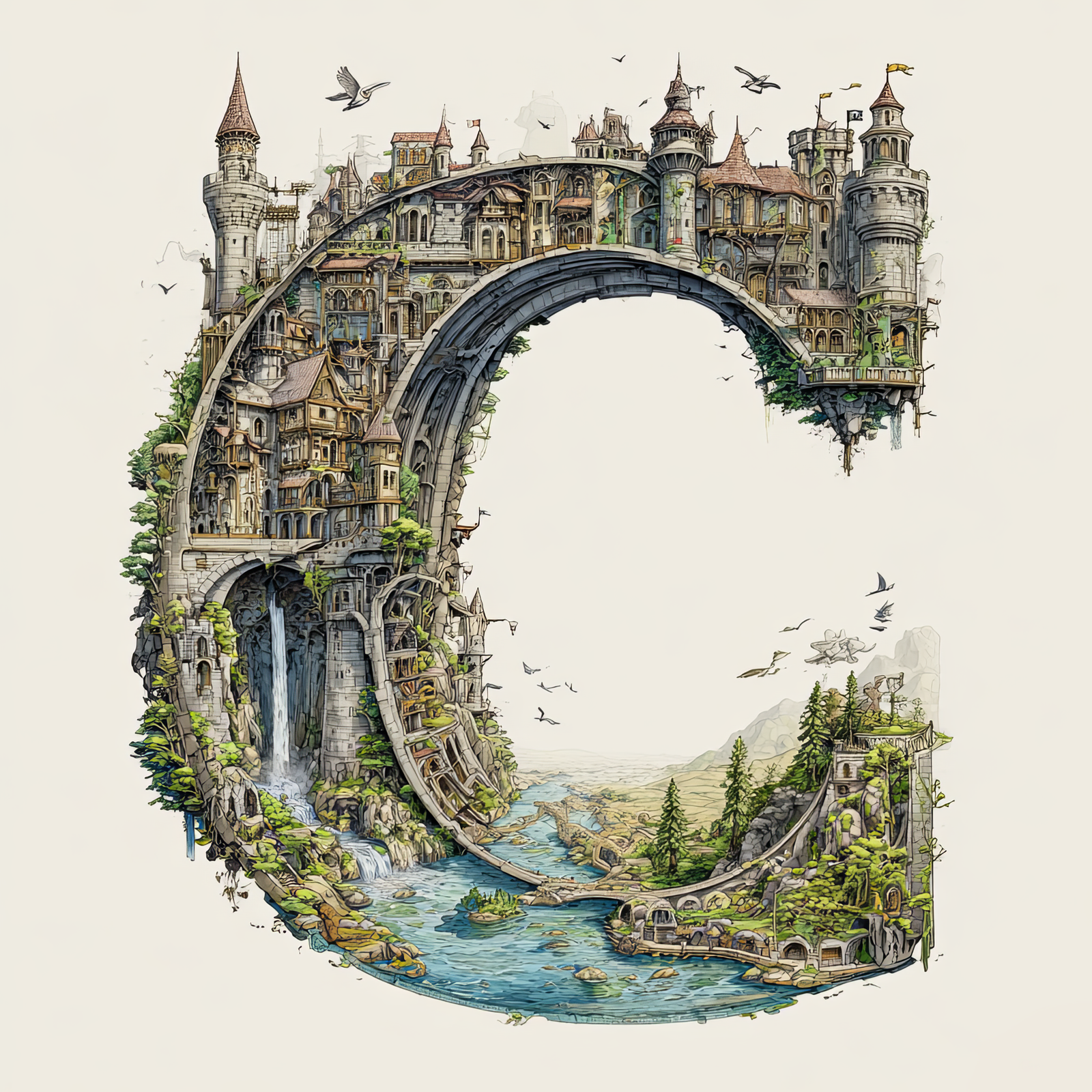
The letter C is transformed into a self-contained fantasy world, filled with towering castles,
winding rivers, stone bridges, waterfalls, and forested cliffs. Every architectural detail is shaped to follow
the curve of the letter, turning the initial into a storybook landscape suspended in the sky.
This illustration is part of the Castles in the Sky Fantasy Alphabet collection, where each letter
becomes its own immersive environment inspired by classic fairytales, illustrated novels, and architectural fantasy worlds.
The letter C adds a graceful, flowing shape to the series while maintaining intricate detail and a strong, readable letterform.
Free Download – Letter C Fantasy Art
You can download this Letter C – Castles in the Sky artwork completely free for personal use.
Scroll to the gallery below and click the Letter C image to open it full size.
Save the image: right-click (desktop) or long-press (mobile) and choose Save Image.
Enjoy it personally—use it as a wallpaper, inspiration, or for at-home projects.
Perfect for personal mood boards, digital wallpapers, craft planning, or previewing before ordering a print.
Great Ways to Use This Letter
This fantasy letter artwork works beautifully as nursery décor, reading-nook art, book-themed interiors, and personalized
initial displays. It can stand alone as a statement piece or be paired with other letters from the collection to spell names
or create a full alphabet wall.
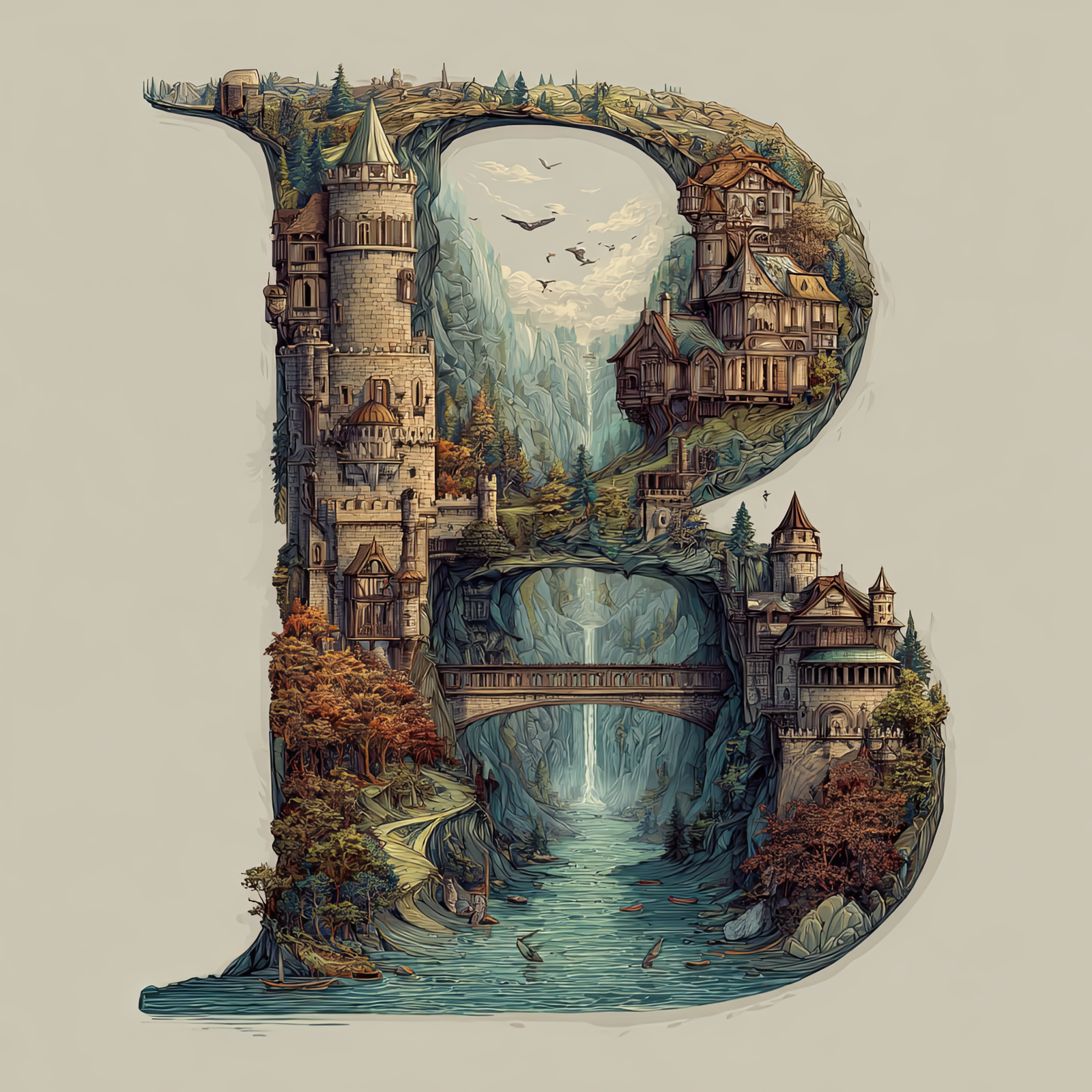
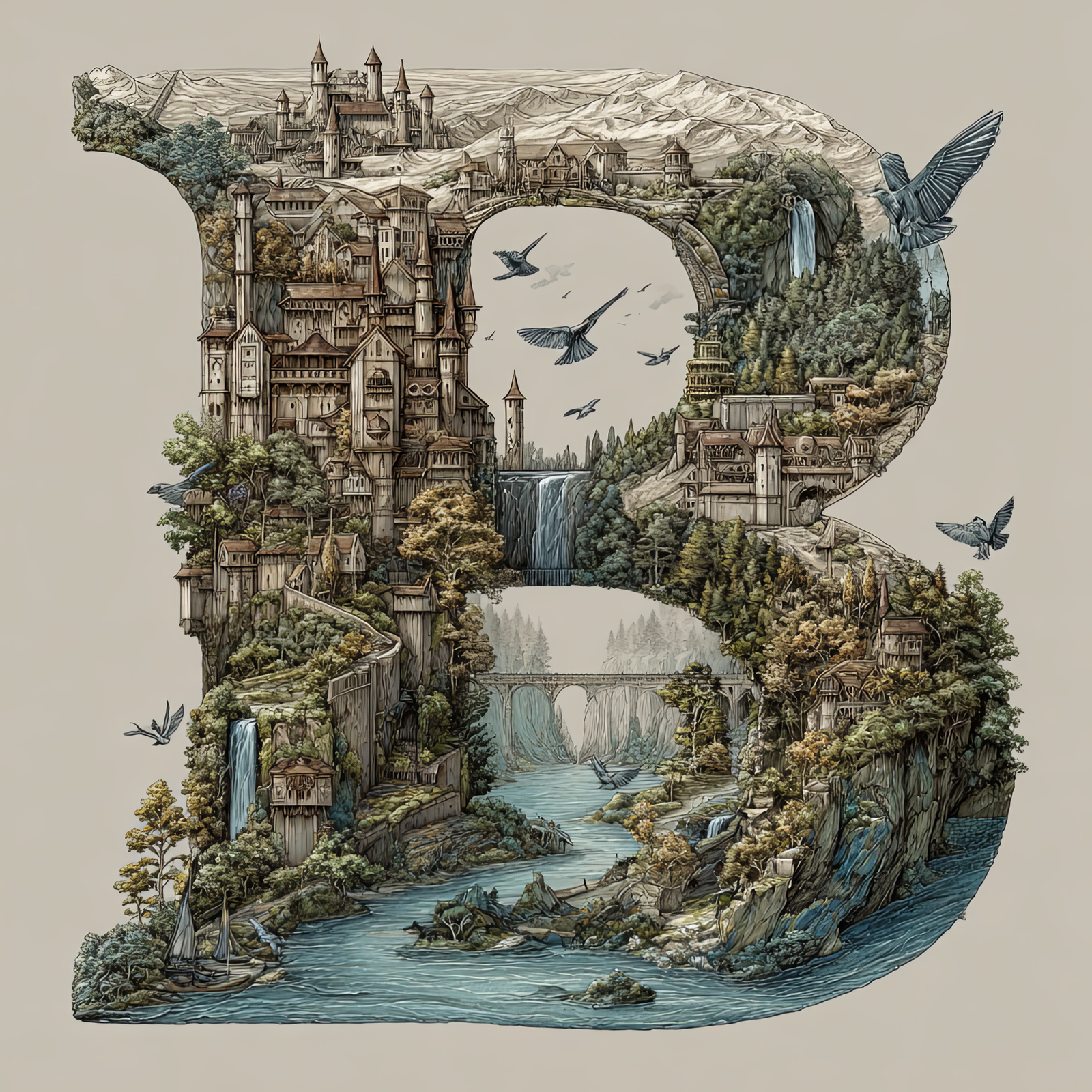
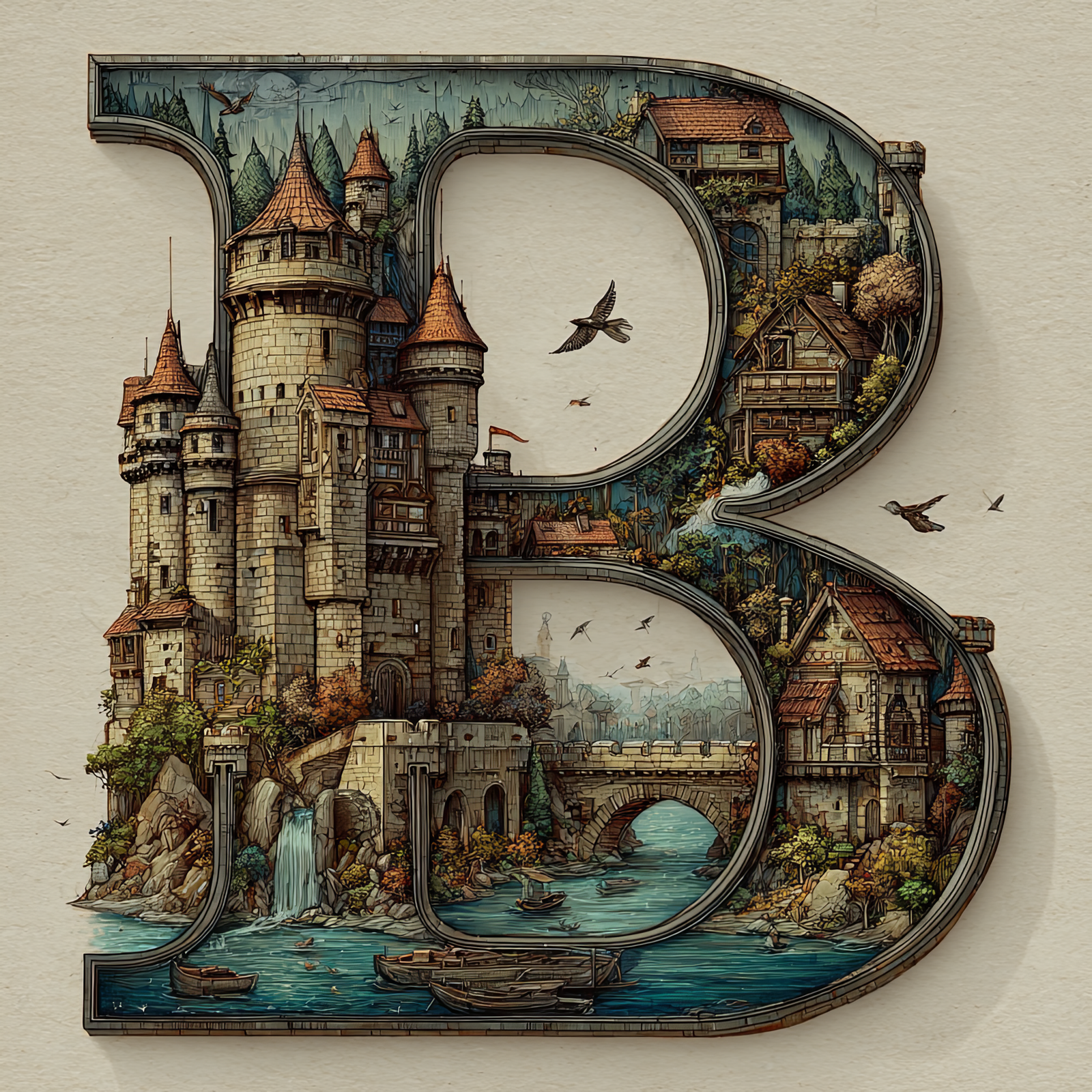
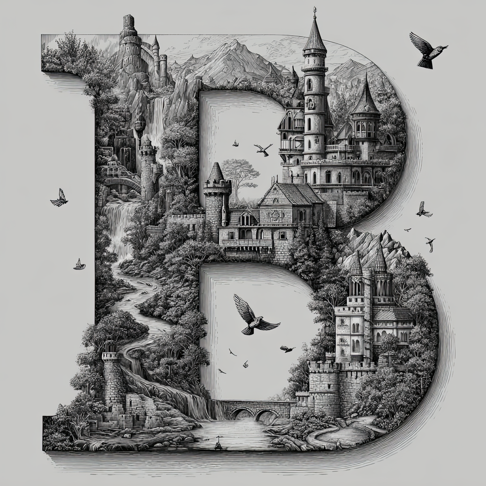
The Letter B: Castles in the Sky Fantasy Alphabet Art
The Letter B: Castles in the Sky Fantasy Alphabet Art
The Letter B: Castles in the Sky Fantasy Alphabet Art
The Letter B: Castles in the Sky Fantasy Alphabet Art
The Letter B: Castles in the Sky Fantasy Alphabet Art
The Letter B: Castles in the Sky Fantasy Alphabet Art
The Letter B: Castles in the Sky Fantasy Alphabet Art
The Letter B: Castles in the Sky Fantasy Alphabet Art
The Letter B: Castles in the Sky Fantasy Alphabet Art
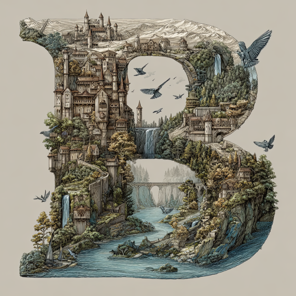
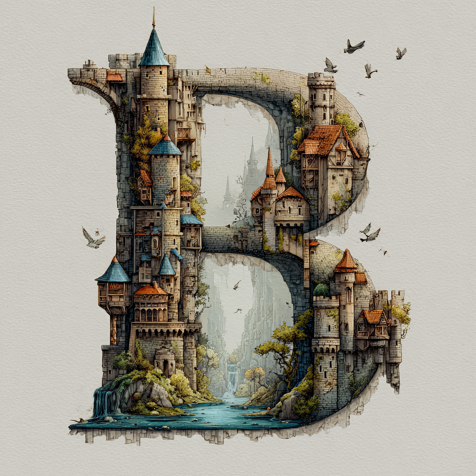
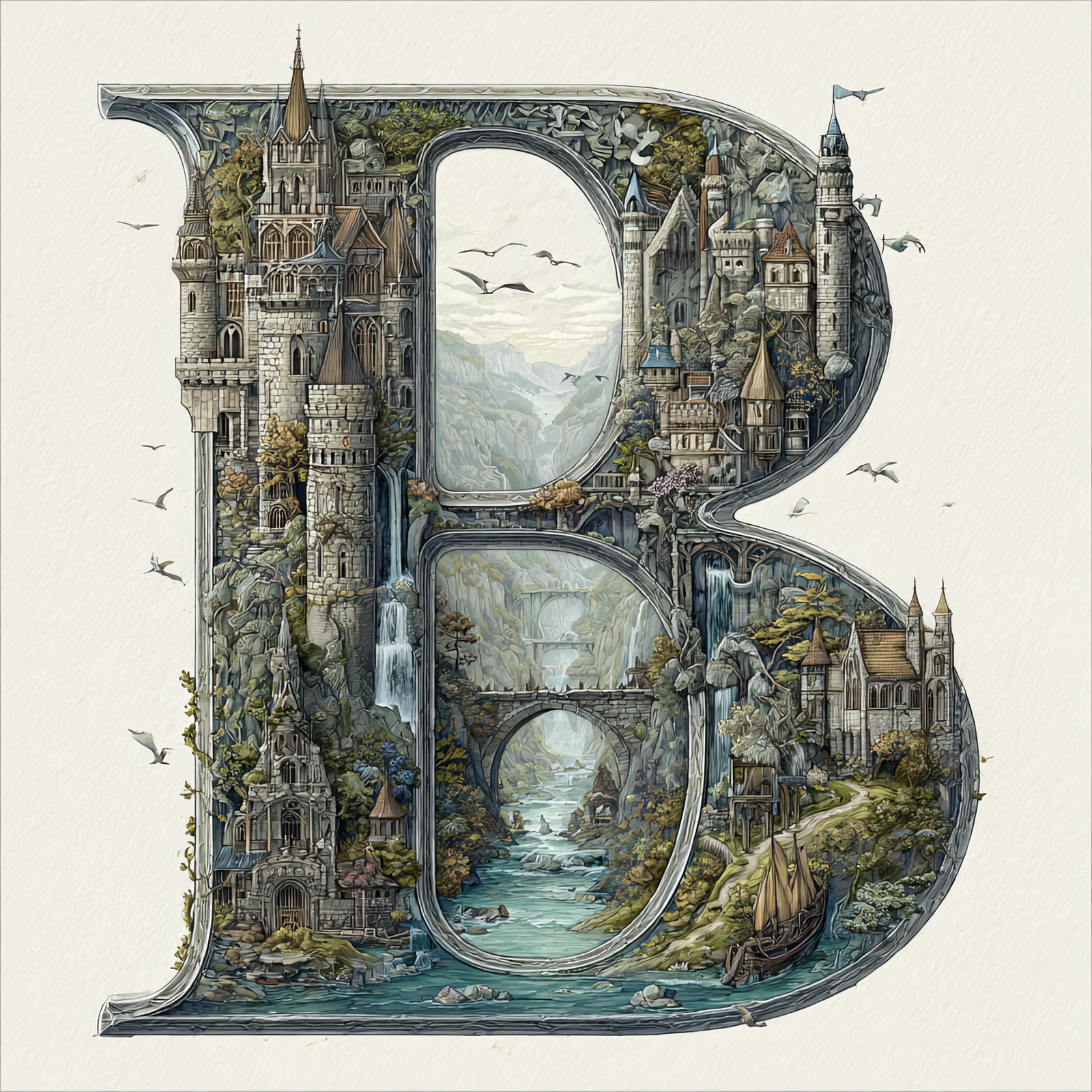
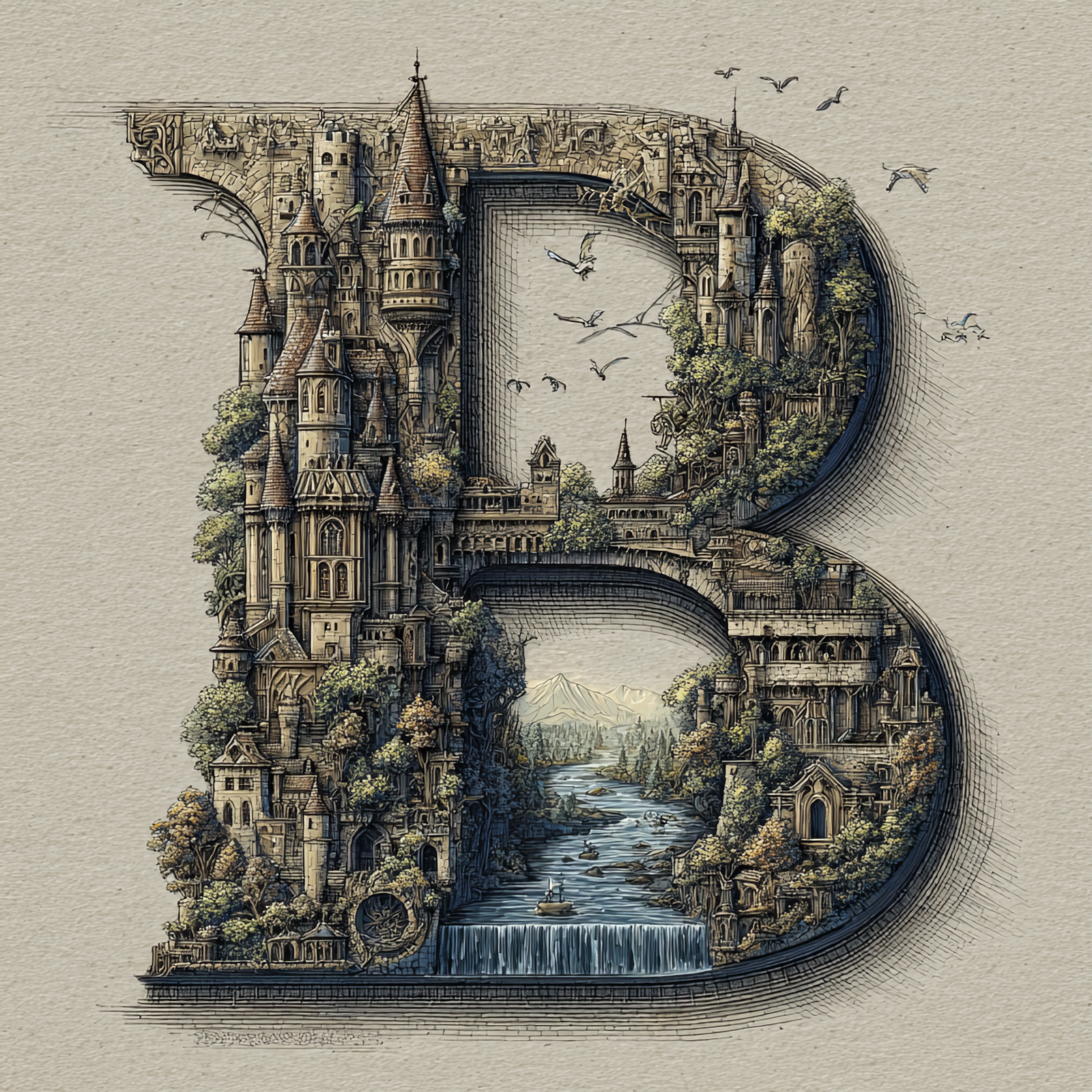
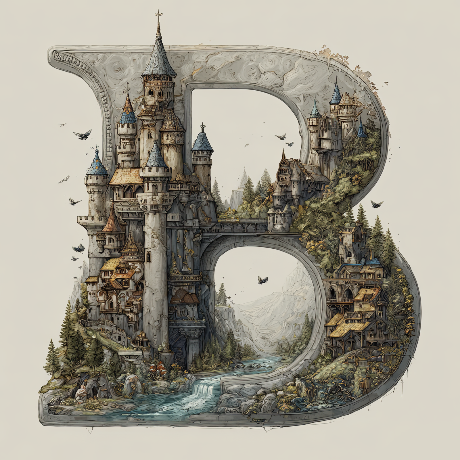
The letter B is transformed into a self-contained fantasy world, filled with towering castles,
winding rivers, stone bridges, waterfalls, and forested cliffs. Every architectural detail is shaped to follow
the curves of the letter, turning a simple initial into a storybook landscape suspended in the sky.
This illustration is part of the Castles in the Sky Fantasy Alphabet collection, where each letter
becomes its own immersive environment inspired by classic fairytales, illustrated novels, and architectural fantasy worlds.
The letter B continues the series with rich detail and a bold, readable letterform.
Free Download – Letter B Fantasy Art
You can download this Letter B – Castles in the Sky artwork completely free for personal use.
Scroll to the gallery below and click the Letter B image to open it full size.
Save the image: right-click (desktop) or long-press (mobile) and choose Save Image.
Enjoy it personally—use it as a wallpaper, inspiration, or for at-home projects.
Perfect for personal mood boards, digital wallpapers, craft planning, or previewing before ordering a print.
Great Ways to Use This Letter
This fantasy letter artwork works beautifully as nursery décor, reading-nook art, book-themed interiors, and personalized
initial displays. It can stand alone as a statement piece or be paired with other letters from the collection to spell names
or create a full alphabet wall.
The Letter A: Castles in the Sky Fantasy Alphabet Art
The Letter A: Castles in the Sky Fantasy Alphabet Art
The Letter A: Castles in the Sky Fantasy Alphabet Art
The Letter A: Castles in the Sky Fantasy Alphabet Art
The Letter A: Castles in the Sky Fantasy Alphabet Art
The Letter A: Castles in the Sky Fantasy Alphabet Art
The Letter A: Castles in the Sky Fantasy Alphabet Art
The Letter A: Castles in the Sky Fantasy Alphabet Art
The Letter A: Castles in the Sky Fantasy Alphabet Art
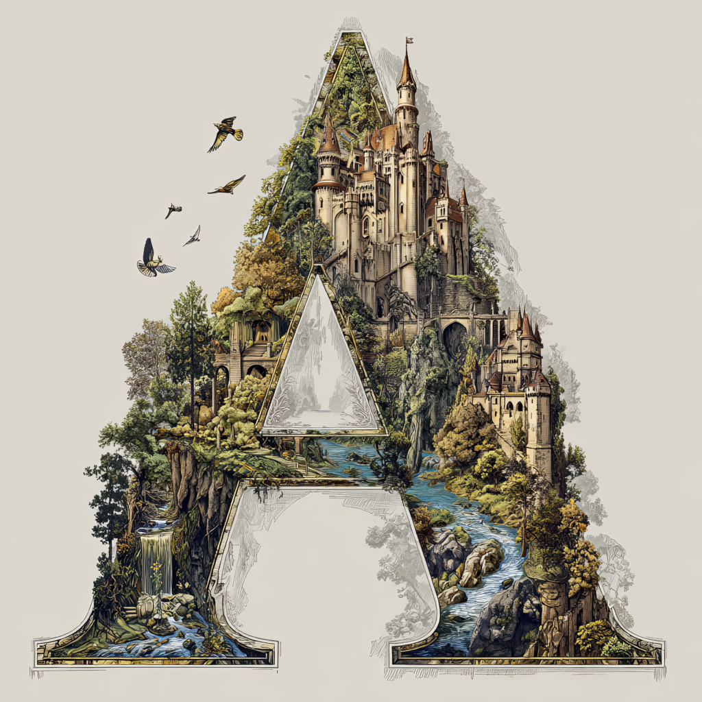
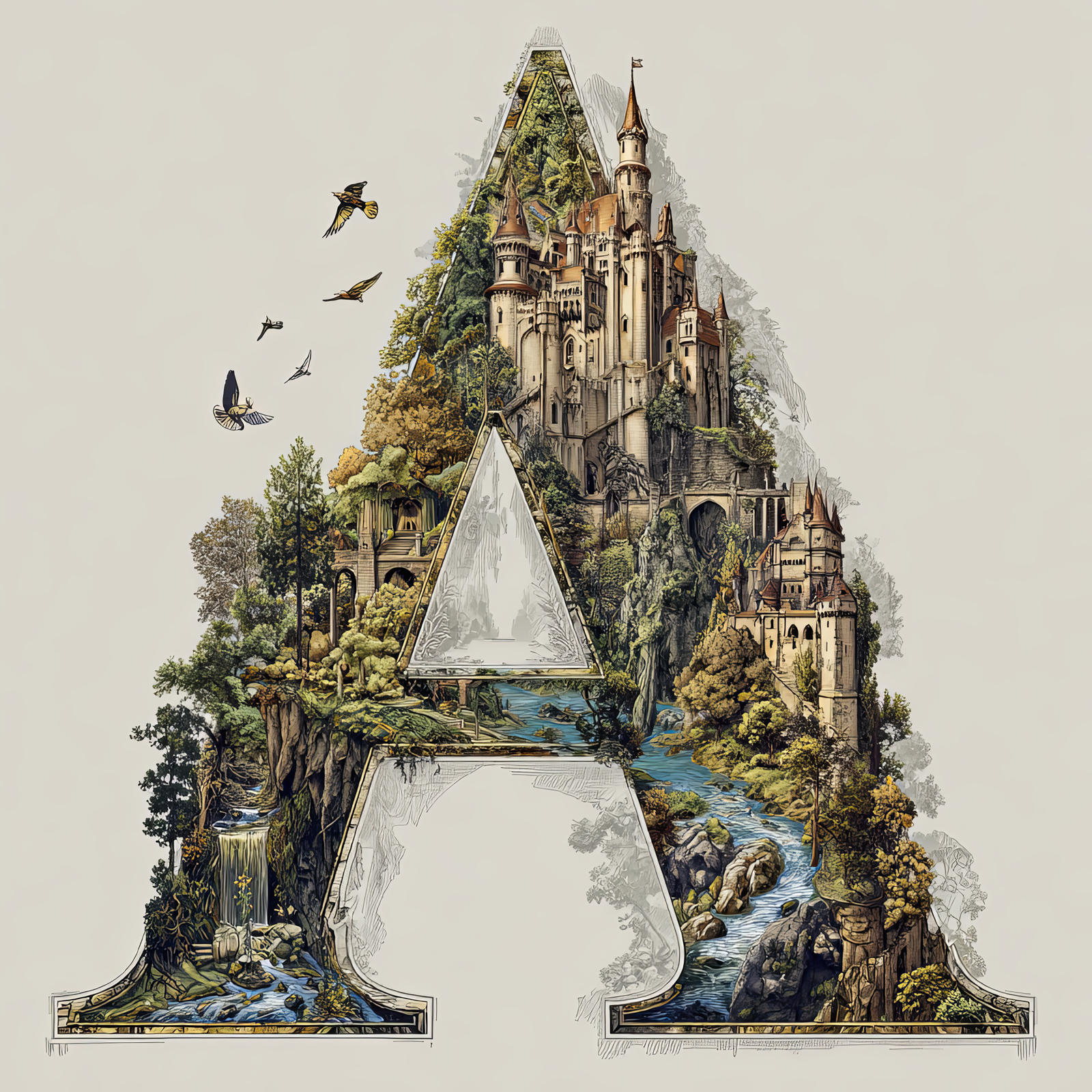
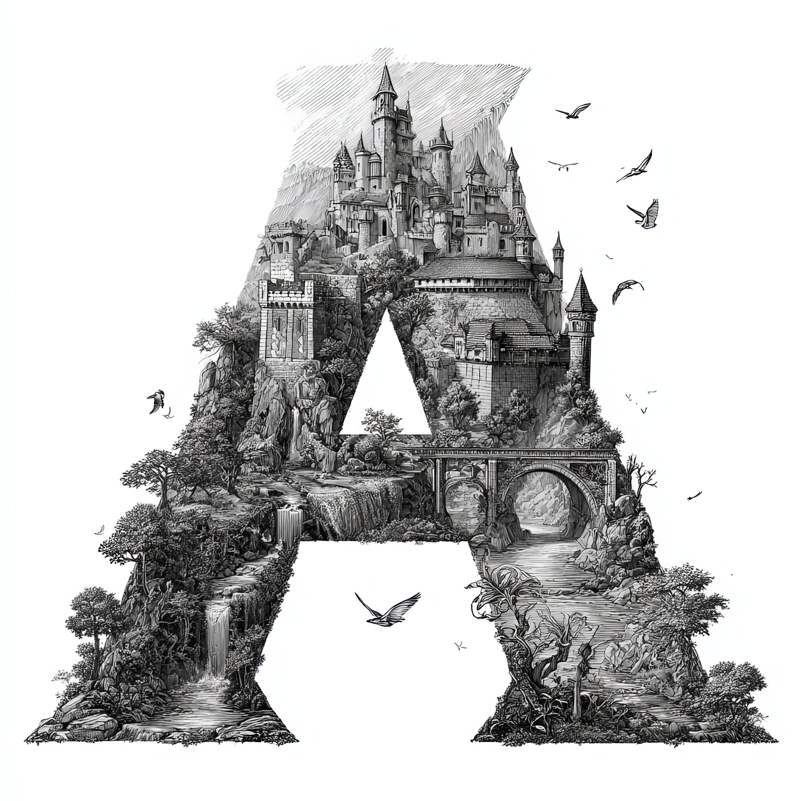
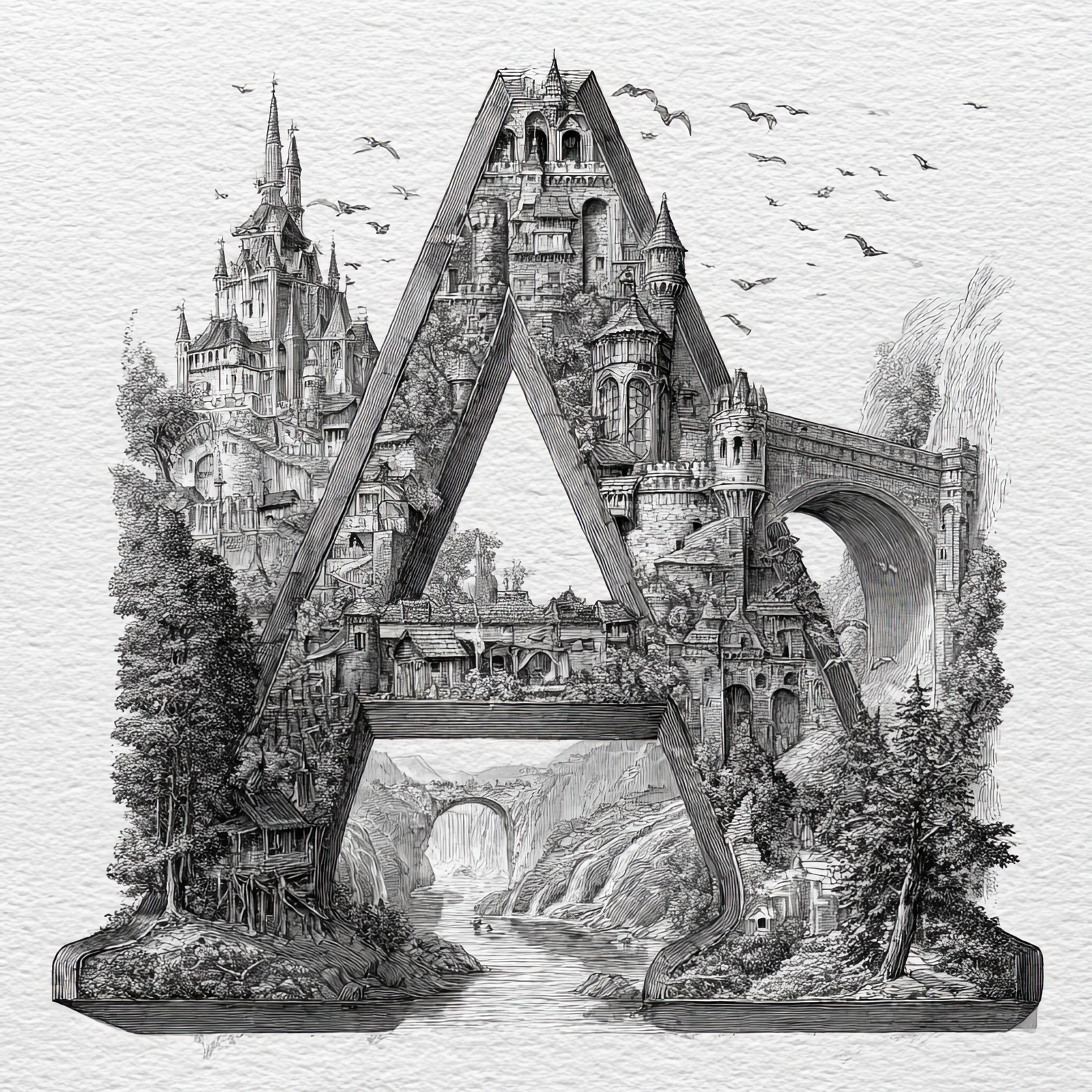
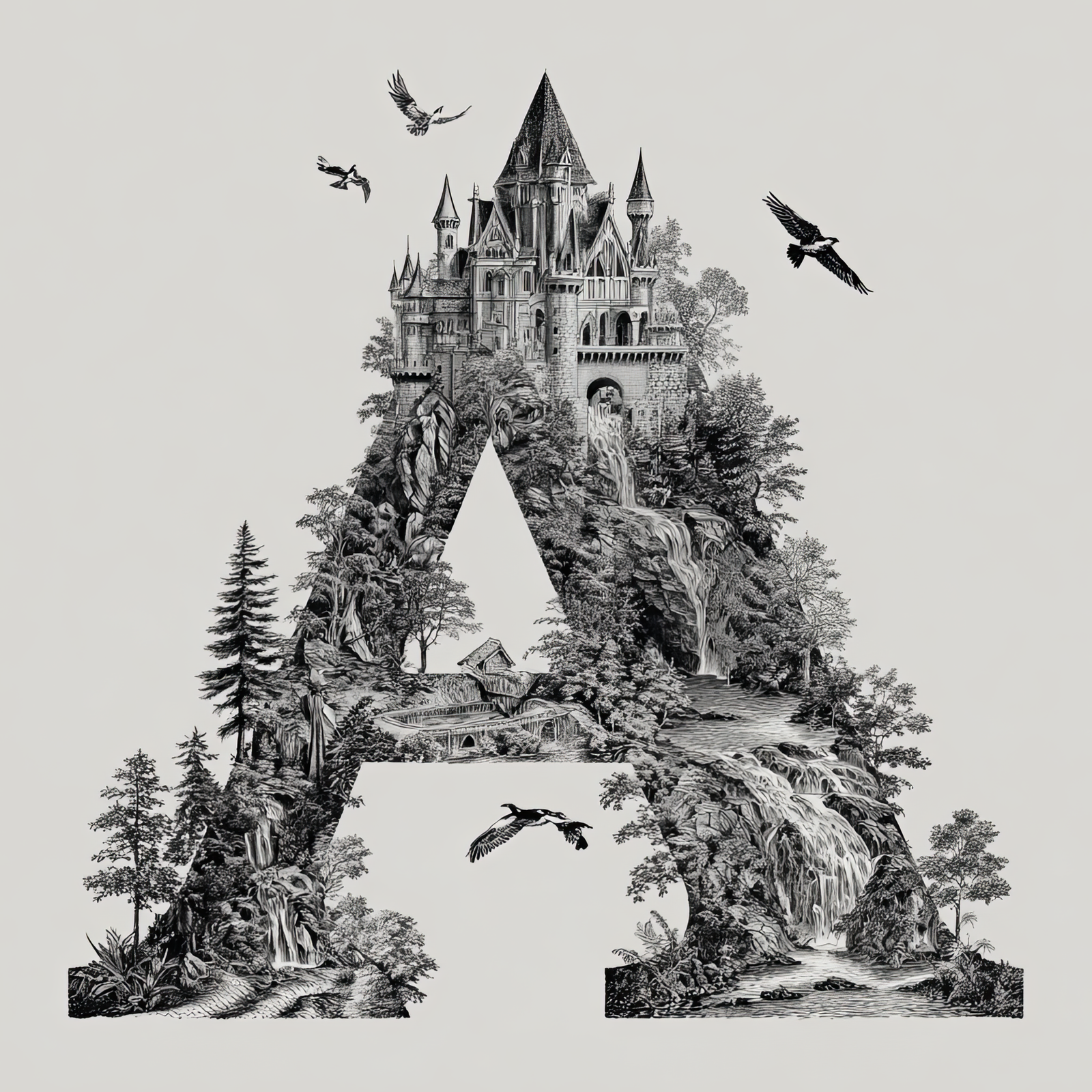
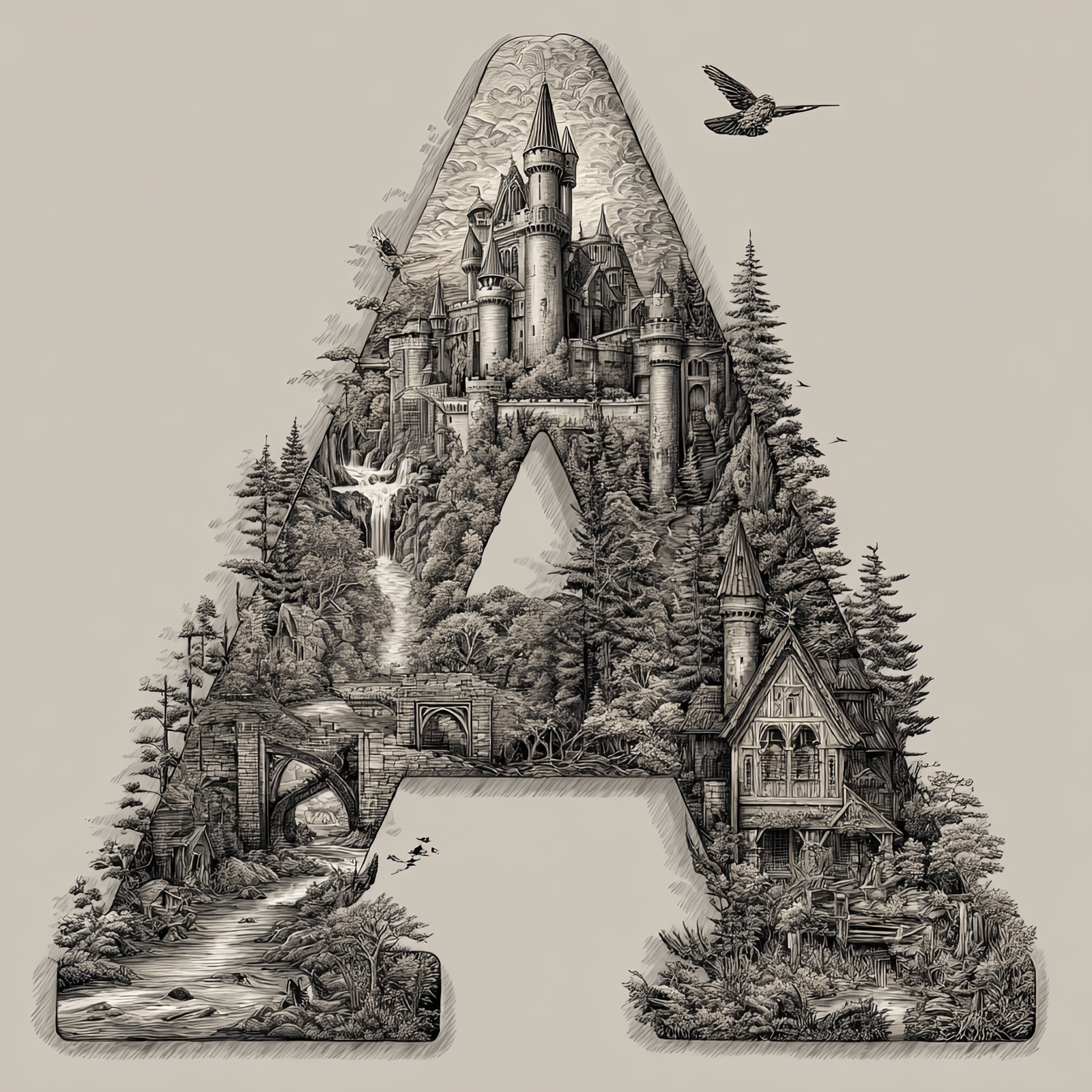
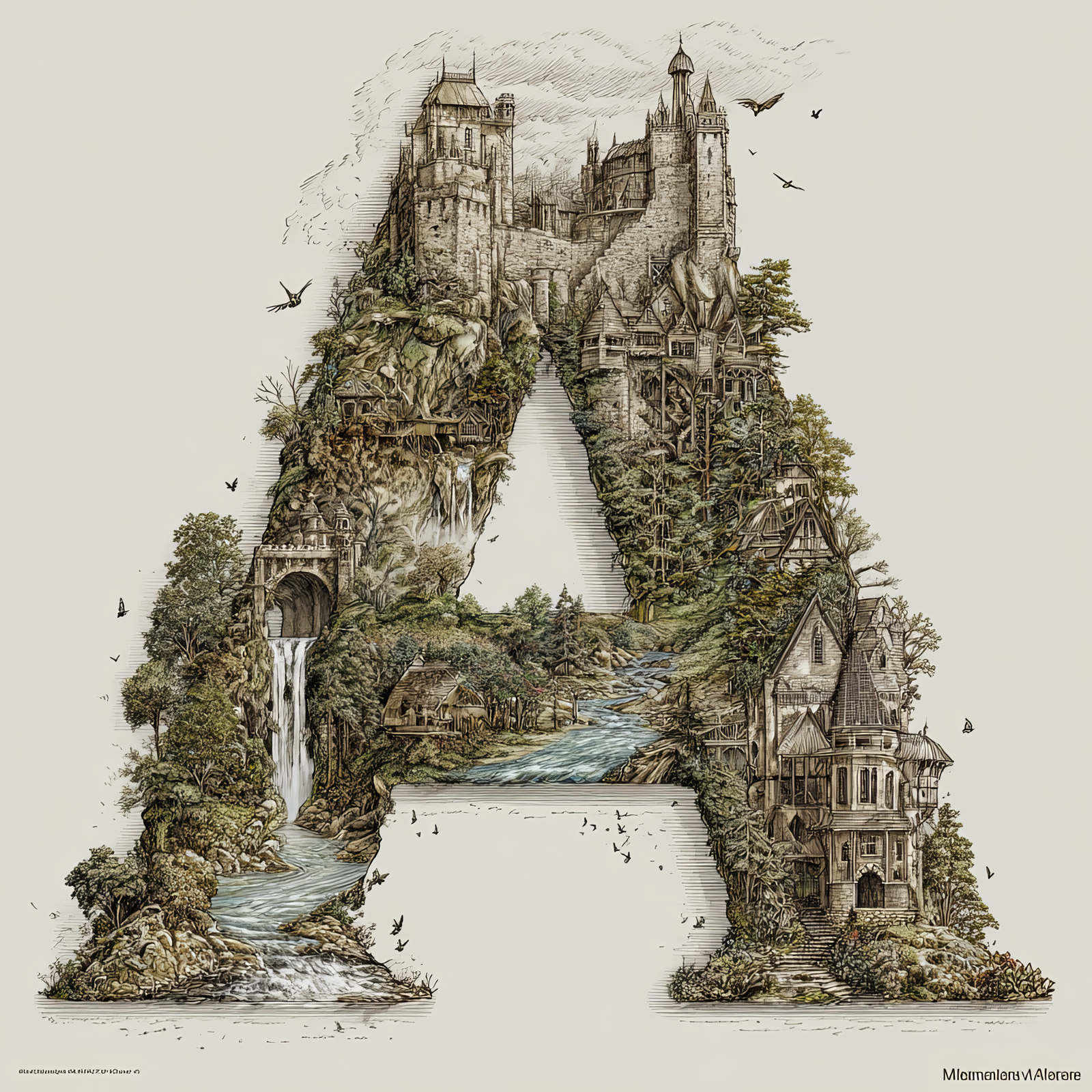
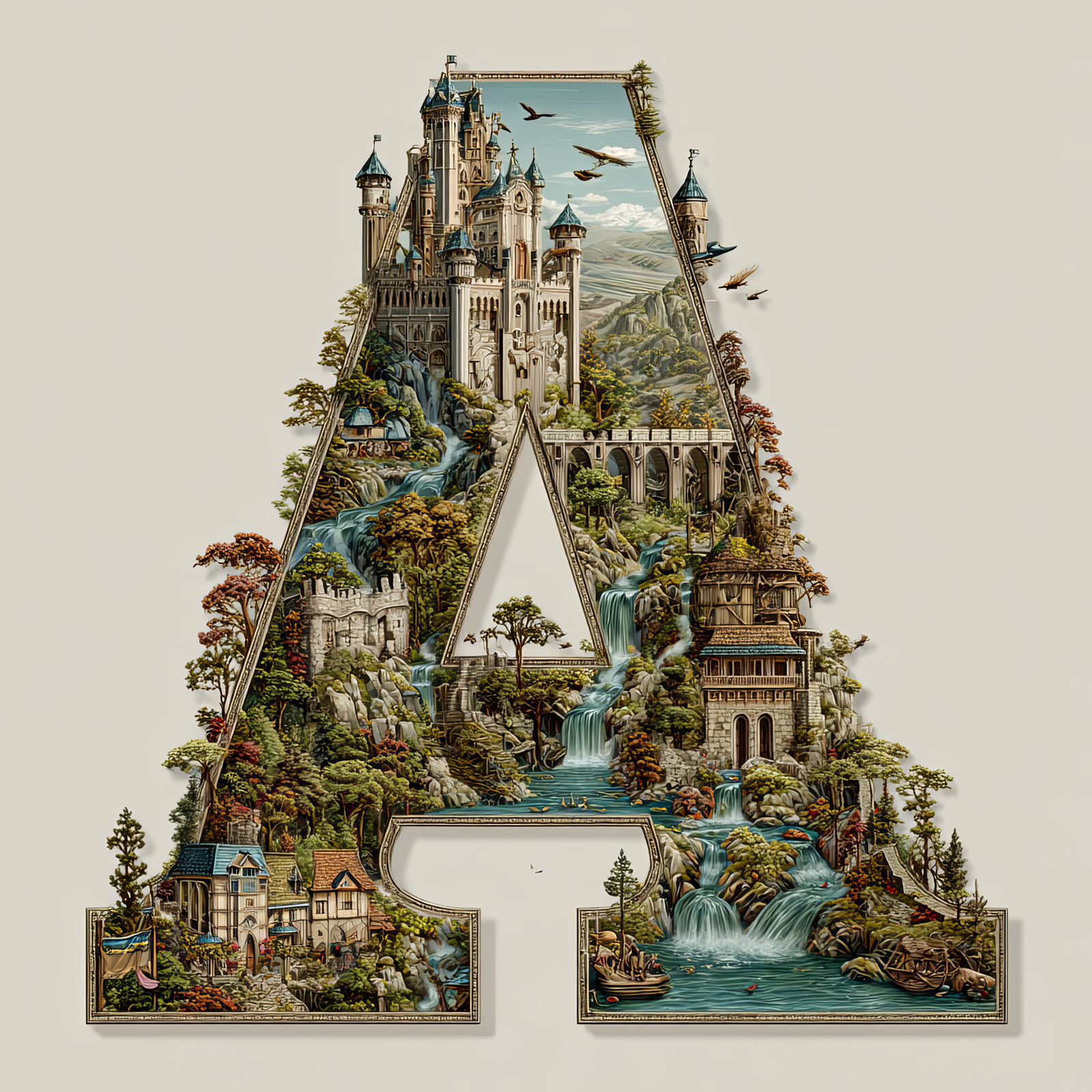
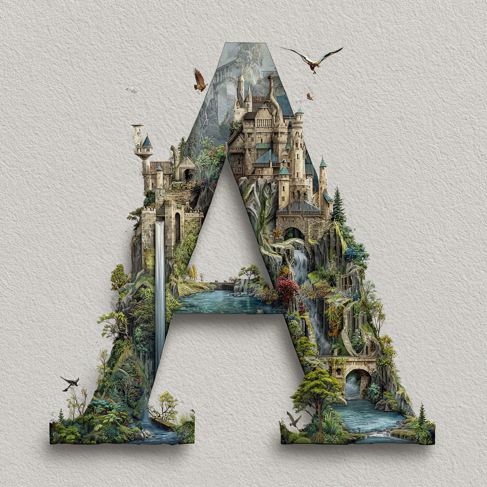
The letter A is transformed into a self-contained fantasy world, filled with towering castles,
winding rivers, stone bridges, waterfalls, and forested cliffs. Every architectural detail is shaped to follow
the structure of the letter, turning a simple initial into a storybook landscape suspended in the sky.
This illustration is part of the Castles in the Sky Fantasy Alphabet collection, where each letter
becomes its own immersive environment inspired by classic fairytales, illustrated novels, and architectural fantasy worlds.
The letter A sets the tone for the series with a balance of intricate detail and a strong, readable letterform.
Free Download – Letter A Fantasy Art
You can download this Letter A – Castles in the Sky artwork completely free for personal use.
Scroll to the gallery below and click the Letter A image to open it full size.
Save the image: right-click (desktop) or long-press (mobile) and choose Save Image.
Enjoy it personally—use it as a wallpaper, inspiration, or for at-home projects.
Perfect for personal mood boards, digital wallpapers, craft planning, or previewing before ordering a print.
Great Ways to Use This Letter
This fantasy letter artwork works beautifully as nursery décor, reading-nook art, book-themed interiors, and personalized
initial displays. It can stand alone as a statement piece or be paired with other letters from the collection to spell names
or create a full alphabet wall.
Some of the links on this site are "affiliate links." This means if you click on the link and purchase the item, We could receive an affiliate commission. more info