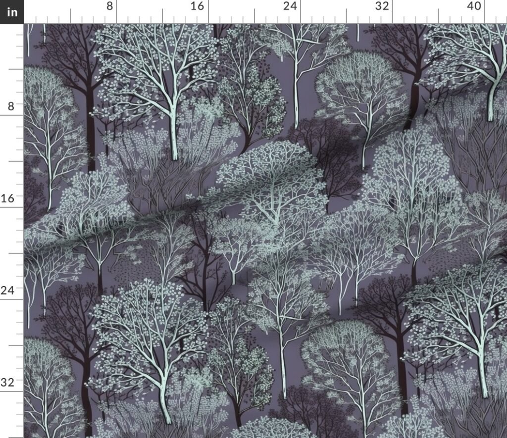
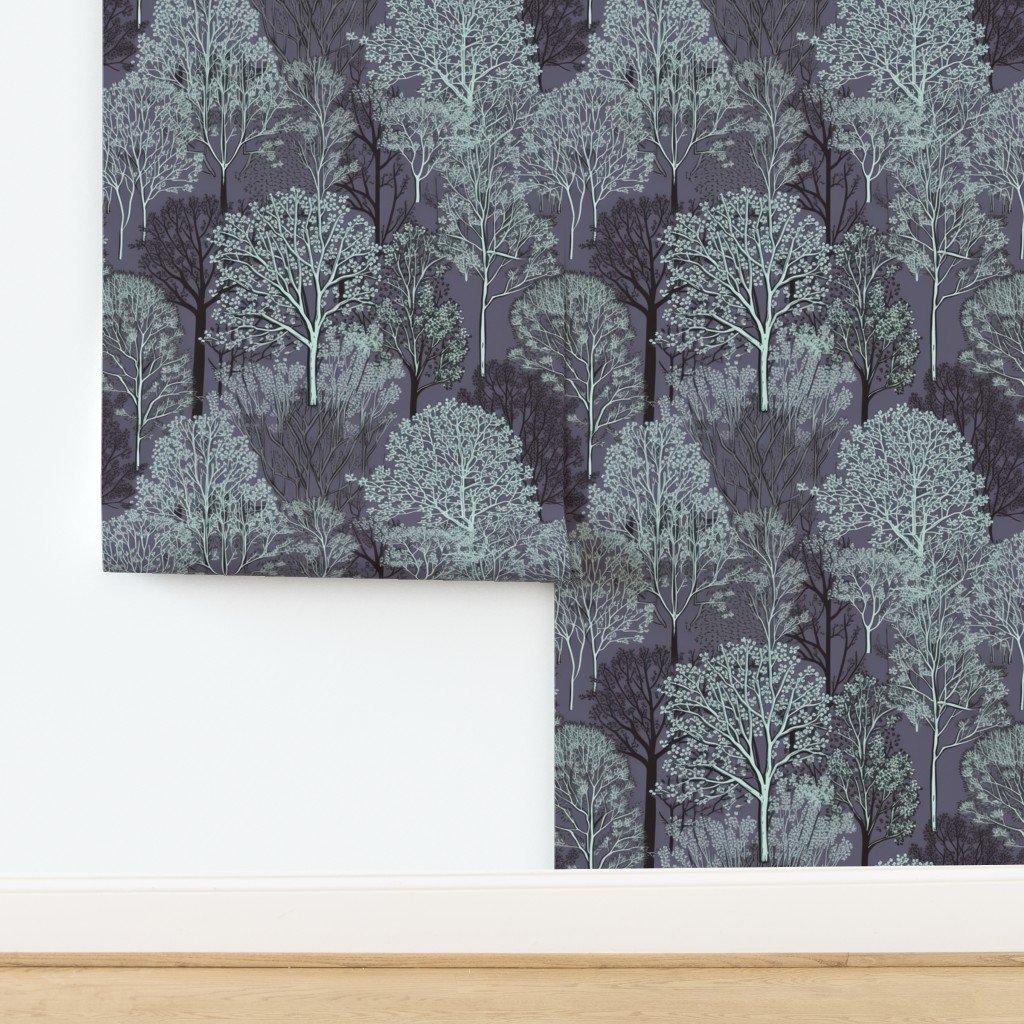
Design Options
Oktoberfest Bavarian Blue and White Small Diagonal Diamond Pattern is a poised celebration of tradition—clean, graphic, and instantly familiar, yet refined enough to live beautifully beyond the season that inspired it. The diagonal diamond grid nods to classic Bavarian textiles with a crisp confidence that feels both festive and architectural, the kind of pattern that can anchor a room without ever raising its voice. In a palette of bright alpine blue and fresh white, the design reads as cheerful and composed at once, offering a structured rhythm that layers effortlessly with wood, linen, pottery, and brushed metal. Available as fabric and as wallpaper, it lends itself to interiors that appreciate heritage motifs presented with modern restraint.
1) What this pattern is
This design is a small-scale diagonal diamond repeat with a distinctly Bavarian point of view—an instantly recognizable motif translated into a tidy, contemporary cadence. The diamonds sit on the bias, which matters more than it first appears: that diagonal tilt introduces movement and lift, keeping the geometry from feeling static and giving the surface a gentle sense of flow. Each row locks neatly into the next, creating a disciplined grid that reads like a tailored textile rather than a novelty print. The motif is simple by design, relying on repetition, contrast, and scale to create its visual impact; the result is a pattern that behaves like a classic check, but with a sharper, more celebratory silhouette. In interiors, that clarity is its strength: it can act as a focal pattern in a restrained room, or serve as a rhythmic backdrop when layered with softer solids, natural textures, and small accents. The overall effect is cheerful and polished—heritage-inspired, but clean enough to suit modern spaces.
2) The color story
The palette is all about crisp contrast and bright clarity: a confident alpine blue paired with a clean, luminous white. Together, they evoke porcelain, painted shutters, and sunlit summer skies—fresh, optimistic references that feel uplifting without slipping into loudness. Blue, when used this purely, carries a sense of order and calm; white brings breathing room, amplifying the pattern’s structure while keeping it airy. That balance makes the design remarkably versatile. In a warm-toned home, it cools the palette and sharpens the edges, pairing beautifully with honeyed oak, tan leather, woven grasses, and creamy stoneware. In a cooler interior, it becomes a crisp accent that looks especially striking alongside soft grays, brushed nickel, and pale woods. The color story also plays well with natural greens, making it an easy companion for plants, herbs, and garden-facing rooms. The mood is classic and bright—an instant refresher that still feels rooted in tradition.
3) Why it works in real homes
Patterns with strong heritage references can sometimes feel “occasion-only,” but the secret of this design is its restraint. The small scale keeps the diamonds from dominating, allowing the motif to function almost like a textural neutral—structured, graphic, and dependable. That means it wears well across everyday life: it hides visual clutter better than a plain solid, yet remains calm enough to coexist with artwork, open shelving, and mixed materials. The diagonal arrangement adds softness to architectural lines, making it especially flattering in rooms with lots of right angles—kitchens, dining nooks, entryways, and home offices—where a touch of movement can make the space feel more welcoming. Because the palette is so classic, it also pairs naturally with staples people already own: striped dish towels, vintage ceramics, simple framed prints, and natural wood furniture. The design invites a sense of order, then lets the rest of the room breathe.
4) Best use cases
This pattern shines anywhere you want a crisp, convivial energy without a lot of visual noise. In dining spaces, it feels perfectly at home—think table linens that set a celebratory tone while still looking polished for everyday meals, or chair cushions that add character without overpowering the room. In living areas, the design becomes a tidy graphic accent: pillow covers, small upholstered pieces, or layered textiles that brighten neutral seating. Bedrooms benefit from its clean rhythm as well, especially when used in smaller doses—an accent pillow, a bench cushion, or a detail that punctuates a calm bedding palette. The motif also suits entryways and mudrooms beautifully, where a hardworking, upbeat pattern can make the space feel intentional and welcoming. As wallpaper, the design reads as architectural: a crisp field of diamonds that brings order and brightness, especially striking in powder rooms, breakfast nooks, or a playful hallway moment.
5) Styling ideas
For a classic Bavarian-inspired look, pair the print with warm woods, creamy whites, and simple pottery—elements that keep the overall styling grounded and timeless. Add matte black accents for a modern edge, or lean into brushed brass for a softer, golden warmth. For a fresh, coastal-leaning interpretation, layer it with pale oak, linen textures, and natural woven details; the blue-and-white contrast will feel breezy and bright, like a well-lit kitchen on a clear morning. If you prefer a more contemporary palette, introduce light grays, crisp white paint, and minimalist silhouettes, letting the diamonds provide the pattern while the rest remains quiet. This design also plays beautifully with subtle companion motifs: narrow stripes, tiny dots, or understated florals in a similarly restrained palette. Keep the supporting pieces simple and tactile—stoneware, wood grain, linen—so the geometry stays crisp and the mood remains effortlessly composed.
6) Scale guidance
The small-scale repeat is the key to this pattern’s versatility. Because the diamonds are compact, the design can cover larger surfaces without feeling overwhelming, reading as a cohesive texture from a distance and revealing its crisp geometry up close. This makes it a strong choice for broad applications—curtains, upholstered panels, or an accent wall—while still feeling refined. In smaller projects, the scale stays legible and charming: it looks tidy on cushions, runners, and other detail pieces where oversized motifs can sometimes feel clunky. The diagonal layout also helps the eye travel, which can visually elongate or soften a surface depending on placement. If you like a balanced look, pair it with solids that echo either the blue or the white; if you prefer layering, keep accompanying patterns small and restrained so the diamonds remain the anchor. The ruler preview is especially helpful here, offering an at-a-glance sense of rhythm and proportion.
7) Explore the vibe
The mood of this design is convivial, bright, and beautifully ordered—a pattern that evokes long tables, laughter, and traditional craftsmanship, but presented with a clean modern finish. It suggests celebration without insisting on it, which is exactly what makes it so livable. In the right setting, it can feel like a subtle nod to Oktoberfest traditions; in another, it simply reads as a crisp diamond check that freshens a space. That duality is the charm: it carries cultural reference and visual clarity in equal measure. The blue-and-white palette lends a sense of lightness that pairs naturally with sunlit rooms, airy kitchens, and spaces that benefit from a little graphic structure. Whether styled as a bold accent or a steady backdrop, the design brings a reassuring rhythm—classic, cheerful, and quietly confident, with the kind of timeless geometry that looks as good in everyday life as it does in a celebratory moment.
Pattern Preview & Style Examples


Recent Comments