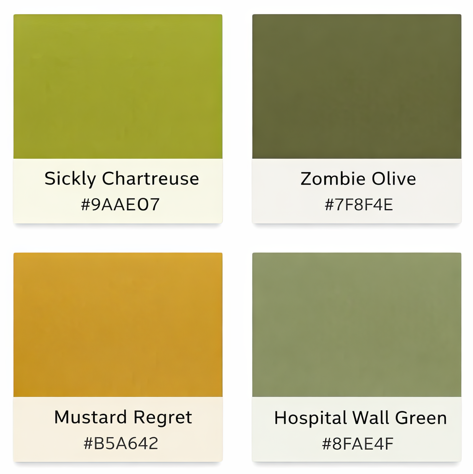
The Usual Suspects
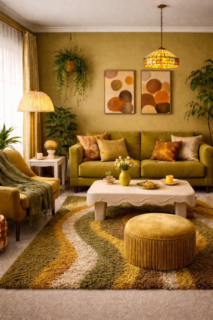
Viewed in isolation, these shades feel harsh and slightly wrong. But place them into a room, repeat them across textiles and surfaces, and something shifts. A single olive cushion feels accidental; an entire olive palette feels deliberate. One mustard accent may seem questionable, yet layered across art, upholstery, and flooring, it becomes cohesion.
👉 EXPLORE THE INTENTIONALLY UNLOVED COLLECTION 👈
Ugly Alone vs. Ugly Together
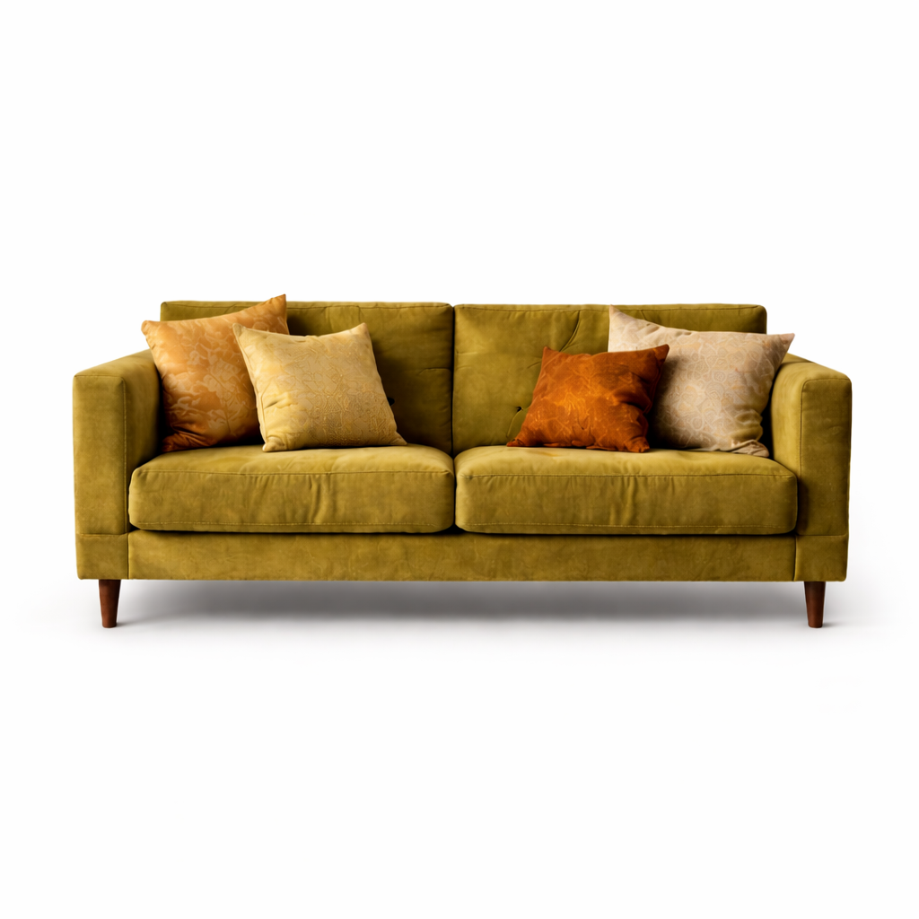
Isolation
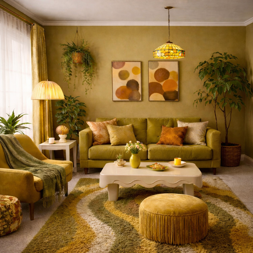
Integration
The real lesson is not about whether a color is attractive in theory. It is about commitment. Safe palettes aim for universal approval, but selective palettes create identity. The moment a room stops trying to please everyone, it begins to communicate something personal.
The Cohesive Palette
The difference is not the color itself. It is the context around it. When these tones are supported, repeated, and softened by texture, they become intentional rather than accidental.
So-called man-repellent colors are not inherently ugly. They are emotionally specific. Used timidly, they look wrong. Used boldly, they look designed. In a culture saturated with safe beige interiors, that boldness can feel unexpectedly refreshing.
The Binding Neutrals
Every bold palette needs a stabilizer. In this collection, that role is played by warm cream / soft linen —
a tone that softens chartreuse, warms mustard, and prevents olive from feeling heavy.
It doesn’t compete. It connects.
Warm Oat Cream
#F2E9DA
Soft Linen
#E8DCC6
These tones aren’t dramatic, and that’s the point. They allow the so-called “ugly” colors
to feel intentional rather than overwhelming. Without a binding neutral, bold palettes
feel chaotic. With one, they feel curated.